For this year’s Favourite TV Show Episode Blogathon, I decided to talk about a show I haven’t discussed in a while. Reflecting on the programs covered on 18 Cinema Lane, I made a surprising discovery. The last time I reviewed any episodes of Murder, She Wrote was all the way back in 2020, when I wrote about Van Johnson’s episodes of the show. To make up for lost time, I selected three episodes of Murder, She Wrote for the 12th Annual Favourite TV Show Episode Blogathon! But, for this year’s event, the episodes I chose correlate with the dates of the blogathon. In fact, each Murder, She Wrote episode is reviewed in order of the blogathon’s dates. Also, each episode review will cover what I liked about the episode, what I didn’t like about the episode, the mystery itself, the other factors from the episode, and my overall thoughts. So, now let’s begin this review of these episodes of Murder, She Wrote!
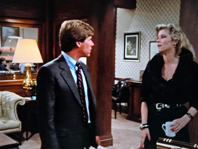
Name: The Dream Team
Season 11, Episode 18
Premiere Date: March 19th, 1995

What I liked about this episode:
Any time I’ve reviewed television show episodes, I have rarely addressed the dialogue as a strength of the episode. But in the case of this Murder, She Wrote episode, ‘The Dream Team’, the dialogue was cleverly written! Before attending a presentation about a development project from a company called Marina Americana, Jessica gives Seth some books about lighthouses. These books are intended to help Seth craft a strong argument for saving Cabot Cove’s lighthouse, which is an important landmark in the town. When Jessica brings up how the books could provide information for the hook of Seth’s argument, Seth says, “The hook I showed you last night will do just fine, thank you”. Sheriff Mort Metzger replies to Seth, “Maybe for the worm hanging from it”. At the presentation, Jessica’s nephew, Grady, reveals his colleague, J. Peter Carmody, plans to restore the lighthouse. Caught off-guard by this revelation, Metzger says, “Yeah, I think he [J. Peter Carmody] was rendered speechless by the Doc’s party trick; putting both feet in his mouth at the same time”. Along with being cleverly written, these quotes I brought up were hilarious!
What I didn’t like about this episode:
The beginning of a typical Murder, She Wrote episode will take the time to establish the characters and their potential motives. This creative decision gives the audience options in figuring out whodunit, as well as provide the story with red herrings. The establishment of characters and their motives in ‘The Dream Team’ took about half the episode. With the titular murder taking place at the episode’s halfway point, the audience is only given half the episode to help Jessica solve the case. Personally, I prefer stories that give viewers more time to figure the mystery out.
The mystery itself:
There are two interconnected stories in ‘The Dream Team’; the murder of a developer’s wife and the Marina Americana development project. But in this almost hour-long episode, more emphasis was placed on whether the development project would come to fruition. It also doesn’t help how, as I mentioned earlier, the audience was only given half the episode to figure the mystery out. In some Murder, She Wrote episodes, the guilty party will be revealed based on at least one small detail most viewers may miss. Though this was the case for ‘The Dream Team’, several smaller clues led up to the culprit’s reveal. Overall, I wish there was a balance between both stories and the audience was given more time to help Jessica solve the case.
The other factors from this episode:
- As Seth explains his thoughts on the Marina Americana development project, Jessica expresses her impatience over how long Seth takes to get to his point. Seth then tells Jessica, “Now that you’re living in New York, you’re becoming as impatient as the rest of those people down there”. In several episodes of Murder, She Wrote, Jessica lived in New York, though this new living arrangement was only meant to be temporary. By having Seth address this part of Murder, She Wrote’s story, it was a good way to incorporate the show’s continuity.
- While we’re on the subject of Seth, I want to address his desire to save Cabot Cove’s lighthouse. At the beginning of ‘The Dream Team’, Seth is against the Marina Americana development project because he fears the lighthouse will be destroyed. He goes so far as to create flyers in an attempt to make the developers feel guilty about risking the lighthouse’s future. However, the amount of time, money, and resources Seth puts toward those flyers could have gone toward actually restoring the lighthouse he claims to care about. If anything, Seth prioritizes talking about the problem instead of trying to solve it.
- Grady is one of the developers of the Marina Americana development project. But when the fruition of the project is in jeopardy, so is Grady’s job. When he shares this information with Jessica, he says, “It’s so damn frustrating. I really believed in this project and, well obviously, so did a lot of other people”. What Grady said brings up an excellent point about how a neighborhood’s residents are not the only people impacted by any change within a neighborhood. In fact, I hadn’t come to this realization until I heard Grady’s quote.
My overall thoughts:
The way I feel about ‘The Dream Team’ is similar to how I feel about ‘The Legacy of Borbey House’; disappointment that Cabot Cove’s maintenance received precedence over the mystery itself. Also, like ‘The Legacy of Borbey House’, the entire first half of ‘The Dream Team’ was devoted to establishing characters and their potential motives. This left only half the episode for the audience to help Jessica solve the mystery. However, I did find the dialogue cleverly written. The examples I provided in this review were hilarious as well. I not only liked the inclusion of Murder, She Wrote’s continuity, I also found Grady’s quote thought-provoking. What I also found thought-provoking was the idea of Cabot Cove changing. As I watched ‘The Dream Team’, I thought about what would happen if Cabot Cove were a real town. Would it adapt with the times or would it stay frozen in time?
Rating: A 3 out of 5

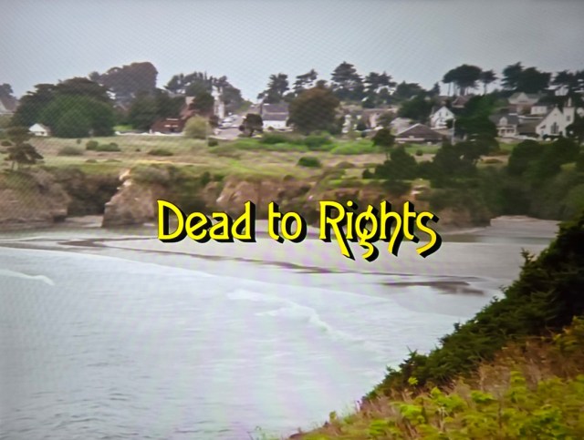
Name: Dead to Rights
Season 9, Episode 18
Premiere Date: March 21st, 1993
What I liked about this episode:
In this episode of Murder, She Wrote, ‘Dead to Rights’, Jessica’s former researcher, Dana Ballard, is accused of murdering her new boss. A major reason for this accusation is how she constantly lies. Dana goes so far as to impersonate Jessica, as well as change Jessica’s answering machine message, in order to be selected for a new job. But one person who sees past Dana’s lying is Missy, the wife of Dana’s new boss, Ethan. During a conversation between the two women, Dana shows off a sweet, even a bit naïve, personality, acting as if she’s oblivious of Missy’s suspicions. When Missy confronts Dana about her suspicions, Dana effortlessly transforms into an irritated, manipulative woman. Because of the screenwriting and Molly Hagan’s (the actress who portrayed Dana) performance, the creative team behind ‘Dead to Rights’ did a good job at establishing Dana as a potential suspect. However, I would like to point out the script provides a reason for Dana’s lying; “borderline psychosis” (as Jessica put it).
What I didn’t like about this episode:
As I just mentioned in this review, Dana is accused of murdering her new boss, Ethan. While this gave Jessica a personal reason for solving the case, the majority of the story focused on proving Dana’s innocence. ‘Dead to Rights’ did a good job at establishing characters and their potential motives. However, this build-up became an afterthought as the episode progressed due to the aforementioned focus on the truth about Dana. Similar to ‘The Dream Team’, the guilty party in ‘Dead to Rights’ was revealed based on a small detail. Had the script provided a balance between proving Dana’s innocence and figuring out who was guilty, the story might have been stronger.
The mystery itself:
Like I’ve already stated in my review, most of the story focused on proving Dana’s innocence. I also stated how the mystery’s guilty party was revealed based on a small detail. Another aspect of the mystery I’d like to bring up is how Jessica works with a lawyer named Vincent to solve the case. Typically, Murder, She Wrote shows Jessica collaborating with police officers, detectives, or investigators when it comes to catching whodunit. So, seeing Jessica engage with the more legal side of the mystery genre was a good change of pace for her!
The other factors from this episode:
- Some scenes in ‘Dead to Rights’ show a large train display the length of the entire wall in Ethan’s office. This train display not only surrounds a miniature town, a large painted backdrop of a desert landscape covered the wall behind the train display. Even though the train display and everything surrounding it was impressive, its inclusion in ‘Dead to Rights’ was random. None of the characters acknowledged the display itself. Plus, Ethan’s reason for the display being in his office was never provided.
- Toward the beginning of the episode, on-screen text reveals how most of the story takes place in Portland, Maine. But in an establishing shot of a hotel’s exterior (implying that’s the hotel Jessica is staying at), Maine’s state flag is not displayed on the hotel. Instead, the state flags for Maryland, Virginia, and Washington D.C. are prominently featured on the hotel’s exterior. In past reviews of Murder, She Wrote, I have complimented the show’s creative team for its location scouting because of how visually appealing the locations themselves have been. So, I’m surprised this film-making mistake went overlooked.
- During Jessica’s and Vincent’s investigation, Vincent turns to a woman named Wanda for assistance. A few scenes show Vincent and Jessica visiting Wanda at her home. Her office/living room is filled with a collection of décor; from a cylindrical fish tank to a colorful pinball game. Because Wanda had such a quirky personality, the creative team behind ‘Dead to Rights’ did a good job utilizing these pieces of décor to paint a picture of who Wanda is. The décor itself also made Wanda’s home look like a cool space!
My overall thoughts:
At best, ‘Dead to Rights’ is an ok episode. But, at worst, the story was weaker than I had hoped. So much emphasis was placed on proving Dana’s innocence, the build-up of the characters and their potential motives became an afterthought as the episode went on. What I also found frustrating was how the guilty party was revealed based on a small detail I think most viewers might overlook. However, there are aspects of ‘Dead to Rights’ I liked. The combination of Molly Hagan’s performance and the screenwriting effectively established Dana Ballard as a potential suspect. The episode’s creative team did a good job showcasing Wanda’s personality through the set design. However, there were some questionable creative choices, like Ethan’s train display and the lack of Maine state flags on the hotel. Now I wonder what other production errors from Murder, She Wrote actually appeared on the show?
Rating: A 3 out of 5


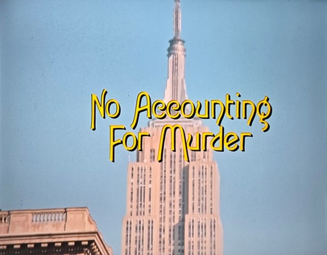
Name: No Accounting for Murder
Season 3, Episode 19
Premiere Date: March 22nd, 1987
What I liked about this episode:
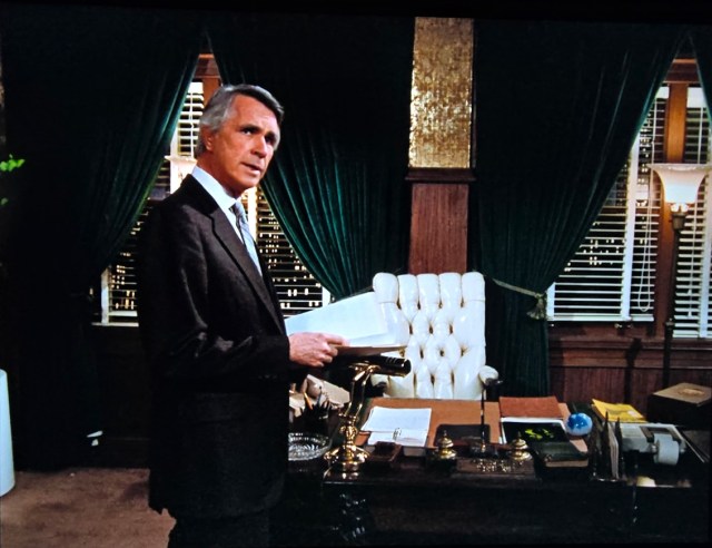
One of the strengths of Murder, She Wrote has been the set design. This episode, ‘No Accounting for Murder’ is a perfect example of this statement! The accounting firm Grady works for is one of the most opulent looking businesses I’ve ever seen in entertainment media. The office of a colleague named Paul Carlisle boasts stunning design choices, including gold wallpaper that sparkled in the light, a white upholstered office chair, and gold décor. Even the accounting firm’s lobby fit the opulent style found in Paul’s office! Deep wood pillars and window frames provide a nice contrast to the light-colored carpet and wallpaper. Similar to Paul’s office, the sofa in the lobby was also upholstered. A gold table lamp adds a touch of elegance to the space. Once again, the creative team behind Murder, She Wrote knew what they were doing when it came to designing this particular set!
What I didn’t like about this episode:
When I reviewed ‘The Dream Team’ and ‘Dead to Rights’, I talked about how the characters and their potential motives were established within the story. But in ‘No Accounting for Murder’, some of the characters aren’t given a potential motive. The characters that do have a potential motive receive it as the story went along instead of toward the beginning of the episode. What also didn’t help was how the culprit was revealed because of a small detail mentioned by one of the characters. The fact only some characters were given a potential motive caused the script to lack red herrings.
The mystery itself:
There are two mysteries within ‘No Accounting for Murder’; the murder of one of Grady’s colleagues, Ralph Whitman, and the “ghost” inhabiting the accounting firm. Unlike the stories in ‘The Dream Team’, the stories in ‘No Accounting for Murder’ didn’t feel connected. In fact, each story felt like it belonged in their own separate episode. Personally, I thought the “ghost” story was more intriguing, as there were more mysterious elements to it. By the episode’s conclusion, however, I was disappointed by the unsatisfactory resolution of that story.
The other factors from this episode:
- In ‘No Accounting for Murder’, Jessica works alongside Lieutenant Timothy Hanratty while trying to solve the case. In a car ride through New York City, Timothy brings up some of Jessica’s past cases and even wonders why she hasn’t received a gold badge from her own police department yet. Jessica replies by saying, “It’s just a quirk of mine, really. The way I see things, you know?” When Jessica said this, I thought about other detectives, both amateur and professional, from entertainment media. They seem to possess a gift for observation, picking up on little details buried among facts, clues, and speculation. What these characters bring to their respective tables is just extraordinary. Any time I’ve watched Murder, She Wrote, I believed Jessica just happened to be that good at being a detective. But after watching ‘No Accounting for Murder’, I now see Jessica possessing a brilliance, similar to other detectives from television and film.
- Last year, when I reviewed the Touched by An Angel episode, ‘Sympathy for the Devil’, I brought up one of the most unintentionally funny moments of the show; when Ty Duncan called his son “Chicken Boy” as an insult. In the Murder, She Wrote, episode, ‘No Accounting for Murder’, an unintentionally funny moment took place during a confrontation between Paul and the murder victim’s wife, Lana Whitman. As an insult, Lana calls Paul an “arrogant horse’s batootie”. Because of how goofy this insult sounded, I ended up bursting out laughing.
- While watching ‘No Accounting for Murder’, I spotted a familiar face among the cast of characters. Ron Masak portrayed a salesman named Marty Giles, who happened to be a potential suspect. Fans of Murder, She Wrote would recognize Ron as Sheriff Mort Metzger, one of the most beloved residents of Cabot Cove. This discovery was such a surprise for me, as I didn’t know Ron had portrayed other characters on Murder, She Wrote besides Metzger. This makes me wonder how often actors and actresses portrayed more than one character on Murder, She Wrote?
My overall thoughts:
Like ‘The Dream Team’ and ‘Dead to Rights’, ‘No Accounting for Murder’ was just ok. Even though I liked the accounting firm’s set design, I didn’t like how some of the characters didn’t receive a potential motive. I also didn’t like how the mystery stories felt disconnected. However, the “ghost” story was intriguing enough to keep me invested in the episode, despite its resolution being unsatisfactory. ‘No Accounting for Murder’ has made me see Jessica in a slightly different way, leaving me appreciative of what she has to offer to the mystery genre’s table. It was nice to see Ron Masak appear in this episode as well. But as I look back on the episodes of Murder, She Wrote I’ve written about, ‘No Accounting for Murder’ will not be reflected on as fondly as other episodes.
Rating: A 3 out of 5
What are your thoughts on these episodes of Murder, She Wrote? Are there any episodes you’d like to see me review? Tell me in the comment section!
Have fun in Cabot Cove!
Sally Silverscreen