Word on the Street: James Dean will be Brought Back in Upcoming Film

Despite what the title suggests, this is not a joke. I actually came across this story when I saw Amber, from Hallmarkies Podcast, comment about it on Twitter. After the negative reaction this piece of movie news caused on the aforementioned social media platform, I knew I had to talk about it. There are several movie bloggers that I know who specialize in writing about the Classic Film Era, so I assume they’ll have thoughts on this topic as well. Two days ago, on November 6th, Alex Ritman, from the The Hollywood Reporter, reported that the creative team behind a film called Finding Jack will incorporate James Dean through the use of CGI. In this article, Alex wrote that the film’s directors, Anton Ernst and Tati Golykh, “obtained the rights to use Dean’s image from his family”. In relation to this, Anton Ernst said “We feel very honored this his family supports us and will take every precaution to ensure that his legacy as one of the most epic film stars to date is kept firmly intact. The family views this as his fourth movie, a movie he never got to make. We do not intend to let his fans down”. As for the specifics on how Finding Jack’s creative team will bring James back, Alex states “that Dean’s performance will be constructed via “full body” CGI using actual footage and photos. Another actor will voice him”. According to the article, Finding Jack will begin preproduction on November 17th, with the intent to release the film next Veterans Day.

299832-P7FMT8-686
Popcorn and movie ticket image created by Freepik at freepik.com. <a href=’https://www.freepik.com/free-photo/cinema-tickets-in-bucket-with-popcorn_2303439.htm’>Designed by Freepik</a>. <a href=”https://www.freepik.com/free-photos-vectors/layout”>Layout image created by Freepik</a>. Image found at freepik.com.

I’m going to be honest, I’m not a fan of this decision for a number of reasons. Even though James Dean’s family approved of this idea, James Dean himself did not. Because he’s been gone for several decades, he has been unable to stand up for himself and give his consent. Bringing him back by using his image without his permission is not only exploitive, but also manipulative. This opportunity gives Finding Jack’s creative team the ability to use James’ image to their liking, not how James himself would have wanted. This situation kinds of reminds me of how I felt about the film, Edward, My Son. I mentioned in that review how, because of the creative team’s choice not to feature Edward on screen, it denied any actor the opportunity to receive a “standing ovation” they had probably worked hard to achieve. In the case of Finding Jack, any actor is denied a chance to add another project to their filmography because this creative team wants to capitalize on a deceased star’s popularity. The decision to bring back James is this manner is also quite cruel. Fans of James Dean are understandably upset that he passed away at such a young age. With Finding Jack’s creative team incorporating James into their film, they are giving his fans and their audience false hope, whether or not it was intentional. I’m guessing that this is a one-time decision, but fans would probably rather see him in more than one project. If fans of other decreased stars find out about this decision from Finding Jack’s creative team, they might want to see them come back in a similar fashion. Personally, I think this creative team’s intention could lead to bad results. It could also open up a can of worms that may never close again.


What are your thoughts on this story? How do you feel about the idea of bringing back deceased stars through technology? Share your thoughts in the comment section below!


Have fun at the movies!

Sally Silverscreen


Here is the link to the article I referenced in this post:

https://www.hollywoodreporter.com/news/afm-james-dean-reborn-cgi-vietnam-war-action-drama-1252703

You can visit Amber’s official Twitter account by typing @amberbrainwaves into Twitter’s search bar.

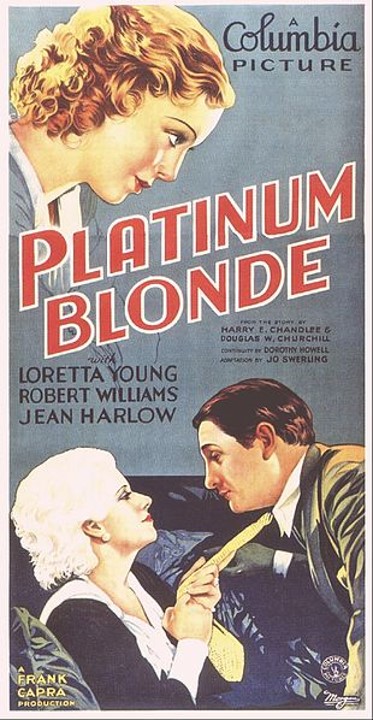
Take 3: Platinum Blonde Review + 150 Follower Thank You

Last month, I received 150 followers! But because of how much time and energy was devoted to writing my editorial for Pale Writer’s Gothic Horror Blogathon, I decided to publish this review in early November. The movie I selected, Platinum Blonde, was released on Halloween in 1931. Since I reviewed Vampyr for my previous blog follower dedication review, I chose Platinum Blonde because, based on the synopsis, it gives the impression that it has a lighter tone. It’s also the first movie of Jean Harlow’s that I’ve ever seen. I discovered this actress through The Jean Harlow Blogathon, hosted by the blogs Musings of a Classic Film Addict and The Wonderful World of Cinema. Even though I didn’t participate in this blogathon, I was introduced to Jean and her contributions to the world of film. Before I begin this review, I want to thank each and every one of my followers! I’m not only impressed by how quickly I reached this milestone, but also by your continued support of 18 Cinema Lane!

Picture1
Platinum Blonde poster image created by Columbia Pictures. Image found at commons.wikimedia.org/wiki/File:PlatBlonde.jpg

Things I liked about the film:

The acting: I was very impressed by the acting performances in Platinum Blonde! This is because all of the portrayals were consistent and expressive. One good example is Robert Williams’ performance. Throughout the film, his portrayal of Stew Smith was charismatic. He almost always had something witty to say and also had an appealing persona. Robert had good on-screen chemistry with both of his female co-stars as well. Jean Harlow had a pleasant on-screen presence while portraying Ann Schuyler. Her personality was charming and she helped create a character that was different from stereotypical expectations. Jean also had a good on-screen relationship with her co-stars. I really liked seeing this film’s supporting cast! Louise Closser Hale was a standout as Mrs. Schuyler! She was very expressive and her performance was memorable from start to finish! This cast would not have been the same without her.


The set design: Most of this story takes place in and around the Schuyler home. Despite this lack of variety in locations, the interior and exterior of the house was spectacular! The layout of the entryway and foyer reminded me of Norma Desmond’s house from Sunset Blvd., from the metal gate to the large, curving staircase. Everything in the Schuyler house was massive in scale. This environment represented how larger than life the family is. Even the small details found in the home highlighted this lavish lifestyle very well. One perfect example is the carved artwork on Ann and Stew’s headboard. While the exterior was shown on screen for a limited amount of time, it had a pleasant presence on film! In the scene where Ann and Stew share a kiss for the first time, the backyard appeared as a private oasis. From the lighted fountain to the flower arrangements, this space looked very inviting.


The cinematography: I wasn’t expecting anything special in Platinum Blonde when it came to the cinematography. But I was pleasantly surprised by the cinematography I did find in this film. In some scenes, when a character would walk up the stairs, the view from the camera looked down on the characters. This presented an illusion that the environment surrounding these individuals was grand in scale. Another scene that had interesting cinematography was when Mrs. Schuyler and the butler, Smythe, were on the balcony looking down on the living room. Because the camera angle came from a ground level perspective, it gave the audience the idea that most of Ann’s family looked down on Stew, both literally and figuratively. It also alluded to the differences in socio-economic standing.

OYHKOT0
Newspaper image created by Zlatko_plamenov at freepik.com. <a href=’https://www.freepik.com/free-psd/newspaper-mockup_1386098.htm’>Designed by Freepik</a>. <a href=”https://www.freepik.com/free-photos-vectors/mockup”>Mockup psd created by Zlatko_plamenov – Freepik.com</a>. Image found at freepik.com.

What I didn’t like about the film:

Under-utilized characters: At the beginning of the film, the character of Bingy Baker was introduced. I thought he would experience one hilarious situation after another while also finding true love. Sadly, this particular character received a very minor role. It also seemed like he was there just for the sake of comic relief. Bingy is an example of how some characters in this movie were under-utilized. If this character were removed from the story, it wouldn’t have made much of a difference.


An unexplained conflict: The start of the film features a conflict about Ann’s brother’s, Michael’s, relationship with a dancer. This is how Stew came to be introduced to the Schuyler family. While the characters kept saying that the situation was bad, they failed to explain why it was bad. With the conflict of Ann and Stew getting married, the audience was given reasons why this was a problem through the visualization of certain events. But this was not the case for Michael’s conflict, as it evidently seemed to be swept under the rug.


A somewhat unhealthy relationship: As I already mentioned, Platinum Blonde’s major conflict revolved around Ann and Stew’s relationship. While there were times when it seemed like they cared about one another, there were also times when their relationship came across as unhealthy. For most of the film, Ann and Stew do not make compromises. The audience gets to see them talking to one another, but these two characters don’t communicate about important martial issues, such as which place they will call “home”. At one point, one member of this relationship becomes hypocritical toward their spouse. Even though this film was created in the early ‘30s, I still found elements of this relationship to be kind of concerning.

101994-OM0XMB-226
Money image created by Freepik at freepik.com. <a href=’https://www.freepik.com/free-vector/bills-and-coins-in-isometric-design_1065328.htm’>Designed by Freepik</a>. <a href=”https://www.freepik.com/free-photos-vectors/business”>Business vector created by Freepik</a>. Image found at freepik.com.

My overall impression:

On Wikipedia, Platinum Blonde is labeled as a “romantic comedy”. But, in reality, the movie is a cautionary “fish out of water” tale. The reason why I chose to review this film is because I thought it would be lighter in tone. However, Platinum Blonde wasn’t as light-hearted as I expected. Sure, there was at least one romance and some humorous moments. But it wasn’t enough to live up to the title of “romantic comedy”. Despite this disappointment, I did like some elements of this movie. One of these was the cinematography. Because of the camera angles, the scenery was not only complimented, but ideas and themes were able to visually present themselves. Platinum Blonde wasn’t the worst thing to be put to film, but it definitely could have been stronger.


Overall score: 6 out of 10


Are you a fan of Jean Harlow? Which film from the ‘30s do you want me to review? Tell me in the comment section!


Have fun at the movies!

Sally Silverscreen

Take 3: Vampyr Review + 145 Follower Thank You

For this blog follower dedication review, I decided to take a different approach when choosing the next film. Instead of the usual system that I apply to these posts, I chose a film that felt like an appropriate choice for ‘31 Spooks of October’, the event I’ve been participating in. Since K, the creator of this event and K at the Movies, wrote about vampire related short stories recently, I thought that reviewing Vampyr would be very fitting. Last week, I was nominated for the Liebster Award by the Brannan sisters from Pure Entertainment Preservation Society! In their article, they offered an invitation to their Third Annual Great Breening Blogathon. Because the purpose of this event is to promote the preservation of the Breen Code, I felt that I had an understanding of the kind of entry that the Brannan sisters were looking for, especially since I participated in “Clean Movie Month” and “A Month Without the Code”. Vampyr was released in 1932, so through this review, I will try to determine how the Breen Code could be applied to this film!

Vampyr poster
Vampyr poster created by Carl Theodor Dreyer-Filmproduktion, Tobis-Filmkunst, and Vereinigte Star-FilmGmbH. Image found at http://www.tcm.com/tcmdb/title/343956/Vampyr/#.

Things I liked about the film:

The cinematography: While watching Vampyr, I was very impressed by the cinematography! Because this movie was created in the early ‘30s, some of the visual tricks that the film’s creative team incorporated into their project felt like they were ahead of their time. Throughout the movie, there were shadows that were presented inside an abandoned warehouse and around the grounds of a hotel and a mansion. When the protagonist, Allan Gray, first sees these shadows, one of them is seen digging in reverse. This is something that audiences probably take for granted today, but was revolutionary back then.


The music: All of the music in this movie was orchestral, similar to silent films. It was used to effectively convey the mood of each scene. Whenever there was a part of the film that was suspenseful, eerie music could be heard. There was even sad music that was playing when a sad moment was presented on screen. This film’s music helped explain what was happening even when no dialogue was spoken. It became an integral part of this project.


Audio that could be heard: This film was styled and constructed like a silent film. But what’s different about Vampyr is that the orchestral music wasn’t the only audio that could be heard. Audible dialogue from the actors replaced title cards. Things like knocks on doors and ringing bells could be heard by the audience. At one part of the film, the sounds of a parrot were included with the visual presentation of the bird. In a film that was created in this specific way, hearing all these sounds was a pleasant surprise!

Third Annual Great Breening Blogathon banner
The Third Annual Great Breening Blogathon banner created by the Brannan sisters from Pure Entertainment Preservation Society. Image found at https://pureentertainmentpreservationsociety.wordpress.com/2019/09/19/announcing-the-third-annual-great-breening-blogathon/.

What I didn’t like about the film:

A limited presence of vampires: When a movie’s creative team assigns a particular title to their project, they make a promise to their audience about what they can expect from the movie. With Vampyr, the subject of vampires wasn’t brought up until thirty-four minutes into the film. The very first vampire was revealed in the second half of the movie. In this project, vampires don’t play as big of a role as I expected. This shows that the creative team didn’t exactly fulfill the promise that they had made.


A simplistic story: For a movie like Vampyr, a sense of mystery in the story is to be expected. However, this plot felt too straight-forward. While there was a little bit of mystery, it wasn’t enough to maintain a consistent level of intrigue. It felt like the script put more emphasis on explaining through visuals what was going on instead of letting the visuals present things as they are. One perfect example is when a book about vampires is given to Allan Gray, in an effort to tell him what’s about to happen. It caused the narrative to be more simplified than it needed to be.


Some confusion: During this film, there were times when it felt like some of the mystery was kept at an arm’s length from the audience. Even though these mysteries were solved, it took awhile for the answers to be presented. Throughout the film, there was one character that kept reappearing. The audience didn’t learn who this person was until after thirty minutes. This extended explanation caused some confusion to happen in the narrative.

176402-OWIP8M-64
Happy vampire image created by Freepik at freepik.com. <a href=’https://www.freepik.com/free-vector/several-vampires-ready-for-halloween_1317599.htm’>Designed by Freepik</a>. <a href=”https://www.freepik.com/free-photos-vectors/party”>Party vector created by Freepik</a>. Image found at freepik.com.

My overall impression:

Before I share my overall impression of Vampyr, I want to thank all of my followers for helping 18 Cinema Lane reach this milestone! Every success that happens here is because you gave this blog a chance! Speaking of chances, I’m glad I gave this film a chance! While it had its errors, I ended up liking it more than I expected. The creative team behind this project adopted story-telling elements that were creative and interesting. Before watching this film, I learned that Vampyr was restored through the incorporation of two different versions of the movie. In the opening credits, there were a lot of names listed, indicating who was involved in the restoration process. This raises a good point of how many people it takes to restore a film. It makes me appreciate the work that’s involved in a cinematic procedure like this. Because this movie was released in 1932, it means that it wasn’t approved by the Breen Code. If it had been created two years later, these are the things that would need to change in order to meet Breen Code standards:


  • During the film’s introduction, it was said that the main character, Allan Gray, studies the subjects of “devil worship and vampires”. While the story does contain vampires, the first part of that statement would need to be rewritten.


  • When the subject of vampires is being explained, there were several references to “The Dark One”. Even though vampires are meant to be villainous in this film, any mentions of “The Dark One”, would need to be rewritten or omitted.


  • There were two times when God’s name was said in vain and one swear word was included in the script. New word choices would have to be made before production started.


  • In one scene, a pool of blood was shown on screen. This scene would have to be removed.


  • A few dead bodies can be seen on screen. These scenes should be rewritten, in order for the deaths to be implied.


Overall score: 7.6 out of 10


Have you seen Vampyr? Is there a film from the 1930s that you want me to see? Tell me in the comment section!


Have fun at the movies!

Sally Silverscreen

Take 3: It’s a Mad, Mad, Mad, Mad, World Review

If you’re wondering why I’m publishing this review for The Second Spencer Tracy & Katharine Hepburn Blogathon early, it’s because I will be attending an event during the weekend when the blogathon is taking place. Since I know I’ll have little to no time to complete this post over the weekend, I thought that publishing it early would be a smart idea. For this blogathon, I will be reviewing two films. As you can tell by the title, the first movie is It’s a Mad, Mad, Mad, Mad, World. I saw this movie for the first time several years ago. But I only watched a third of the film before I decided to stop watching it. When I was choosing what to write about for the aforementioned blogathon, It’s a Mad, Mad, Mad, Mad, World came to mind. Had I judged this film too harshly? Now that I’m watching it years later, would I find more enjoyment out of the movie this time? In this review, I will be attempting to answer these questions, especially since the movie stars one of the actors that this blogathon is dedicated to; Spencer Tracy.

It's a Mad, Mad, Mad, Mad World poster
It’s a Mad, Mad, Mad, Mad World poster created by Casey Productions and United Artists. Image found at en.wikipedia.org/wiki/File:It%27s_a_Mad,_Mad,_Mad,_Mad_World_(1963)_theatrical_poster.jpg

Things I liked about the film:

The acting: This movie has one of the largest casts in cinematic history. But what worked in this cast’s favor was that every performer had television or movie experience prior to appearing in this film. This presented the team dynamic that comes from working with a group of people. What I noticed while watching this movie was how consistent each performance was. Some actors and actresses received more screen-time than others. However, the consistency of the characters was maintained from start to finish. Another aspect to this cast was their on-screen chemistry. All of these characters had a very interesting relationship with one another. Because of the performers’ experience with working on other movies and television shows, it helped the cast create a sense of acquaintanceship with each other.


The scenery: California is the primary filming location for this movie. It’s interesting how the various landscapes featured in the Golden State were present within the story. Most of the film takes place in the desert, but there were some unique ways that this location played into the narrative. One example is when Otto Meyer, portrayed by Phil Silvers, drives down a very steep hill. Other landscapes in this movie include the city and the seaside, which also serve an important role in this story. I think it’s great that the creative team behind this film chose to show a more well-rounded view of this state. It reminded me of the movie, Return from Witch Mountain.


The music: All of the music in this film was created by the Los Angeles Symphony Orchestra. Despite this, it worked well with the events that took place on screen. Since this movie is a comedy, most of the music was up-beat in order to fit the overall tone. However, there were times when the music created a mood that felt different from the film’s norm. Going back to the example of Otto Meyer driving down the hill, the music that was incorporated into this scene created a moment that felt suspenseful. There was a song that was performed toward the beginning and end of the movie called “It’s a Mad Mad Mad Mad World”. This song’s score could be heard at various parts of the film.

Spencer and Katherine Blogathon
The Second Spencer Tracy & Katherine Hepburn Blogathon poster created Crystal from In the Good Old Days of Classic Hollywood and Michaela from Love Letters to Old Hollywood. Image found at https://crystalkalyana.wordpress.com/2019/08/04/announcing-the-second-spencer-tracy-and-katharine-hepburn-blogathon/.

What I didn’t like about the film:

The weak story: People from different walks of life trying to find a large sum of money is a story that sounds like it has potential. But, in reality, this idea works better on paper than it does on the screen. The majority of the movie relies on driving scenes and people yelling at one another. The jokes and gags seemed to last longer than necessary, potentially making up for the weak plot. Any time there was a moment for commentary, the screen-writers don’t take advantage of them. Instead, they focus on creating a series of subplots that feel repetitive.


The run-time: It’s a Mad, Mad, Mad, Mad, World is approximately two and a half hours, while IMDB lists the movie at three hours and twenty-five minutes. As I’ve already said, this plot was pretty weak. However, the story itself was also straight-forward. This film’s run-time feels excessive, being drawn-out longer than it needed to be. A film’s run-time can be hit or miss. It all comes down to what the story calls for. Personally, I think It’s a Mad, Mad, Mad, Mad, World should have been about an hour and thirty to fifty minutes. That way, the story could have gotten straight-to-the-point a lot sooner.


The humor: Humor, like film, is subjective. What is funny for one person might not be hilarious for another. For me, there were very few jokes in It’s a Mad, Mad, Mad, Mad, World that I found legitimately funny. One example was when, at the beginning of the film, the man who tells the other characters about the money literally kicks a bucket before he dies. But the majority of the jokes revolved around people getting hurt at the expense of others. Instead of finding the events on the screen hilarious, I kept wondering how the characters were able to survive their ordeals. Something that I’ve already talked about was how, most of the time, the characters end up yelling at one another for a host of reasons. This aspect of the film didn’t add humor to the story either. What it did, instead, was sound like a broken record.

Joshua Tree National Park
Joshua Tree National Park in California image created by Welcomia at freepik.com. <a href=”https://www.freepik.com/free-photos-vectors/tree”>Tree photo created by welcomia – http://www.freepik.com</a>. Image found at freepik.com.

My overall impression:

If there is ever a movie that I haven’t finished or I haven’t watched in several years, I am more than willing to give it a second chance. Since I have this blog, it provides a place where I can analyze and evaluate each title. Unfortunately, It’s a Mad, Mad, Mad, Mad, World did not deserve that second chance. Like I said, humor and film are subjective. This means that this particular film was not for me. Yes, there were things about the movie that I liked. But the negatives ended up out-weighing the positives. The movie, to me, felt like a drawn-out joke that had trouble finding its punch-line. It also seemed like the creative team behind this film put more emphasis on recruiting as many actors and actresses as possible instead of focusing on telling a good story. Since this is a double feature, I’m hoping that the second movie I plan to watch is better than this one.


Overall score: 5 out of 10


Have you seen any of Spencer Tracy’s films? Are you looking forward to the second part of this double feature? Share your thoughts in the comment section!


Have fun at the movies!

Sally Silverscreen

Take 3: Caesar and Cleopatra Review + 140 Follower Thank You

September has been a weird month for 18 Cinema Lane. The movies that I’ve reviewed have either been period films or films with a release date from the 1940s. In October, I will try to review movies that are outside of these cinematic realms. But for this blog follower dedication review, I have chosen a movie that was released in September of 1946. According to Wikipedia, Caesar and Cleopatra was released in September of 1946 in both the United States and the United Kingdom. So, this is the film I have chosen for this review. When it comes to this particular cinematic story, I have heard of the version starring Richard Burton and Elizabeth Taylor. But I had never heard of the 1946 film until I was researching movies for this specific post. The only film of Vivien Leigh’s that I’ve seen is Gone with the Wind. Despite the fact that I was not a fan of that movie, I wanted to give other movies starring Vivien a chance.

Caesar and Cleopatra poster
Caesar and Cleopatra created by Gabriel Pascal Productions, Eagle-Lion Films, and United Artists. Image found at https://www.imdb.com/title/tt0038390/?ref_=nv_sr_1?ref_=nv_sr_1.

Things I liked about the film:

The acting: The acting performances in Caesar and Cleopatra were pretty good! Claude Rains did a great job at bringing his character to life! Creating a character that appears both likable and unlikable is not an easy feat. By adopting a persona that was both charming and cunning, Claude was able to present Caesar as being likable enough to form relationships and alliances, but unlikable enough to show how self-centered this character truly is. Despite having a limited amount of screen-time, Apollodorus quickly became my favorite character in this movie! This is because Stewart Granger, the actor who portrayed this character, was so expressive and animated. Because of applying these elements to his performance, Stewart’s portrayal of Apollodorus was such a joy to watch.


The set designs: I really liked seeing the sets throughout this movie! They made this cinematic world feel larger-than-life and epic because of how grand they were in size. These sets appeared historically accurate, showing the level of detail that the film’s creative team applied to this part of the project. The craftsmanship of the sets was truly remarkable, with Cleopatra’s palace being a good example of this. All of these factors helped make the scenery feel immersive, like the audience can see themselves entering that world. The sets were so impressive, that they were visually appealing!


The costumes: Caesar and Cleopatra was presented in Technicolor, so the costumes were showcased in the way they were meant to be seen. These costumes were as stunning as the cinematic world where they resided in! The characters were clothed in bright colors, helping to make the costumes eye-catching and vibrant. Even outfits that were mostly white had a splash of color incorporated into them. The use of metals was also interesting, as it ended up complimenting the outfits. One example was Apollodorus’ blue outfit that had gold embroidery. There was one scene where Britannus explains to Cleopatra why he wears the color blue. This explanation provided some interesting insight that isn’t always found when it comes to a film’s costume designs.

392047-PCXNXE-893
Illustration of Egyptian sphinx image created by Freepik at freepik.com. <a href=”https://www.freepik.com/free-photos-vectors/background”>Background vector created by freepik – http://www.freepik.com</a>. Image found at freepik.com.

What I didn’t like about the film:

Cleopatra’s character development: When I think of Cleopatra, I think of a woman who has the skills and intelligence to lead a kingdom. While watching Vivien’s performance, there were times when she brought my idea of this historical figure to life. But there were also times when it felt like Vivien was trying to recreate her portrayal of Scarlett O’Hara. I recognize that she was making the best of the material she was given. However, I think the film’s creative team was attempting to take advantage of the popularity and success of Gone with the Wind. If this was their intention, the decision caused Cleopatra’s character development to come across as inconsistent.


The run-time: Caesar and Cleopatra is a film that is over two hours. Because of this, it caused the movie to feel longer than it might have been intended. The run-time also made some scenes feel drawn out for the sake of satisfying the film’s run-time. One example was when the Roman army met the King of Egypt. The conversations featured in this script also seemed longer than they needed to be. If Caesar and Cleopatra was under two hours, maybe an hour and fifty minutes, then the story would have moved at a faster pace.


Lots of dialogue-heavy scenes: In this movie, there’s a war taking place between Rome and other countries, including Egypt. However, the majority of the story focuses on the characters having conversations with one another. As I’ve already mentioned, these conversations felt longer than they needed to be. Because of the number of dialogue-heavy scenes, it created an imbalance between these scenes and any scenes that were action-heavy. The scenes that involved action were far and few between. Moments of suspense were also subdued. A perfect example of this is when Alexandria’s library was on fire. I understand that this film was created during the Breen Code era. But it doesn’t mean that project shouldn’t have action, especially if the story calls for it.

stone-horses-1219399-1278x670
Chariot statue from the Roman Empire image created by Michel Meynsbrughen at freeimages.com. “FreeImages.com/Michel Meynsbrughen.”

My overall impression:

As I mentioned in my review, Gone with the Wind became a very successful and popular movie. When this happens, other studios will try to recreate that success. But not every movie can recapture that accomplishment that the previous title had reached. Caesar and Cleopatra is a perfect example of this situation. While the movie was just ok, it feels like it tried to take advantage of Gone with the Wind’s popularity. From Vivien’s reenactment of Scarlett O’Hara to the story being more dialogue-heavy, this film wasn’t able to be its own project. Despite this, there were factors within the film that I liked. Some of them were the costumes and the sets. Because this is the only cinematic version of this story that I’ve seen, I don’t have anything to compare this project to. But I’m glad that I chose this film for my 140 blog follower dedication review. To each and every one of my followers, thank you for choosing to support 18 Cinema Lane! Your interest in this blog means a lot to me.


Overall score: 6 out of 10


What are your thoughts on this review? Do you like films that feature a historical approach to the story? Share your thoughts in the comment section!


Have fun at the movies!

Sally Silverscreen

Take 3: I Remember Mama Review

Earlier this month, MovieRob, from the blog, MovieRob, invited me to join the monthly blogathon called Genre Grandeur. This is a monthly blogathon where different themes are chosen by various bloggers. Since I’ve never participated in Genre Grandeur before, I decided to give it a try. September’s theme, as chosen by Carl, from Listening to Film, is Ensemble Movies. Like with any blogathon, I take the time to pick a film that is the right option for me and that could bring something unique to the table of the blogathon. While searching through lists of the “best” ensemble movies, I discovered that I Remember Mama would be classified as an “ensemble film”. Because I already had this movie on my DVR, I figured this would be the perfect movie for me to review for Genre Grandeur! The goal of this blogathon is to share your favorite film from the chosen genre. This was my first time watching the movie, so my review is meant to determine if I Remember Mama could be a favorite ensemble project.

I Remember Mama poster
I Remember Mama poster created by RKO Radio Pictures. Image found at http://www.tcm.com/tcmdb/title/2237/I-Remember-Mama/#.

Things I liked about the film:

The acting: In any ensemble film, every actor and actress is expected to bring the best of their acting talents to the screen. That’s exactly what happened in I Remember Mama! In this film, all the cast members pulled off an excellent performance! Irene Dunne may be the lead actress, but she never overshadows anyone. Instead, her performance compliments the other performers. Irene was very expressive, sometimes relying on expressions more than actual dialogue. However, this aspect helped make the performance appear more emotional and realistic. Fans of The Waltons would recognize Ellen Corby as Esther “Grandma” Walton. Her portrayal of Aunt Trina highlights how versatile her acting abilities are. She effectively brings a personality that stands out from the other aunts in this cinematic family. Ellen also did a good job at carrying a Norwegian accent. Her performance is an example of how great an ensemble film can be, as it celebrates the cast as a whole instead of a select few.


The cinematography: I Remember Mama is a film that I was not expecting to see interesting cinematography in. But, as I watched the film, I was pleasantly surprised by how creative and visually appealing it really was. One common trick was how mirrors were used in a given scene. A perfect example is when Katrin begins to narrate her story. As the story starts, the mirror that is in Katrin’s room turns into a window as the audience enters the first flashback. Close-ups of people’s faces were also commonly used throughout this film. In one scene, Uncle Chris’ face is presented as a close-up when he tells his nieces to move out of his way. Because of the use of this cinematography trick, it reinforces the idea that this character is “scary”, a description that other family members gave him.


The messages and themes: Throughout this story, I found several messages and themes that resonated beyond the screen. Selflessness is just one example of an overarching theme that is relatable for a variety of audience members. Whether it’s Mama/Marta putting the needs of her family before her own or Uncle Chris looking after his grand-nephew while he’s in the hospital, it goes to show just how far this on-screen family will go to provide happiness and well-being for each other. The effects of one’s actions is a very important message in I Remember Mama. An example that really highlights this point is when the family has to deal with an injured cat. I’m not going to spoil this point of the film, in case you haven’t seen this movie yet. But all I’ll say is that it has a profound effect on one of the characters.

Painted Cup of Coffee with Natural Coffee Beans on a Chalkboard.
Coffee cup drawing image created by Valeria_aksakova at freepik.com. <a href=”https://www.freepik.com/free-photos-vectors/background”>Background image created by Valeria_aksakova – Freepik.com</a>. <a href=’https://www.freepik.com/free-photo/painted-cup-of-coffee-with-natural-coffee-beans-on-a-chalkboard_1013935.htm’>Designed by Freepik</a>. Image found at freepik.com.

What I didn’t like about the film:

Some characters get under-utilized more than others: While having an ensemble cast does have its advantages, it also has its flaws. A flaw in I Remember Mama’s cast is how some characters are under-utilized more than others. Even though most of the story revolves around Mama and Aunt Trina gets her own subplot, Aunt Jenny and Aunt Sigrid aren’t given much to do within the story. Throughout the film, each daughter in the Hanson family shares a teachable moment with their mother. Nels, the only son in the family, is never shown sharing one of these moments. Arne, one of Uncle Chris’ grand-nephews, isn’t seen interacting with many of the characters. While he does spend time with this uncle, during a stay in the hospital, he doesn’t receive a subplot.


Having difficulty understanding the accents: In I Remember Mama, most of the older characters speak with a Norwegian accent. That’s because some of them immigrated to the United States prior to the events that take place in the movie. All of the actors did a great job at pulling off this accent! However, there were times when I found it difficult to understand what they were trying to say. This is because I’m not used to hearing Norwegian accents in film, so this flaw is my fault as a viewer.

Norway Map Touristic Symbols Isometric Poster
Norway’s past and present image created by Macrovector at freepik.com. <a href=”https://www.freepik.com/free-photos-vectors/poster”>Poster vector created by macrovector – http://www.freepik.com</a>. Image found at freepik.com.

My overall impression:

Before I share my final thoughts on I Remember Mama, I want to thank MovieRob for inviting me to join Genre Grandeur! When I first discovered genre grandeurs, I thought it was an overwhelmingly analytical process. But the more I learned about it, the more I realized how simple the process really was. I’m glad that I was able to provide my insight to the blogathon’s overarching topic. Speaking of this topic, I’m now going to talk about my thoughts on I Remember Mama! This film was better than I expected it to be! It’s a movie I’ve heard about before, but had never taken the time to see. Because of this Genre Grandeur, I was given a good excuse to finally watch it! I Remember Mama is a story that is engaging and relatable. What helps make this movie memorable is the cast and the cinematography. Since I found this movie to be so good, it definitely has become a favorite when it comes to “ensemble films”!


Overall score: 8 out of 10


Do you like genre guesstimations? Would you like me to participate in the next one? Please tell me in the comment section!


Have fun at the movies!

Sally Silverscreen

Take 3: The Sky’s the Limit Review + 135 Follower Thank You

Thank you to all of my followers that helped 18 Cinema Lane reach this milestone! If it weren’t for you, this blog would have never reached 135 followers in only one year! So, like before, it’s time for another blog follower dedication review! This time, I’m going to talk about a film that was released in September of 1943. The Sky’s the Limit is the only film from this time period that I was able to rent, so that’s the film that I have chosen. I have a confession to make: up until this point, I have never seen a movie where Fred Astaire made an on-screen appearance. I am familiar with who Fred is as a performer, so it’s hard to believe that this is the first of his films that I’ve seen. Choosing this film seems fitting for this particular review.

The Sky's the Limit poster
The Sky’s the Limit poster created by RKO Radio Pictures. Image found at https://www.imdb.com/title/tt0036363/?ref_=nv_sr_1?ref_=nv_sr_1.

Things I liked about the film:

The acting: Like I mentioned in the introduction, this was the first film of Fred Astaire’s that I’ve seen. Despite this, I was very impressed with his performance! His presentation was very natural and believable, helping him bring a certain amount of charm to his character. Before watching The Sky’s the Limit, I had no idea that Fred could sing. His singing and dancing talents added uniqueness to his on-screen presence. Another performance that I was impressed by was Joan Leslie’s! Joan made her character well-rounded because of the various emotions and behaviors she adopted. I was also pleasantly surprised by her singing and dancing abilities! By incorporating those elements to her role, it made her performance that much more enjoyable!


The on-screen chemistry: Not only did Fred and Joan deliver good performances individually, they also presented good performances as an on-screen pair! Throughout the film, their characters appeared to truly like each other. Moments where Fred and Joan spent time together represent the sweeter parts of the movie. While the relationship of the characters gradually developed, this aspect was portrayed in a way that felt believable. The fact that Fred and Joan’s acting talents were similar worked in their favor. It made their performances complement one another!


The dance numbers: Whenever Fred Astaire is cast in a movie, it’s almost guaranteed that there will be, at least, one dance number. In The Sky’s the Limit, Fred performed one dance solo and two dance duets with Joan Leslie. These performances were very well choreographed, appearing flawless and captivating. All of those hours of practice seemed to pay off. Fred and Joan also looked like they having fun during their performances! When a dancer looks like they’re enjoying what they’re doing, it helps the enjoyment factor of the dance number!

Six designs of military airplane
Military plane image created by Brgfx at freepik.com. <a href=”https://www.freepik.com/free-photos-vectors/background”>Background vector created by brgfx – http://www.freepik.com</a>. Image found at freepik.com.

What I didn’t like about the film:

The plot: You’re probably thinking, “If you didn’t like the plot, then why did you watch this movie?” The plot itself wasn’t bad, but it was too straight-forward for my liking. Before watching The Sky’s the Limit, I assumed that the protagonist would face one hilarious situation after another in order to resolve the conflict. However, no efforts were made to find a solution to the conflict. There were very few humorous moments in the film as well. This story took itself more seriously than I think it should have. It seemed to forget that “comedy” was a part of its identity.


The limited amount of dance numbers: When I found out that Fred Astaire would be starring in the film and that it was classified as a “musical”, I was expecting the movie to be filled with singing and dancing. In this hour and thirty-minute picture, there were only three dance numbers, with the first one appearing about forty minutes into the film. When a movie’s creative team hires an actor with more than one talent, they should help that actor use their talents to the fullest extent. This is especially true when the movie is labeled as a “musical”. If this doesn’t happen, it makes the actor appear under-utilized.


No consequences: As I said in the introduction, The Sky’s the Limit was released in 1943. This means that the film premiered during the Breen Code era. But when Fred Astaire’s character never faced any consequences for his actions and choices, I was shocked that the people behind the Breen Code would find this part of the story to be acceptable. One example is when Fred’s character is upset over a break-up. This causes him to destroy a restaurant’s bar by breaking drinking glasses and throwing a bar stool at the mirrored background. All that happens is Fred paying for his drink and acting as if nothing out of the ordinary had happened. Because he never owned up to his mistakes, I found it difficult to root for his character.

Dancing Pairs 2 Retro Cartoon Templates
Couple performing the waltz image created by Macrovector at freepik.com. <a href=”https://www.freepik.com/free-photos-vectors/background”>Background vector created by macrovector – http://www.freepik.com</a>. Image found at freepik.com.

My overall impression:

I can’t believe that I hadn’t seen any of Fred Astaire’s movies until now! That’s a great thing about this blog, as it gives me an excuse to introduce myself to films that I might not have seen otherwise. Now that I’ve shared what I liked and didn’t like about the movie, I can now tell you my honest opinion about it. Personally, I found the film to be just ok. It’s definitely not one of the worst films I’ve seen this year. But, it’s not one of the best films I’ve seen this year either, as it hasn’t aged as well as other projects from that decade. Despite this, I’m still glad I gave this movie a chance! Something that I have said before was how you never know if a film will be good or bad unless you watch it. This is certainly the case for my experience seeing The Sky’s the Limit. Once again, thank you to all of my followers! If it weren’t for you, this review wouldn’t exist.


Overall score: 6.1 out of 10


What are your thoughts on my review? Are you looking forward to my next movie review? Please tell me in the comment section!


Have fun at the movies!

Sally Silverscreen

Take 3: Return to Peyton Place Review (A Month Without the Code — #7)

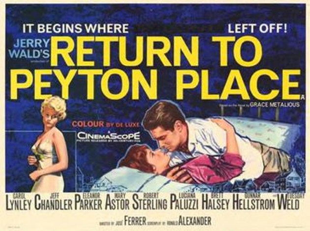
It seems fitting that my last review for the Summer Under the Stars Blogathon would be published at the end of the month. While looking through the marathon roster for Turner Classic Movies’ (TCM’s) marathon, I came across a film titled, Return to Peyton Place. Despite the fact that I was not familiar with who Mary Astor is, as an actress, I found the film’s description to be interesting. When I was learning more about this film, I discovered that it was the sequel to Peyton Place. So, I decided to watch the 1957 production in order to educate myself on the movie I was about to watch. To me, Peyton Place was just ok. The run-time was too long and the story felt like it belonged on a television show. How will the sequel compare to the first movie? Read my review of 1961’s Return to Peyton Place to find out!

Return to Peyton Place poster
Return to Peyton Place poster created by 20th Century Fox. Image found at en.wikipedia.org/wiki/File:ReturnToPeytonPlaceFilm.JPG

Things I liked about the film:

The acting: Some of the cast members from the first film didn’t return to reprise their roles. Two of them are Diane Varsi, who portrayed Allison MacKenzie, and Hope Lange, who portrayed Selena Cross. Taking their places in the sequel are Carol Lynley and Tuesday Weld. The great thing about their performances is how they were able to bring a sense of continuity to their characters. Just like in the first movie, Allison is a head-strong woman who is determined to make a name for herself. Meanwhile, Selena is trying her best to move forward from her traumatic past. While returning faces made their appearances in Return to Peyton Place, new characters were also introduced. One character is Mrs. Roberta Carter, who is the mother of Ted Carter. Portrayed by Mary Astor, Roberta was one of the most memorable characters in this movie! Mary effectively brought the unlikeable qualities that Roberta contains. With her demeanor, facial expressions, and reactions, Mary gave the audience a reason to dislike Roberta.

The subplots: Like Peyton Place, the sequel featured several subplots that come together to create one larger plot. What’s different about the subplots in this movie is they were much more interesting than those from the first movie. Return to Peyton Place features three subplots; Allison becoming a best-selling author, Roberta dealing with her son and his new wife, and Selena rebuilding her life after the events of the first film. These subplots led to the main plot, which revolved around the controversy of Allison’s book. These stories not only propelled the narrative from the predecessor forward, but also added depth to the returning characters. It gave new characters a reason to participate as well, providing some interesting interactions and conversations.

The ideas expressed: What I liked about Peyton Place was the ideas that were expressed in the story. A few examples are honesty, the effects of gossip, and reaching out to those in need. This was also a highlight in Return to Peyton Place! Through each story, realistic and relatable ideas were presented. For example, during the main plot, where the town is deciding what to do about Allison’s book, the subjects of censorship and which version of the truth should be respected are brought up. The way they were incorporated into the overall narrative felt natural and made sense within the movie. It also gives the audience the ability to connect with the characters as well as the world they reside in.

Summer Under the Stars banner
Summer Under the Stars Blogathon banner created by Kristen from Journeys in Classic Film and Samantha from Musings of a Classic Film Addict. Image found at https://journeysinclassicfilm.com/2019/07/08/the-2019-tcm-summer-under-the-stars-blogathon/.

What I didn’t like about the film:

The run-time: Return to Peyton Place is a little over two hours. While it is shorter than the first film, I still think this story didn’t need to be that long. Personally, I believe that Return to Peyton Place should have had a run-time of about one hour and thirty minutes. This would allow the narrative to get to the point sooner.

Overshadowed subplots: As I previously mentioned, Return to Peyton Place is told through several subplots. However, some of these subplots received less screen-time than others. Because Allison is the film’s protagonist, her subplot is focused on the most. While this creative decision made sense, it put the other subplots at a disadvantage. Ted and Raffaella’s subplot is a good example of this. Since their story was explored for a limited amount of time, it didn’t receive a satisfying conclusion. I also felt the same way about Selena and Nils’ subplot.

No explanation provided: When Allison published her book, some of the people in Peyton Place had a problem with the novel’s content. While they complained about how the book was “vulgar” and “lewd”, an explanation for why the book was bad was never given. This frustrated me because, as a viewer, I wanted to understand both perspectives on the issue. Because the book’s content was barely referenced in the movie, it made the argument against the book seem weak. This part of the movie reminded me of Chesapeake Shores’ third season, where the O’Brien family had an issue with Bree’s book, but never shared what exactly was in the book.

A Month Without the Code banner
A Month Without the Code Blogathon banner created by Tiffany and Rebekah Brannan from Pure Entertainment Preservation Society. Image found at https://pureentertainmentpreservationsociety.wordpress.com/2019/07/31/announcing-amonthwithoutthecode65/.

My overall impression:

As a movie, I thought Return to Peyton Place was decent. But as a sequel, I liked it more than the first movie! With more interesting stories, a smaller cast, and a tighter script, this movie was entertaining and enjoyable. Like its predecessor, Return to Peyton Place is a film that has something to say, providing ideas that are thought-provoking and relatable. While it does have its flaws, it also has its merits. There are things this movie does that improves upon the first one. One example is featuring a collective story that feels more cinematic. I’m really glad that I watched Peyton Place before watching Return to Peyton Place because I would have been so confused if I hadn’t. While there is less problematic content in Return to Peyton Place, some things would need to change if it were released in the Breen Code era. These things are:

  • There were several instances where unpleasant or questionable statements and phrases were spoken by the characters. One example is when Lewis says to Allison, “It takes two to make a love affair”. Statements like this would need to be rewritten.
  • On two separate occasions, Selena’s traumatic past is talked about by Selena herself. Because it involves dark subjects, this part of the story would have to be revised in order to meet Breen Code standards.
  • There is one scene where Ted and Raffaella are seen passionately kissing while laying on a bed. Even though these characters are married to each other and this act never leads to sex, this scene would have to be changed. The kiss itself would be shorter and would not take place on the bed.
  • Kisses in this movie are more passionate and last longer than kisses in Breen Code films. If Return to Peyton Place premiered during the years of 1934 to 1954, the kisses would be shorter in time length.
  • Some of the female characters wear outfits that have low necklines. These outfits would need to be changed to reflect more modesty.
  • There are two times when Allison is seen disrobing on screen. Even though she is shown wearing a full-body slip, these moments would end up being removed from the film.

Overall score: 7.1 out of 10

What are your thoughts on Turner Classic Movies’ Summer Under the Stars marathon? Which review from this blogathon has been your favorite? Share your thoughts in the comment section!

Have fun at the movies!

Sally Silverscreen

Take 3: The Big Sleep Review + 130 Follower Thank You

My blog received 130 followers last week! To all of my followers, thank you for helping 18 Cinema Lane become this successful! This review would not be possible without you! For this blog follower dedication review, I have chosen a movie that was released in August of 1946. By looking at the title, you would know that the film I selected is The Big Sleep! I’m going to be honest; I don’t watch films from the film-noir genre often. It’s just not a genre that I purposefully go out of my way to watch. However, because I, as a movie blogger, try to go out of my cinematic comfort zone, I still chose to watch The Big Sleep. I also discovered that this movie is labeled as a mystery. Since I review mystery films from time to time, I figured this would be something that I might enjoy. Choosing this particular movie for this review makes sense, especially since the last time I reviewed a mystery film for a blog follower dedication review was when I wrote about The Moon-Spinners back in January.

The Big Sleep poster
The Big Sleep poster created by Warner Bros. Image found at https://www.warnerbros.com/movies/big-sleep/.

Things I liked about the film:

The acting: What helped bring this story to life was the acting performances! I’ve seen Humphrey Bogart in Casablanca, so I was familiar with his acting style. His performance in The Big Sleep embodied the tone and attitude of the film. Humphrey’s character, Philip, could either be mysterious and serious or charming and suave. That’s because he was able to effectively portray those emotions and personas when he needed to. Before watching The Big Sleep, I was more familiar with Lauren Bacall’s voice-acting work than her on-screen performances. However, I was very impressed by her portrayal of Vivian Rutledge! Her acting style is similar to Humphrey’s, in that her performance is more subtle in presentation. Her on-screen personality ranged from serious and head-strong to flirty and charismatic. With each scene and scenario, Lauren brought believability to her role.


The mystery: If you’ve ever visited my blog, you’d know that I watch and review a lot of the programming on Hallmark Movies & Mysteries. What makes The Big Sleep different from those movies is how the mystery is written. As the mystery plays out on screen, the audience gets to experience the events alongside the characters. This allows the surprises and twists to catch viewers off-guard. The way this mystery is written also gives the audience the feeling that they are sharing moments with the characters. It helps them connect with the protagonist and the people around him.


The tone: Because The Big Sleep is a part of the film-noir genre, the tone is darker and more serious. A strength this movie has is how consistent it was. Throughout the film, the subjects and ideas that were expressed belonged to the real world. This kept the story grounded and the characters realistic. Since there were stakes in The Big Sleep, everything was handled with seriousness and reverence. These things made the story mature without becoming too dark or unpleasant. All of the aforementioned components helped maintain this tone’s consistency.

detective-desktop-1240088-1280x960
Vintage detective desk photo created by Olivier Bourgeois at freeimages.com. Photo by <a href=”/photographer/ornicar69-54520″>Olivier Bourgeois</a> from <a href=”https://freeimages.com/”>FreeImages</a&gt; Image found at freeimages.com.

What I didn’t like about the film:

A limited amount of suspense: In some mystery stories, the suspense is consistent throughout the film. Unfortunately, The Big Sleep was not one of those films. The suspense in this movie was very limited. It almost seemed like it was utilized for the sake of plot convenience. This made some parts of the movie more interesting than others.


So many characters: Mystery movies usually have a larger cast of characters. Some of them serve as suspects for the mystery. In The Big Sleep, I felt like there were too many characters. Sometimes, it was difficult to remember who was who and their connection to the mystery. What didn’t help was having some characters appear on screen for a short amount of time. Not every character was introduced toward the beginning of the film, like most of the films on Hallmark Movie & Mysteries. This felt like the characters could come and go whenever they pleased.


Lack of lighting: There were some scenes in The Big Sleep that featured very little lighting. Because of this, I had a difficult time trying to see what was happening on screen. One example is the scene where the person who shot Arthur Gwynne Geiger was being arrested. I understand that this movie is classified as film-noir. But just because a film’s tone is dark, that doesn’t mean the scenes have to be dark in presentation.

Private detective office interior cartoon vector
Interior image of detective’s office created by Vectorpocket at freepik.com. <a href=”https://www.freepik.com/free-photos-vectors/vintage”>Vintage vector created by vectorpocket – http://www.freepik.com</a>. Image found at freepik.com.

My overall impression:

As I said in my introduction, film-noir is a genre that I don’t watch often. But, because this review is meant to thank my followers, I was willing to go out of my cinematic comfort zone and share my thoughts on films that I think are worth my followers’ time. The Big Sleep is a movie that I ended up liking. The mystery was interesting and I enjoyed seeing the acting performances. However, this film does have its flaws, such as having too many characters and lack of lighting. For someone, like me, who doesn’t watch a lot of movies from the film-noir genre, I’m glad I gave this film a chance! Something that I mentioned in my review was how I watch a lot of content from Hallmark Movies & Mysteries. When I talk about films like The Big Sleep, it helps me expand my cinematic horizons when it comes to mystery films. For my blog follower dedication reviews, I will continue to share films that are different from the last.


Overall score: 7.5 out of 10


Do you watch films from the film-noir genre? If so, which one is your favorite? Let me know in the comment section!


Have fun at the movies!

Sally Silverscreen

Take 3: The Nun’s Story Review (A Month Without the Code — #4)

When I was choosing films to review for the A Month Without the Code blogathon, one of the movies that I wanted to see was The Nun’s Story. This is a film that I had never heard of until I read Debbie’s (from the blog, Moon in Gemini) review. After reading that article, I found the story of The Nun’s Story to be fascinating. I was especially curious to see how the concept of someone joining a Religious Order would be included. In movies that feature characters who are members of a Religious Order, the process of becoming a member is not often shown. Since The Nun’s Story was going to air on Audrey Hepburn’s day during the Summer Under the Stars marathon on Turner Classic Movies (TCM), this inspired me to make the decision to talk about Non-Code films for both the A Month Without the Code and Summer Under the Stars blogathon! Before watching The Nun’s Story, I saw Breakfast at Tiffany’s, which was the only film of Audrey’s that I had seen. Choosing this film for these blogathons has given me the opportunity to watch more of Audrey’s movies!

The Nun's Story poster
The Nun’s Story poster created by Warner Bros. Image found at https://www.warnerbros.com/news/articles/2019/07/12/60-years-nuns-story.

Things I liked about the film:

The acting: As I said in the introduction, the only other film of Audrey’s that I’ve seen is Breakfast at Tiffany’s. Her role in The Nun’s Story is very different from her aforementioned film. For one thing, there were times when her character, Gaby, was supposed to be silent due to the rules of the congregation. Audrey used this part of the script to her advantage by relying on her facial expressions as much as possible. An example of this is when Gaby is told that she will have to purposefully fail her exam in order for another Sister to pass. Audrey’s reaction allowed her character to say so much while using so few words. While watching this film, there was one performance that I felt needed to be addressed. During the story, Gaby is assigned to work in a psychiatric hospital, where she encounters a patient known as “Archangel Gabriel”. This character was portrayed by Colleen Dewhurst. Despite the fact that her screen-time was limited and that she was given very few lines, Colleen relied on facial expressions and emotions to bring her character to life. A perfect example is the scene where “Archangel Gabriel” asks Gaby for a glass of water.

The process of becoming a Nun: When it comes to movies featuring members of the Religious Order, the process of becoming a member is rarely featured. In The Nun’s Story, this process is thoroughly explored, allowing for this part of the story to be interesting and informative. It wasn’t just limited to a certain section of the film. The process is even observed after Gaby becomes a Nun. When she finally gets to do service work in the Congo, she still finds herself facing challenges and obstacles. This shows that being human is an on-going process, complete with personal growth and reflection. It also makes the character of Gaby relatable.

The messages and themes: Throughout this film, there were lots of messages and themes that I found relatable, even if Gaby’s specific experience isn’t relatable. An overarching example is the twists and turns that happen in Gaby’s life before her dream of volunteering in the Congo is realized. Life is unpredictable, with a limited amount of aspects being in our control. In The Nun’s Story, Gaby faces several situations that prevent her from achieving her dream. However, she never gave up and continued to work very hard toward her goals. Other messages and themes that are found in this movie were personal responsibility, honesty, and taking time to care for one’s self.

A Month Without the Code banner
A Month Without the Code Blogathon banner created by Tiffany and Rebekah Brannan from Pure Entertainment Preservation Society. Image found at https://pureentertainmentpreservationsociety.wordpress.com/2019/07/31/announcing-amonthwithoutthecode65/.

What I didn’t like about the film:

A limited amount of character development: Even though The Nun’s Story had a large cast, the film’s character development was very limited. For the character of Gaby, there is some character development to be found. However, because the story focuses more on Gaby’s journey of becoming a Nun, her character development seemed to sit on the side-lines. For the rest of the characters, their character development was either at a minimum or nonexistent. While the audience gets to become familiar with the characters, they never really get to know them.

Some segments being shorter than others: Because the narrative of The Nun’s Story focused on Gaby’s journey of becoming a Nun and her volunteer work in the Congo, other aspects of the story were shown in shorter segments. The beginning of World War II is a good example of this. Even though enough was shown to give audiences the intended point, it wasn’t explored as much as other parts of the film. If anything, it just felt like another stepping stone in Gaby’s journey.

Summer Under the Stars banner
Summer Under the Stars Blogathon banner created by Kristen from Journeys in Classic Film and Samantha from Musings of a Classic Film Addict. Image found at https://journeysinclassicfilm.com/2019/07/08/the-2019-tcm-summer-under-the-stars-blogathon/.

My overall impression:

Before and after Turner Classic Movie’s (TCM’s) presentation of The Nun’s Story, Ben Mankiewicz shared that Audrey’s favorite role in her career was her role in The Nun’s Story. After watching the movie, I can kind of understand why she would be so fond of this role. It’s very different from her other roles and the story itself is much more serious than some of her other films. Because of this, it allowed Audrey to become an even more well-rounded actress by exploring various acting methods. The Nun’s Story features a narrative that is rarely seen in films of its kind: the process of becoming a member of the Religious Order. Since this story filled a void that no one else had, it helped the movie bring a sense of uniqueness to cinema. Out of all the films I’ve seen for “A Month Without the Code”, I’d say that The Nun’s Story is one of the “cleaner” ones! It was even given a Production Code Administration seal of approval, the same one that was seen in the opening credits of many Breen Code films! There are only two things that I found that would have to be changed or eliminated if this film were released during the Breen Code era. The first is the underlying racism that can be found when Gaby goes to the Congo. Because this story takes place in the 1930s, I’m guessing that the inclusion of this topic was meant to provide commentary about the views of that time-period. The second is naked babies being shown on-screen. Since this happened in only one scene, these babies were not featured for very long.

Overall score: 7.8 out of 10

Have you seen The Nun’s Story? Which movie of Audrey’s would you like to see me review? Please share your thoughts in the comment section!

Have fun at the movies!

Sally Silverscreen

If you want to read Debbie’s article about The Nun’s Story, visit this link:

A Woman at War With Herself: The Nun’s Story (1959)