Take 3: The Curse of Frankenstein Review

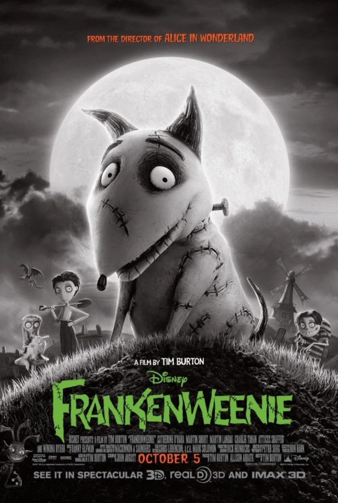
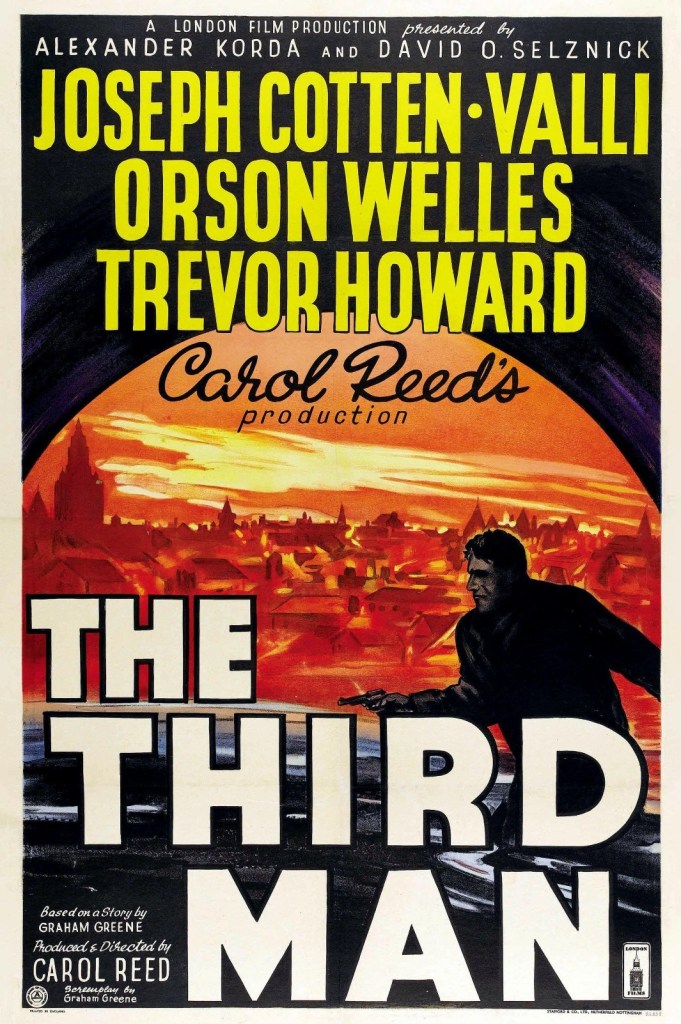
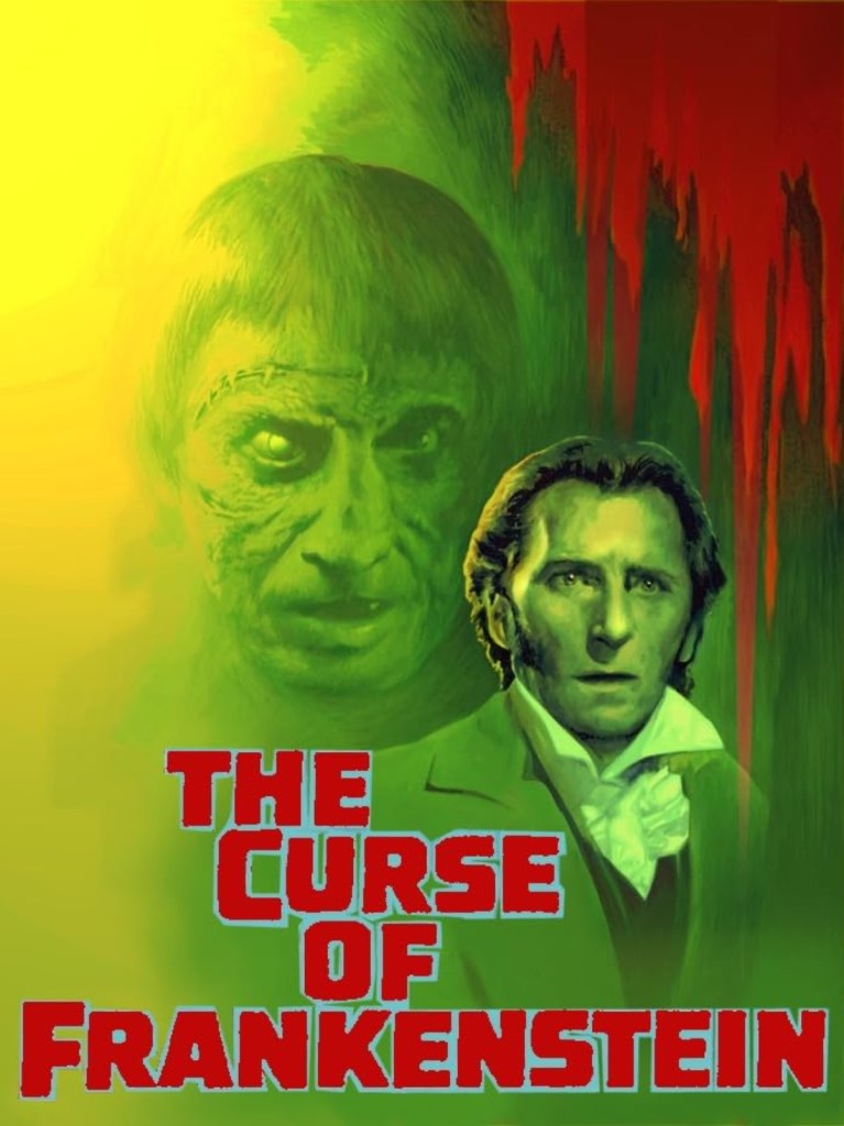
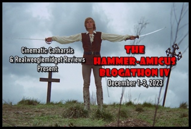
When I was first introduced to the world of Hammer-Amicus films, it was through the Third Hammer-Amicus Blogathon, hosted by Gill and Barry, from Realweegiemidget Reviews and Cinematic Catharsis. For that event, I reviewed the 1972 movie, Vampire Circus, which I thought was just ok. With the return of the aforementioned blogathon, I’ve decided to choose a Hammer-Amicus production that was recommended to me. Back when I wrote about Vampire Circus, Barry, from Cinematic Catharsis, suggested I check out several films, with 1957’s The Curse of Frankenstein being one of them. In my review of Frankenweenie, I mentioned how I haven’t seen many adaptations of Mary Shelley’s Frankenstein. To make up for lost time, I selected The Curse of Frankenstein for the blogging event!

The Curse of Frankenstein poster created by Hammer Films and Warner Bros.

Things I liked about the film:

The use of WarnerColor: When discussing “classic” cinema, there has been a debate over whether a film should remain with black-and-white imagery or if it should receive the Technicolor treatment. In my opinion, I’m glad The Curse of Frankenstein was released in WarnerColor, which I believe was the studio’s version of Technicolor. This creative decision allowed certain elements within scenes to appear vibrant! In Victor’s laboratory, various jars and bottles were scattered throughout the room. Liquid filled these bottles and jars, boasting bright colors like red, blue, even purple. These hues provided a nice contrast to the gray walls of the laboratory. The incorporation of color worked in the favor of the film’s wardrobe department! While working on his experiment, Victor wore a beige three-piece suit. He also wore a maroon neck scarf, which gave his outfit a pop of color. Another character who wore a mostly beige outfit is Elizabeth, whose gown was covered in a silky beige material. Her dress featured a light blue bow and sash, providing the gown with a nice color combination!

Historical accuracy: Mary Shelley’s Frankenstein was published in 1818. Reflecting on The Curse of Frankenstein, it seems like the movie’s creative team kept this fact in mind as the project looked and felt historically accurate! Remember when I mentioned Victor wore a three-piece suit with a maroon neck tie? His friend, Paul, also wore a three-piece suit. Victor even wore a pocket watch, an accessory that he occasionally used. The attire of both Paul and Victor highlighted how men dressed in the 1800s. Home décor is also reflective of when a story takes place. In the upstairs hallway and in the sitting room of Victor’s house, the walls were covered in intricate wallpaper. The wallpaper, which featured elegant patterns, showcases the artistic details that homeowners in the 1800s favored.

The acting: From what I remember of Mary Shelley’s story, Elizabeth’s presence was very limited. Her appearances in the book were so small, readers only became familiar with her. In The Curse of Frankenstein, Elizabeth was given more appearances in the story. This allowed Hazel Court, the actress who portrayed Elizabeth, to present her character as a friendly woman with a likable personality! One scene I liked was when Elizabeth is having a debate with Victor and Professor Bernstein. Professor Bernstein warns Victor about being consumed by science, also reminding Victor of how he should use science for good. Elizabeth adds to the debate by stating it would be better for Victor to go outside and get some fresh air. The way she suggests this to Victor is of kind encourage. A pleasant smile is shown on her face and she is comfortably sitting in an armchair.

In order to bring his experiment to life, Victor recruits the help of his friend, Paul. Because of how often Paul interacts with Victor, Peter Cushing and Robert Urquhart share several scenes together. What Robert’s and Peter’s performance have in common is how effective they utilized emotion! As Victor is conducting his first experiment, bringing a puppy to life, Victor’s face is filled with curiosity. Realizing his experiment was a success, his face slowly transforms into happiness. Victor is so happy, even his eyebrows move. Anytime Paul is upset over Victor’s obsession with his experiment, Robert consistently presents his face with a stern look. His voice also sounds stern, with a hint of anger detected. Based on their performance in The Curse of Frankenstein, I was impressed by Peter and Robert’s acting talents!

The Hammer-Amicus Blogathon IV banner created by Gill from Realweegiemidget Reviews and Barry from Cinematic Catharsis

What I didn’t like about the film:

A prolonged appearance of Frankenstein’s creature: Within Mary Shelley’s novel, a key character is Frankenstein’s creature himself. Through interactions between the creature and Victor Frankenstein, readers are reminded of how some good intentions can lead to bad results, a message that overarches Mary’s story. In The Curse of Frankenstein, however, so much time is spent showing Victor creating the creature to the point where the creature doesn’t become alive until almost fifty minutes into this hour and twenty-three-minute movie. Even when the creature, portrayed by Christopher Lee, appears in the film, he is only on screen for a handful of scenes. He also doesn’t have many interactions with Victor.

Changed context: After watching Oliver! from 1968, I read Charles Dickens’ novel. Comparing the book to the film, I discovered how the creative liberties made to the adaptation changed the context of certain parts of the story. Since I have read Mary Shelley’s novel before seeing The Curse of Frankenstein, I took notice of how the 1957 movie changed the context of certain narrative parts. A great example is Victor’s motivation for creating the creature. Mary Shelley’s book explains how the inspiration for Victor’s experiment came to him at college. Victor was curious about whether he could, from a scientific perspective, create a human being out of nothing. The adaptation shows Victor being encouraged by his tutor to bring people back from the dead, after Victor and his tutor bring a puppy back to life. Looking back on The Curse of Frankenstein, it seems like some of these creative liberties were made just for the sake of it.

Some inconsistent parts of the story: There were some parts of The Curse of Frankenstein that were inconsistent. One example is Victor’s quest to create the creature. When his tutor encourages him to bring people back to life, Victor declares he will set out to create “the perfect man”, using the “hands of an artist” and the “brain of a genius”. Several scenes later, when Victor shows his friend, Paul, his progress, Paul is disgusted by what he sees. Victor states how the looks don’t matter, but how he brought the creature to life at all. But when Paul criticizes Victor for the creature’s lack of intelligence, Victor blames Paul for destroying the creature’s brain. If Victor’s goal was to bring the creature to life at all, why would he be so upset over the creature’s brain? Victor’s motivation for creating the creature should have been consistent like it was in the book.

Scared audience image created by Katemangostar at freepik.com. <a href=’https://www.freepik.com/free-photo/terrified-friends-watching-horror-movie-in-cinema_1027311.htm’>Designed by Freepik</a>. <a href=”https://www.freepik.com/free-photos-vectors/people”>People image created by Katemangostar – Freepik.com</a>. Image found at freepik.com.

My overall impression:

When a book or pre-existing story is being adapted into a form of visual media, there are bound to be creative liberties included in the final product. Sometimes, these creative liberties can improve upon the source material, making the piece of visual media more entertaining. But there are times when creative liberties are incorporated just for the sake of it. When I chose to review The Curse of Frankenstein, I was hoping the creative team behind the 1957 film would display a stronger understanding for Mary Shelley’s story, especially after seeing Frankenweenie. Instead, the film’s creative team relied so much on creative liberties, I found it distracting. What also didn’t help was prolonging the appearance of Frankenstein’s creature. Based on the movie’s appearance, it looks like the creative team cared about how their project was presented. I not only liked the acting performances, I also appreciate the project’s historical accuracy and the use of WarnerColor. But, unfortunately, The Curse of Frankenstein is another movie that emphasizes style over substance.

Overall score: 5.1 out of 10

Have you seen The Curse of Frankenstein? Would you like to see me review more films from Peter Cushing’s or Christopher Lee’s filmography? Please tell me in the comment section!

Have fun at the movies!

Sally Silverscreen

Take 3: The National Tree (2009) Review + 475 and 480 Follower Thank You

Back in August, I published an editorial about why Evan Williams and George Blagden should go to Eurovision 2024. While doing research for that editorial, I discovered Evan had starred in a Hallmark Christmas movie! Since that film, 2009’s The National Tree, is one I haven’t seen before, I decided to choose it for my next Blog Follower Dedication Review! Reflecting on Hallmark’s Christmas line-ups over the past few years, it seems like the network isn’t making a strong effort to include older Christmas movies in their programming. This, in my opinion, is a shame because some of those older films are more creative than most of the newer Hallmark projects. The National Tree is a part of this conversation, as the film was not only released fourteen years ago, it also doesn’t include a lot of tropes and cliches found in Hallmark’s Christmas pictures. Before we take a trip through this review, I want to thank all the followers of 18 Cinema Lane!

The National Tree (2009) poster created by Hallmark Channel, QVF, and Cypress Point Productions

Things I liked about the film:

Evan Williams’ performance: There are times when an actor or actress gives such a strong performance, they practically carry the movie they’re starring in. This was the case for Evan’s portrayal of Rock in The National Tree! In my opinion, Evan shined the brightest in this film! Rock’s charismatic personality made him a memorable character. Along with that, Evan gave a versatile performance that showcased a variety of expressions and emotions. From being terrified of driving a semi-truck during a forest fire to expressing gratitude over people’s interest in the soon-to-be National Tree, these moments felt realistic, which allowed me to stay engaged in Rock’s story. Because The National Tree premiered over ten years ago, I’d be interested in seeing Evan star in a Christmas movie in the near future!

Creative storytelling: In most of Hallmark’s Christmas movies from the past five, maybe ten, years, the same tropes and cliches have been incorporated into the script. Whether it’s the inclusion of the “woman from the city going back to her small hometown” cliché, showcasing a bundle of Christmas activities, or focusing on planning a party, those elements cause little creativity among these stories. With The National Tree, however, the story revolves around Rock and his father delivering their tree from Oregon to Washington D.C. in order for their tree to become the National Tree. A lot of cliches and tropes that typically find a place in Hallmark’s Christmas programming were avoided because of this story’s more creative approach. Even though there is a romance in The National Tree, it isn’t a primary focus like in other Hallmark projects. The movie provides a different perspective of how people can spend their time during the Christmas season, which creates variety among Christmas projects!

Rock’s interest in filmmaking: During their trip from Oregon to Washington D.C., Rock claims to his father how film is his life. There are several examples and references throughout The National Tree that prove Rock’s point. At the beginning of the movie, the audience witnesses Rock’s award-winning video, the same video that got his tree selected as the National Tree. Segments of the video are filmed in black-and-white imagery, appearing as scenes from a western film. Rock even dresses the part, wearing attire from what looks like the 19th or early 20th century. Before and during his trip, Rock creates videos chronicling the journey. In one video, he uses postcards to show the viewer where he and his father will go. These postcards serve as animation in between scenes, giving visual representations of each state along the trip. Rock’s interest in filmmaking not only makes him an interesting character, it gives the movie a unique identity!

Blue sparkly Christmas tree image created by Macrovector at freepik.com. <a href=”https://www.freepik.com/free-photos-vectors/frame”>Frame vector created by Macrovector – Freepik.com</a>. <a href=’https://www.freepik.com/free-vector/merry-christmas-card_2875396.htm’>Designed by Macrovector</a>. Image found at freepik.com.

What I didn’t like about the film:

Things that don’t make sense: There were some parts of The National Tree that, to me, didn’t make sense. One example was the claims made by Rock’s father, Corey. During the trip, Corey believes people coming to see the tree are ripping off its branches. But throughout the movie, the tree is wrapped tightly in a big canvas sheet and bound to the truck in what appears to be heavy duty rope, bungee cord, and straps. Even Rock records a video of the tree being placed on the truck, providing proof that the tree was secure. There are no scenes in the movie showing anyone vandalizing the tree. With all that said, Corey’s claims seem confusing.

Lack of on-screen chemistry: In The National Tree, Corey works alongside Faith to transport the tree across multiple states. Since Faith’s company is sponsoring the contest that selected the titular tree, she volunteers to supervise the tree’s journey. As I watched this movie, I didn’t sense on-screen chemistry between Andrew McCarthy and Kari Matchett. This had to do with The National Tree adopting the same flaw as Christmas at Castle Hart: showing the characters spending more time in a professional context. Faith and Corey are, more often than not, professional acquaintances. While they do spend personal time together, these moments are far and few between. The lack of romantic connection between Corey and Faith prevented Kari and Andrew from sharing on-screen chemistry.

Relying more on a premise than a plot: Looking back on movies I’ve seen and even reviewed, I realize how I don’t gravitate toward road-trip films. My reason is the story focuses so much on the trip itself, there is little to no room for a conflict or a plot. The National Tree would be considered a road-trip film, as the story revolves around Rock and Corey’s trip to Washington D.C. While I appreciate how this story is more creative than others from Hallmark Christmas movies, The National Tree relied on a premise more than a plot. A premise is what entices a viewer to watch a film, which in this case is Rock and Corey traveling across the United States to transport a tree. But a story’s plot allows the audience to ask “and then what happened”. Like other road-trip movies, The National Tree focuses on the trip itself. The straight-forward nature of the story didn’t leave room for the audience to ask questions.

Children holding American flags during a sunset image created by rawpixel.com at freepik.com. <a href=”https://www.freepik.com/free-photos-vectors/people”>People photo created by rawpixel.com – http://www.freepik.com</a>. Image found at freepik.com.

My overall impression:

In recent years, older Christmas movies have made fewer appearances during Hallmark’s Christmas line-ups. The National Tree is one of these films, as it was created during a time when the network didn’t release forty movies in one season. This has allowed the 2009 project to display a more creative story, not relying on the usual tropes and cliches from Hallmark’s Christmas programming. However, the story doesn’t leave much room for a plot or conflict, as the script focuses on the road-trip. There are even parts of the story that don’t make sense and lack of on-screen chemistry. But there are good things about The National Tree. One of them was Evan Williams’ performance, as he carried the film from start to finish! If you are interested in watching this movie, I’d recommend viewing it as a Thanksgiving film, as the story takes place around Thanksgiving. There is even a scene where some of the characters share Thanksgiving dinner. I’d also recommend watching this movie for Evan’s performance, which was the brightest star of this production!

Overall score: 6 out of 10

Have you seen The National Tree? Would you like to see Evan Williams star in another Christmas movie? Tell me in the comment section!

Have fun at the movies!

Sally Silverscreen

Take 3: Shadowlands (1985) Review

Films are a way to visually tell a story. The subjects can range from the fictional to the historical. With movies belonging in the non-fiction genre, that story can introduce viewers to a particular person, event, or time period. This is the case for the 1985 made-for-TV film, Shadowlands! I will admit I knew very little about C.S. Lewis prior to The Two Jacks Blogathon, hosted by Taking Up Room. While I was aware of his contribution to literature, creating the Chronicles of Narnia series, my knowledge of the author was surface-level. By participating in this blogathon and by choosing to review Shadowlands, I hoped to learn more about C.S. Lewis and the literary world he created! Now, it’s time to open the wardrobe door and step into this review!

For some reason, Shadowlands has two titles: Shadowlands and C.S. Lewis Through the Shadowlands. Because the movie doesn’t have an offical poster on IMDB, I chose this poster for my review. Shadowlands (1985) poster created by British Broadcasting Corporation (BBC) and BBC Enterprises.

Things I liked about the film:

The acting: In past reviews, when I talked about a movie’s acting performances, I’ve mentioned the believability of those portrayals. This believability comes from the actors displaying an understanding for their roles, as well as for the talents of their co-stars. As I watched Shadowlands, I could sense the believability from the cast. This element was so strong, it allowed the interactions to come across as realistic. Whenever C.S. Lewis and Joy Gresham shared conversations with one another, it seemed like they shared a mutual connection, being on the same page and even on the same paragraph. The combination of Joss Ackland and Claire Bloom’s talents allowed these performances to compliment each other! There were other interactions that appeared realistic in Shadowlands. When a medical situation takes place in the family, Douglas, portrayed by Rupert Baderman, asks C.S. Lewis about the situation itself. Douglas’ eyes display a longing look, desperate for things to get better. As C.S. Lewis reveals the answer, he has a serious expression on his face. These emotional expressions from both actors brought a sense of honesty to the interaction.

C.S. Lewis’ perspective: Because Shadowlands is based on a part of C.S. Lewis’ life, some of his perspectives are included in the script. The delivery of these perspectives and how they were incorporated into the story was insightful and thought-provoking. In a letter to Joy, C.S. Lewis explains how Narnia is a part of something bigger. From how I interpreted this statement, C.S. Lewis is pointing out how Narnia is a key component of the overarching story. It was interesting to hear Narnia referenced this way, as that world plays such a large role in its series, it seems like the star of the show. Amongst a group of colleagues during Christmastime, C.S. Lewis acknowledges how the birth of Jesus is considered a miracle. But he also points out how Springtime is a miracle, when plants are reborn and the world around the characters comes alive. Looking back on C.S. Lewis’ statement, it can be easy to take Springtime for granted, as it is a natural occurrence that happens on its own.

Historical accuracy: The historical accuracy in a historical/period drama can be found in the visual details. These details can also provide clues for the specific time a story takes place. Several scenes of Shadowlands show a rotary dial phone on a desk or on a table. The phones in the film are black, even though these types of phones can boast any colorful hue. In a scene where one of the characters is in the hospital, the bed is built with a silver metal frame. Even the knobs on a medical machine feature a simplistic design and make a loud, clicking sound. With these observations in mind, it appears that Shadowlands takes place in the 1950s or 1960s.

The Two Jacks Blogathon banner created by Rebecca from Taking Up Room

What I didn’t like about the film:

Sudden jumps in time: Shadowlands has a run-time of an hour and thirty-two minutes. This means progression of time is forced to be condensed for the sake of satisfying the run-time. Within the film’s first thirty minutes, however, the condensation of time was jarring, causing events to happen too quickly. After C.S. Lewis and Joy Gresham first become acquainted with each other, she tells him that she’ll return to England with her sons, in order for them to meet C.S. Lewis. In the very next scene, Joy has returned to England with her children. Several scenes later, Joy makes plans with C.S. Lewis about spending Christmas with him. A scene after that, Christmastime was already arrived.

An overshadowed brother: When I talked about this film’s sudden jumps in time, I mentioned Joy having two sons. These sons, David and Douglas, travel with their mother to England and eventually make England their permanent residence. Throughout the story, Douglas’ perspective is the one that is prioritized, as he is a fan of the Chronicles of Narnia series. The audience even sees how Douglas deals with a tragic situation. David’s thoughts about this tragic situation are referenced, but never showcased. I know there is only so much story to tell in an hour and thirty-two minutes. But I wish David’s perspective hadn’t been ignored.

Things left unexplained: In my review’s introduction, I said I hoped to learn more about C.S. Lewis by watching Shadowlands. While I did learn some things about the famous author, the story assumed the viewer already had basic knowledge about him. One example of this is how some things were left unexplained. There is a scene where C.S. Lewis is lecturing a group of students in a classroom. No explanations were provided for why he was lecturing these students or why he was teaching in the first place. It wasn’t until after I saw the movie that I learned C.S. Lewis was a professor at Oxford.

Sketch of London image created by Archjoe at freepik.com. <a href=’https://www.freepik.com/free-vector/hand-drawn-houses-of-parliament_1133950.htm’>Designed by Archjoe</a>. <a href=”https://www.freepik.com/free-photos-vectors/background”>Background vector created by Archjoe – Freepik.com</a>. Image found at freepik.com.

My overall impression:

A person or event featured in a movie may be so fascinating, they deserve their own documentary. Some examples are the events that inspired Over the Edge and Evel Knievel. C.S. Lewis is one of these people that deserves a documentary, as he is an interesting literary figure. In fact, I think the story of Shadowlands should have been a documentary instead of a film. Even though I learned some information about the famous author, the movie assumed the audience already knew about him. This was the cause of things within the story not being explained. If the story of Shadowlands had been a documentary, important events could be discussed and prioritized without the program’s run-time being a concern. But reflecting on Shadowlands as a film, there are aspects of the project I can appreciate, such as the acting performances and hearing about C.S. Lewis’ perspective. With all that said, I thought the movie was just ok.

Overall score: 6 out of 10

Have you seen 1985’s Shadowlands? Would you like to see me talk about C.S. Lewis’ stories on my blog? Please tell me in the comment section!

Have fun in Narnia!

Sally Silverscreen

Take 3: …and Your Name Is Jonah (1979) Review

I will admit I was a bit overwhelmed by my blogathon theme. With the theme of family being so broad, I could have chosen almost any movie, television episode, or book to write about. On a trip to IMDB, however, I came across the 1979 made-for-tv film, …and Your Name Is Jonah. Since I had never seen, let alone heard of, this movie prior to the event, that is what I selected for Familyathon! As I’ve stated before on 18 Cinema Lane, I haven’t had the best of luck finding a television film from the ‘70s I like. Out of these titles, they have ranged from fine, ok, or disappointing. During my search for my Familyathon topic, I also realized how I’ve heard of few programs revolving around a family dealing with a misdiagnosis. So, reviewing …and Your Name Is Jonah is bringing something new to my blog’s table!

…and Your Name Is Jonah poster created by Charles Fries Productions and CBS

Things I liked about the film:

The acting: Like I mentioned in my review’s introduction, …and Your Name Is Jonah is about a family dealing with a misdiagnosis. At the beginning of the movie, Jenny and Danny, the titular character’s parents, learn their son is deaf after years of believing he had an intellectual disability. Learning about a misdiagnosis and adjusting to a new diagnosis can be overwhelming for a family. Through their portrayal of Jonah’s parents, Sally Struthers and James Woods make these feelings of stress and frustration come across realistically. During dinner, Jonah throws his peas on the floor, indicating how he doesn’t want to eat them. Genuine confusion can be seen on Danny’s face and heard in his voice as he takes Jonah’s plate away, in order to stop Jonah from throwing his food on the floor. Meanwhile, Jenny tells her son to stop making a mess in a calm, yet stern voice. She even points to her own plate, trying to get Jonah to eat his food. After Jonah receives his plate of food back, he continues to throw the peas on the floor. Agitation grows in Danny’s voice when he finds out the behavior hasn’t stopped. When Jenny decides to move Jonah’s plate into the kitchen, informing her husband about her plan in a calm manner, Jonah has a temper tantrum. This causes Danny to become frustrated over the situation, even sounding agitated with his other son, Anthony. Jenny, simply trying to keep the peace, attempts to stand up for Jonah, her voice sounding like she’s begging her husband for understanding. She also looks exhausted and overwhelmed.

When given a role that has little to no dialogue, an actor or actress must use facial expressions, emotions, and body language in order to show what their character is not saying. Jeffrey Bravin, the actor who portrayed Jonah, effectively utilized these acting techniques! This allowed the audience to learn more about Jonah, even knowing more information than his parents did. When Jonah wears his hearing aid for the first time, Danny and Jenny get into an argument over the hearing aid. Meanwhile, Jonah removes the hearing aid, his face expressing discomfort while doing so. His face continues to express discomfort when Jenny puts the hearing aid back into his ear. Jonah then looks sad and confused as he’s trying to figure out what his parents are saying. Through Jonah’s perspective, the audience can hear that, to him, Danny and Jenny sound like they’re arguing underwater. This scene helps the audience learn, before Jenny and Danny, that the hearing aid is not helping Jonah like it was intended to.

An introduction to deaf culture: Last year, when I reviewed Children of a Lesser God, I discussed how the film served as an introduction to deaf culture. This was achieved by the audience getting to know the characters and learning why they do or don’t want to learn to speak. …and Your Name Is Jonah also serves as an introduction to deaf culture. However, the introduction came from Danny and Jenny learning more about their son’s diagnosis. Toward the beginning of the movie, Jenny and Danny discover Jonah might benefit from using a hearing aid. An audiologist explains to Jonah’s parents how a hearing aid will help their son hear sounds he can just barely hear. This explanation provides a basic understanding of hearing aids for both Jonah’s parents and the audience. Later in the movie, Jenny gets invited to attend a deaf club. While attending one of the club’s meetings, Jenny learns some signs, ranging from describing animals to feelings. This demonstration was a beneficial introduction to sign language for Jenny as well as the audience.

Diversity in education: The idea of education not being “one size fits all” has gained attention in the 21st century. That idea included as an overarching theme in …and Your Name Is Jonah seems ahead of its time, as the film was released in 1979. Throughout the movie, Jonah’s family try to teach him to speak through speech. But these efforts are met with little to no results. Instead of letting frustration get the better of her, Jenny admits that her approach to education is not the right fit for her son. After this realization, she seeks out other options in order to help Jonah learn to speak. By Jenny seeking out a new approach, the story acknowledges how children learn differently and how various teaching techniques are available to best meet a child’s educational needs.

Familyathon blogathon banner created by Sally Silverscreen of 18 Cinema Lane

What I didn’t like about the film:

Prolonging Jonah’s break-through: In my review of I Never Promised You a Rose Garden, I talked about Deborah’s recovery process being rushed. This was the result of the film taking so long to show Deborah’s break-through, with that moment taking place in the movie’s last twenty minutes. Jonah’s break-through is also prolonged in …and Your Name Is Jonah. As I mentioned in this review, Jonah’s parents are overwhelmed by their son’s new diagnosis. However, for the majority of the story, they stubbornly try to use the same teaching technique with little to no results. While Jonah does receive a break-through, that moment takes place an hour and twenty-four minutes into an hour and thirty-three-minute movie. I wish this break-through had been reached sooner, so more time could be spent seeing Jonah thrive instead of struggling.

Lack of questions from Jonah’s parents: When Jonah is being released from the hospital, Danny and Jenny confess to the hospital’s director and the audience how their son has been at the hospital for “three years and four months”. When the hospital’s director tries to answer Jenny’s question of how Jonah got admitted in the first place, Jenny tells him, “You went over it and I just listened, and I still don’t understand”. This situation, along with Jonah’s new diagnosis, should have encouraged Jenny and Danny to ask more questions. Instead, they don’t dig beyond the surface. One example involves Jonah receiving a hearing aid. Earlier in this review, I brought up how Jonah’s parents learn about hearing aids and their intended purpose. While Jonah uses a hearing aid for the majority of the film, Danny and Jenny are frustrated by Jonah’s lack of progress. During one of Jenny and Danny’s arguments, the scene is presented from Jonah’s perspective, with the argument sounding like it’s taking place underwater. Had Jonah’s parents asked more questions about the hearing aid, they would have gained a better understanding why their son doesn’t seem to like wearing it.

An antagonistic speech therapist: One of the characters Jonah’s parents turn to for help is a speech therapist named Mrs. Marquardt. While Mrs. Marquardt had good intentions, I didn’t like how the film presented her as a more antagonistic character. When Mrs. Marquardt first meets Jenny and Jonah, Jenny tells Mrs. Marquardt how Jonah doesn’t seem to like wearing his hearing aid. Mrs. Marquardt tells Jenny how “he must learn to like it” and that his hearing aid is “his best friend”. While explaining the purpose of speech therapy to Jenny, Mrs. Marquardt tells her how children are not allowed to use sign language. Mrs. Marquardt explains how “once a child begins to use signs, he becomes lazy in learning how to use his voice and read lips”. I’m aware that some stories require the inclusion of an antagonistic character. But when a story like …and Your Name Is Jonah carries the overarching theme of how education is not “one size fits all”, the emphasis should be a teaching technique not working doesn’t necessarily mean it’s bad.

Sign language alphabet image created by Freepik at freepik.com. Hand sign vector created by freepik – www.freepik.com

My overall impression:

In my review, when I talked about the acting in …and Your Name Is Jonah, I mentioned how Jonah received a misdiagnosis. After learning their son is deaf, Danny and Jenny become so overwhelmed, they are desperate to find a solution. While watching the 1979 made-for-TV movie, I was reminded of the 2008 Hallmark Hall of Fame film, Sweet Nothing in My Ear, a story about parents trying to find a solution for their deaf son. However, I find myself preferring Sweet Nothing in My Ear over …and Your Name Is Jonah. In the 1979 film, Jonah’s break-through is prolonged, taking place in the film’s last nine minutes. For the majority of the story, Jonah’s parents don’t ask more questions, a cause for Jonah’s break-through being prolonged. This is different from Sweet Nothing in My Ear, where the parents spend that story exploring every available option for their child. Even though the conclusion of Sweet Nothing in My Ear is open-ended, that creative decision was made to allow the audience to form their own perspective. I will say …and Your Name Is Jonah provided a nice introduction to deaf culture. It also showcased good acting performances and a theme that made the film feel ahead of its time. But, overall, this movie was just fine, in my opinion.

Overall score: 7.2 out of 10

Have you seen …and Your Name Is Jonah? Are there any made-for-TV movies you’d like to see me review? Let me know in the comment section!

Have fun at the movies!

Sally Silverscreen

Take 3: Frankenweenie (2012) Review + 470 Follower Thank You

Before I start this review, I would like to say thank you to each and every follower of 18 Cinema Lane! This blog would not be the success it is today without you, so I appreciate your support! For this Blog Follower Dedication Review, I wanted to choose a film that was Halloween themed, as the holiday is just around the corner. I also recognize how animated films are rarely covered on my blog. Combining the two concepts, I selected the 2012 Disney movie, Frankenweenie! While I have read Mary Shelley’s classic novel, I haven’t seen many adaptations of Frankenstein. Yes, I did review Jesse James Meets Frankenstein’s Daughter. But there were very few traces of Mary’s source material woven into that film. When it comes to Halloween fare, vampires, including Dracula himself, have made their home on 18 Cinema Lane. So, Frankenweenie serves as a nice change! Put on your costumes and grab your Trick-or-Treat buckets, it’s time for this Blog Follower Dedication Review!

Frankenweenie (2012) poster created by Walt Disney Pictures, Tim Burton Productions, and Walt Disney Studios Motion Pictures

Things I liked about the film:

The animation: When it comes to animation, Tim Burton has a very distinct style. While this style shines in Frankenweenie, I want to talk about how the characters express emotion. Throughout the story, emotions are expressed through the mouth and eyelids. This prevented the characters from appearing static. One example is when Victor is working on his science experiment for the first time. After performing the experiment, Victor is curious about its effectiveness. When he thinks the experiment didn’t work, Victor’s mouth is turned in a frown and his eyelids are lowered. That combination created a facial expression that showcased Victor’s sadness and disappointment.

Creative ideas are typically found in Tim Burton’s animated films. In Frankenweenie, this creativity is found in the creatures who appear in the story! When Victor’s peers try to recreate his experiment, they receive unexpected results. A turtle comes back to life as a hybrid between a turtle and a dinosaur. Due to a mix-up, one girl’s cat turns into a combination of cat, werewolf, and bat. These creatures were so unique, as I have never heard or seen them in media before. Frankenweenie serves as an example of how imaginative the animation genre can be!

The “Easter Eggs”: “Easter Eggs” are references that are subtly woven into a piece of entertainment media. Disney and Tim Burton related “Easter Eggs” can be found in Frankenweenie! During Victor’s science experiment, he flies two kites in an attempt to capture lightening. One of these kites is shaped like a bat, a nod to when Tim directed Batman from 1989. In Victor’s room, there is a poster of 20,000 Leagues Under the Sea. This is a reference to when Disney adapted that story in 1954. I love when a film scatters “Easter Eggs” throughout the story, as it keeps the audience engaged in what they’re watching!

The messages and themes: Frankenweenie included several good messages and themes into the story! One of them appeared when Victor is interacting with his science teacher, Mr. Rzykruski. During this conversation, Victor explains how his science experiment worked the first time, but not the second time. Mr. Rzykruski helps Victor understand his dilemma by stressing how he should do science experiments for the right reasons. This message becomes an overarching theme in Frankenweenie, as characters’ intentions determine an outcome.

Group of puppies image created by Rawpixel.com at freepik.com. <a href=”https://www.freepik.com/free-photos-vectors/background”>Background photo created by rawpixel.com – http://www.freepik.com</a>. Image found at freepik.com.

What I didn’t like about the film:

No pops of color: Frankenweenie is presented in black-and-white imagery. This creative choice allowed the movie to boast a distinctive aesthetic. But what would have made the visuals even more interesting is if pops of color were included. Whenever lightening appears, a bright yellow flash could have graced the screen. If a character were holding a Sea Monkey packet, that packet could have delivered vibrant hues of blue and purple. Adding color to certain elements or objects would have emphasized important parts of the story. Those pops of color would have also stood out nicely against the black-and-white background.

An underutilized antagonist: In stories created for children/families, there will sometimes be a grown-up character as the main antagonist. A perfect example is Miss Trunchbull from Matilda. There is a grown-up antagonistic character in Frankenweenie, Mr. Burgermeister, the mayor of New Holland. But unlike Miss Trunchbull, Mr. Burgermeister was underutilized in the story. Victor faced more conflicts with his peers than with Mr. Burgermeister. Plus, the mayor’s appearances in the movie were far and few between. This makes me wish Victor’s peers had been the only antagonists in the film.

Parts of the story that are unexplained: For this part of my review, I will include a spoiler for Frankenweenie. If you have not seen this film and are interested in watching it, please skip this part and continue where it says “My overall impression”.

As I mentioned earlier, Victor’s peers receive unexpected results after they try to recreate his experiment. When these creatures cause chaos throughout the town, Victor helps his peers reverse the effects of their experiments. With the use of electricity, Victor is able to reverse the effects of the turtle/dinosaur hybrid, with the turtle becoming dead again. Yet, when Victor uses electricity on his dog, Sparky, the dog stays alive. Because the science wasn’t explained, this part of the story felt inconsistent.

Cute Halloween border created by Freepik at freepik.com. <a href=’https://www.freepik.com/free-vector/halloween-background-with-fun-style_1310632.htm’>Designed by Freepik</a>. <a href=”https://www.freepik.com/free-photos-vectors/background”>Background vector created by Freepik</a>. Image found at freepik.com.

My overall impression:

Disney has a history of re-telling pre-established stories. When re-telling these stories, whether it’s The Hunchback of Notre Dame or Oliver Twist, the delivery of these projects has adopted distinct identities and aesthetics, making the movie feel unique and creative. With Frankenweenie, it is a cute, unique take on Frankenstein! The combination of stop-motion animation and black-and-white imagery allow the movie to stand out among other versions of Mary Shelley’s story. “Easter Eggs” related to Tim Burton and Disney keep viewers engaged in the film they are watching. Yes, there are flaws within Frankenweenie, like unexplained parts of the story and an underutilized antagonist. However, this is a good choice for Halloween entertainment!

Overall score: 7.8 out of 10

Have you seen Frankenweenie? Are there any animated films you like watching during the Halloween season? Let me know in the comment section below!

Have fun during Halloween!

Sally Silverscreen

Take 3: Christmas at Castle Hart Review

You’re probably wondering why I’m reviewing a Christmas movie right before Halloween, especially since I tend to wait until about November to write about Christmas films. That’s because I chose this particular title, Christmas at Castle Hart, for the Genre Grandeur blogathon! When I discovered October’s theme was ‘Mistaken or Stolen Identity Films’, the first movie that came to mind was the 2021 Hallmark Channel project, Christmas at Castle Hart. But Genre Grandeur isn’t the only reason why I wanted to check this film out. Back in 2018, in my Movie Blogger’s Christmas Wish List, I wrote how I wanted to see Stuart Townsend and Marguerite Moreau star in a Hallmark Hall of Fame movie together. Since the publication of that Christmas wish list, Hallmark has abandoned Hallmark Hall of Fame, not releasing a film for that collection since 2019. Despite that, I kind of got what I wanted, with Stuart co-starring in a Hallmark Christmas movie. Will Christmas at Castle Hart reach expectations? Keep reading this review to find out!

Christmas at Castle Hart poster created by Leif Films Media., Merlin Films, and Hallmark Channel

Things I liked about the film:

The acting: I will admit I haven’t seen many projects from Stuart Townsend’s filmography, with Queen of the Damned being his only project I’ve seen in its entirety. A reason why I wanted to see Stuart star in a Hallmark production was to see if he had what it takes, talent wise, to carry a Hallmark film. He proved he could with his portrayal of Aiden in Christmas at Castle Hart! During the movie, Aiden takes Brooke, portrayed by Lacey Chabert, to a run-down chapel in desperate need of repair. This trip encourages Aiden to tell Brooke a story of a renovation project gone wrong. When telling this part of the story, Aiden looks completely defeated, looking back on how he let someone down. Aiden’s defeated attitude radiated through the screen, as the emotions Aiden felt appear genuine. Stuart’s ability to show emotions genuinely helped create a protagonist that was likable!

Lacey Chabert is one of the strongest actresses Hallmark has in their community! She has proven she can work with both comedic and dramatic material. One of the great things about Lacey’s acting abilities is how easily she adapts to various situations. When her character, Brooke, learns about her mistaken identity, she displays a collection of reactions. At first, Brooke appears confused at being referred to by another name. When she realizes what is going on, Brooke looks shocked, but never makes the other characters suspicious. She then seems irritated by what the mistaken identity entails. Yet Brooke maintains a professional persona the entire time. This scene serves as a great example of Lacey’s acting talents!

When a Hallmark movie features older members of royalty or nobility, those characters will, more often than not, carry a snobbish attitude. This attitude will especially be present whenever they interact with characters that are labeled as “commoners”. But Kate O’Toole’s portrayal of Duchess of Abercorn was much different from those aforementioned characters. In fact, her on-screen personality was so pleasant! The Duchess of Abercorn was so friendly toward Brooke and her sister, Margot. She even goes out of her way to help the sisters in their search for their family history. Kate’s performance helped break a trope that is typically found in Hallmark’s “royal” films. This made me wish the Duchess of Abercorn had more appearances in this film!

The scenery: When I reviewed Chasing Leprechauns, I talked about how that movie’s creative team didn’t seem to take the initiative to capture Ireland’s natural beauty on film. The creative team of Christmas at Castle Hart learned from the previous movie’s mistakes, showcasing Ireland in a much more appealing light! While Ireland’s greenery was made visible through long, establishing shots, a light sprinkle of snow veiled the countryside. From the movie’s titular castle to the small-town streets, everything looked like it existed inside a snow-globe! When Brooke and Aiden were riding horses, there were some establishing shots near Ireland’s coast. The icy blue and gray water complimented the white and green of the nearby landscape, creating an interesting winter palette. Because of the creative team’s desire to feature the best of Ireland’s natural environment, the scenery looked inviting!

The set design: More often than not, the set design in Hallmark’s Christmas films appear beautiful. While this is the case for Christmas at Castle Hart, there were some design choices that really stood out! One example is the Christmas party Brooke and Margot plan. The ballroom is covered in shades of gold and cream. Lighted tree branches serve as walls surrounding the space. The branches made the room feel intimate, creating a smaller event that felt more private and exclusive. That design choice was one of the more creative Christmas decorations I’ve seen in a Hallmark production! At a local pub, the wooden bar shelves and countertop are covered in string lights. Even the large, red-framed, exterior windows are given Christmas attention, paired nicely with green garland. Creative decisions like the ones I mentioned show how this creative team paid attention to the space they had at their disposal!

Blue sparkly Christmas tree image created by Macrovector at freepik.com. <a href=”https://www.freepik.com/free-photos-vectors/frame”>Frame vector created by Macrovector – Freepik.com</a>. <a href=’https://www.freepik.com/free-vector/merry-christmas-card_2875396.htm’>Designed by Macrovector</a>. Image found at freepik.com.

What I didn’t like about the film:

Bad CGI: CGI (computer generated images) is a component that isn’t common in Hallmark’s programming. I’m also aware how Hallmark projects tend to have smaller budgets. Even though the movie’s poor CGI wasn’t a consistent flaw, it was still noticeable enough to point out. In one scene, Aiden is driving through the Irish countryside. Whenever he looked over at Brooke, a green outline was visible around Aiden’s head, revealing pieces of the creative team’s green-screen. When the titular castle was first presented in the film, I wondered if the wreaths on the castle were images added in post-production. In a close-up shot of the castle, it appears I may be correct. One of the wreaths had a visible shadow that made it look like the wreath was floating over the stone wall of the castle. Looking back on Christmas at Castle Hart, I wonder why CGI was used in this film in the first place?

The underutilization of Stuart Townsend: Since 2018, I’ve wanted to see Stuart Townsend in a Hallmark production, specifically a Hallmark Hall of Fame movie. While I kind of got what I wanted, I didn’t get it the way I wanted it. In Christmas at Castle Hart, Stuart wasn’t given much material to work with. In fact, Aiden spent the majority of the story driving Brooke around Ireland. There were opportunities for Aiden to be more involved in the story, such as restoring a local chapel. Sadly, these opportunities weren’t given to Aiden. Instead, the story heavily revolved around Brooke and her efforts to plan a Christmas party.

An underutilized subplot: A subplot within Christmas at Castle Hart was Brooke and her sister, Margot, trying to trace their family roots and learn more about their father. This part of the movie created a more unique element to Hallmark’s Christmas programming. But most of the story focused on Brooke and Margot’s efforts to plan a Christmas party. This creative decision led to the aforementioned subplot being treated like an afterthought. While this search for Brooke and Margot’s family heritage was brought up in a few scenes, the search itself was not elaborated on. Even though this subplot was resolved, the resolution was underwhelming.

Weak on-screen chemistry: As I mentioned earlier in this review, I liked Stuart’s and Lacey’s performance in Christmas at Castle Hart. However, I found their on-screen chemistry weak. This weakness had more to do with the material itself. Aiden and Brooke spend most of the story interacting in a professional context. That prevented the characters from developing a romantic spark between them. While there were sweet moments between Aiden and Brooke, such as baking a plum pudding together, I never got the impression they were falling in love.

Irish heart image created by Freepik at freepik.com. <a href=”https://www.freepik.com/free-photos-vectors/label”>Label vector created by freepik – http://www.freepik.com</a>. Image found at freepik.com.

My overall impression:

I haven’t seen all of Hallmark’s movies taking place in Ireland. But out of the ones I’ve seen, most of them have been underwhelming. Christmas at Castle Hart is, sadly, one of those titles I wasn’t impressed with. For me, the biggest flaw was the writing. Brooke and Margot’s search for their family history was a more unique story for Hallmark’s Christmas programming. Unfortunately, this part of the story was treated as an afterthought. There were opportunities for Stuart’s character, Aiden, to become more involved in the story. Yet, Stuart’s talents were underutilized, giving him little material to work with. Christmas at Castle Hart is an example of Hallmark’s focus on quantity instead of quality. Had this same movie been created during the prime of Hallmark’s ‘Countdown to Christmas’ line-up, more attention to detail would have been given, especially for a project starring Lacey Chabert.

Overall score: 5.2 out of 10

Have you seen Christmas at Castle Hart? What is your favorite Christmas movie starring Lacey Chabert? Please tell me in the comment section!

Have fun at the movies!

Sally Silverscreen

Take 3: Blackbeard, the Pirate Review

Pirate films are rarely covered on 18 Cinema Lane. In fact, the only three I’ve reviewed are The Princess and the Pirate (which I liked), Captain Sabertooth and the Treasure of Lama Rama (which I found disappointing), and China Seas (which was just ok). This is one of the reasons why I chose to write about the 1952 movie, Blackbeard, the Pirate! The other reason is Linda Darnell’s involvement, as she is the subject of the Linda Darnell Centennial Blogathon, hosted by Musings of a Classic Film Addict! Blackbeard, the Pirate is the second film of Linda’s I covered on my blog. The first one was The Song of Bernadette, which was also reviewed for a blogathon. The 1943 film was one of the best I saw last year! But because Linda’s role was smaller in that movie, I had to remind myself which character she portrayed. Since her role in Blackbeard, the Pirate was bigger, it was easier for me to remember her performance!

Blackbeard, the Pirate poster created by RKO Radio Pictures

Things I liked about the film:

The acting: Since Linda Darnell is one of the reasons why I reviewed Blackbeard, the Pirate, I’ll talk about her performance first. Linda was cast as the lead female protagonist, portraying a character named Edwina. Throughout the film, she consistently carried her character with confidence that radiated off the screen! Edwina was also a head-strong character, going toe-to-toe with characters like Blackbeard and sharing banter with them. Speaking of Blackbeard, Robert Newton shined in this role! What made his portrayal work was how animated and energetic it was. That consistent energy made Blackbeard interesting to watch! Linda shared a lot of scenes with Keith Andes, who portrayed Robert Maynard. I liked his performance for two reasons. The first reason is how calm Robert appeared while under pressure, a protagonist who didn’t let his feelings get the better of him. The second reason is how Keith’s on-screen chemistry with Linda was nice!

Clever dialogue: There were some moments in Blackbeard, the Pirate where I found the dialogue cleverly written! A great example is when Edwina meets Blackbeard for the first time. During this introductory encounter, Blackbeard asks Edwina what her name is. She then says Blackbeard’s name, in disbelief because she’s standing in his presence. Blackbeard replies by telling Edwina she can’t have the name ‘Blackbeard’, as that is his name. That scene was not only funny, it was also an interesting glimpse into Blackbeard’s perspective!

Historical accuracy: Most pirate films take place prior to the 19th century. This means the historical accuracy of the project can make or break that story. In the case of Blackbeard, the Pirate, it looked like the creative team cared about the presentation of their film! There are many ways historical accuracy can be featured in a movie. One way is through the cast’s wardrobe. While trying to escape from Blackbeard, Edwina asks Robert to untie her dress. This is so she can navigate around the ship in less layers. This scene reveals how Edwina was wearing a corset, an article of clothing that was common in the 17th century. Edwina’s outfit alone showed how much research was done to make this project look and feel historically accurate!

The Linda Darnell Centennial Blogathon poster created by Samantha from Musings of a Classic Film Addict

What I didn’t like about the film:

A misleading synopsis: According to a synopsis I read, Blackbeard, the Pirate is about Sir Henry Morgan’s attempt to capture Blackbeard and stop his pirating ways. This synopsis turns out to be a lie, as Henry doesn’t appear until fifty-seven minutes into this hour and thirty-eight-minute movie. Even while Henry is involved in the story, he isn’t given much to do. It made me wonder why Henry was included in the film in the first place?

An unclear story: Like any genre, there are several types of stories that can be told in a pirate film. But in Blackbeard, the Pirate, the movie’s creative team tried to tell several types of stories in one production. These include a quest for treasure, a “cat and mouse” chase between Henry and Blackbeard, and the hero rescuing the female protagonist from the villain. The creative team’s attempt to incorporate different types of stories prevented their movie from developing its own identity. The story itself isn’t clearly defined because of this creative choice.

A meandering protagonist: I’ve stated before how some Hallmark movies will center around a protagonist who says they’re going to do something, but spends most of the movie not doing the thing they said they were going to do. This isn’t just an issue in Hallmark films, as that was also an issue in Blackbeard, the Pirate. Through a voiceover toward the beginning of the movie, Robert claims he wants to bring Henry to the authorities, as he wants to receive the reward money. Unfortunately, Robert doesn’t make any attempts to capture Henry. In fact, he does everything but make Henry face accountability for his past actions. This meandering subplot is the result of the creative team trying to tell too many types of stories at once.

Ship steering wheel pattern image created by Jemastock at freepik.com. <a href=”https://www.freepik.com/free-photos-vectors/background”>Background vector created by jemastock – http://www.freepik.com</a>. Image found at freepik.com.

My overall impression:

I mentioned in my review’s introduction how I don’t talk about pirate films often. So, it’s disappointing when one of these movies turn out less than stellar. Blackbeard, the Pirate was, sadly, underwhelming. This was due to the weak screenwriting. Too many story ideas were incorporated into one script, preventing the film from adopting its own identity. That creative decision also caused the protagonist to not reach his goal. However, there were aspects of the movie I liked, such as the acting and the historical accuracy. But, in my opinion, the cast deserved better material. I’d like to check out more films from Linda’s filmography. Hopefully, I’ll find a movie better than Blackbeard, the Pirate.

Overall score: 5.3 out of 10

Have you seen Blackbeard, the Pirate? Are there any pirate films you like to watch? Let me know in the comment section!

Have fun at the movies!

Sally Silvrescreen

Take 3: The Third Man Review

When the terms “American Film Institute”, “classic”, and “Austria” are put in the same sentence, most people would think of the 1965 film, The Sound of Music. While that movie has become a beloved staple in cinema, there’s another title that fits the aforementioned criteria; 1949’s The Third Man. This film also fits the criteria for Hometowns to Hollywood’s Celluloid Road Trip Blogathon: International Edition. I’ve seen several movies from American Film Institute’s list of the top one hundred films of all time. Some of these films have, in my opinion, earned their respective places on that list. Other films have left me confused, questioning why a given film is on the list in the first place. While American Film Institute’s list comes across as objective, I have learned that almost any movie list is subjective. Therefore, I’m checking out The Third Man for myself, determining if I think the 1949 film should be on American Film Institute’s list!

The Third Man poster created by London Film Productions, StudioCanal International, and Selznick Releasing Organization

Things I liked about the film:

The acting: In The Third Man, Ernst Deutsch portrayed Baron Kurtz, a friend of Harry Lime. Despite appearing in the film for a limited period of time, Ernst, in my opinion, stole the show! Anytime he appeared on screen, Ernst’s facial expressions were very fluid and expressive, allowing his character’s reactions to be on point. His performance makes me wish he had more appearances in The Third Man! Individual portrayals were not the only memorable performances, as I liked the on-screen chemistry between Joseph Cotten and Alida Valli. One scene shows Holly and Anna discussing Holly’s friend, Harry. This scene gave Alida and Joseph the opportunity to give their characters genuine emotion, from Anna shedding tears over how the world grew up around Harry to Holly smiling over a past memory of his friend. Their performances made their characters feel like they were meant to be together.

The set design: As mentioned in the introduction, The Third Man takes place in Austria. With the story set in Vienna, the landscape is urban, boasting a European charm that is reflective in the set design. Toward the beginning of the film, Holly goes to a restaurant in the middle of the city. The crown jewel of this location is the marble columns holding up the ceiling. Carved detailing bordered the edges on the ceiling, adding quaint elegance to the restaurant. Even the police station featured elegant design choices, such as the patterned wallpaper. The set design of The Third Man serves as a visual example of timeless beauty, still holding up 74 years later!

An honest glimpse of post-World War II Europe: The story of The Third Man takes place after World War II. Through visual presentation and the dialogue, the state of Vienna, Austria is showcased in an honest way. In one scene, Holly is being chased through the city. During this chase, Holly runs over rubble and hides in an abandoned car. Holly’s hiding place, as well as the rubble, are remnants of the war. Featuring these remnants prominently in the chase scene highlights the aftermath Vienna, Austria faced.

The Celluloid Road Trip Blogathon: International Edition banner created by Annette from Hometowns to Hollywood

What I didn’t like about the film:

Tilted angles: The role of a cinematographer is to present a scene in visually appealing ways. Creative decisions relating to cinematography can make a scene memorable, allowing the audience to bring up specific moments. In The Third Man, several scenes stood out because of cinematography, as these scenes were delivered at a tilted angle. However, there was no reason for those scenes to be presented that way. In fact, the tilted angles came randomly. It felt like those scenes were filmed that way simply for the sake of it.

Tonally unfit music: Acoustic guitar served as the only soundtrack for The Third Man. While this sound was pleasant to hear in some scenes, it was jarring to hear in other scenes. When the police, in one scene, dig up a grave in order to solve a mystery, the acoustic guitar sound gave off a cheerful tone. Yet, the scene itself was very serious in tone, as the film’s mystery is a murder mystery. This is just one example of the music being tonally unfit.

Inconsistent sense of urgency: As I just mentioned, the mystery in The Third Man is a murder mystery. In these types of stories, there is typically a strong sense of urgency, as the protagonist wants to stop the guilty party from hurting other people. But in The Third Man, the sense of urgency was inconsistent. Chase scenes and the climax are where the urgency was present. However, these moments were far and few between. Most scenes featured characters talking with one another. While there can be urgency included in these moments, urgency was not prioritized in the script.

My overall impression:

In 2008, the American Film Institute released a revised list of their one hundred films of all time. On this list, The Third Man was replaced by other titles. However, it does make me wonder why this film was on American Film Institute’s original list in the first place? As I stated in my review of The Bridge on the River Kwai, movies that appear on lists such as American Film Institute’s should, in my opinion, fit one of two categories; those that represent the time they were released and those that brought something new to the cinematic table. The only explanation I can think of is how The Third Man shows Europe post-World War II. Yet Roman Holiday takes place in Italy post-World War II and never appeared on any of American Film Institute’s lists. As for bringing something new to the cinematic table, I can’t think of how The Third Man achieved that. Similar to The Bridge on the River Kwai, this movie has left me confused.

Overall score: 6-6.1 out of 10

Have you seen The Third Man? How many movies from American Film Institute’s lists have you watched? Please share your thoughts in the comment section below!

Have fun at the movies!

Sally Silverscreen

Take 3: No Country for Old Men Review

Recently, I wrote about a movie that was recommended by one of my readers. That film was the 1998 romantic comedy, You’ve Got Mail, a title I chose to review for a recent blogathon! But that’s not the only film recommendation I’m talking about for a blogging event this month. Because September’s Genre Grandeur theme is ‘Movies That Take Place in Mexico’, I had to research titles that would be eligible for the event. When I discovered one of these movies was No Country for Old Men, I remembered how Annlyel, from Annlyel Online, had once recommended the film to me. Finding another good opportunity to review a recommended title, I selected the 2007 film for this edition of Genre Grandeur! No Country for Old Men is a movie I had heard of, as it was nominated for several awards during “awards season”. But since I hadn’t seen the film until this blogathon, I couldn’t form an opinion on it. Now that I have checked out No Country for Old Men, I can finally share my thoughts on the 2007 picture!

No Country for Old Men poster created by Paramount Vantage, Miramax, Scott Rudin Productions, and Mike Zoss Productions

Things I liked about the film:

The scenery: In some scenes, the story takes place in a desert. Through screen-writing and cinematography, the desert looked photogenic on film! One of my favorite shots is when Llewelyn is returning to his truck. While he does this, a huge gray storm-cloud is slowly overtaking the sand-colored desert in the background. Thunder can also be heard. This shot looked striking on screen, as well as serving a visual representation of what was to come in the story.

Showing instead of telling: The script of No Country for Old Men doesn’t rely on dialogue. This is to emphasize the visual presentation of the story. Choosing to show instead of tell also allows the audience to figure things out for themselves. Throughout the story, Llewelyn is being chased by Anton. During this chase, it is unknown how Anton knows where Llewelyn is. Until Llewelyn makes a discovery that explains Anton’s knowledge of his whereabouts. This discovery and its connection to Anton are visually presented, with no dialogue included. The audience is given the opportunity to piece the story together because of this creative decision.

Hiding causes of suspense: As I already explained, No Country for Old Men emphasizes showing instead of telling. Another way this is accomplished is by hiding characters that cause suspense. When Llewelyn discovers a crime scene, he sees another truck is parked next to his truck, with characters entering and exiting their vehicle. Because this takes place at dawn, only the silhouette of the characters and their truck is shown. Later in the movie, Llewelyn is being chased through a small town. During the chase, the film’s antagonist can be seen in the reflection of a nearby store window. But only their silhouette is shown in this window, causing suspense to take place in the story. Both suspense and intrigue were incorporated into the film because of the use of showing instead of telling!

Joshua Tree National Park in California image created by Welcomia at freepik.com. <a href=”https://www.freepik.com/free-photos-vectors/tree”>Tree photo created by welcomia – http://www.freepik.com</a>. Image found at freepik.com.

What I didn’t like about the film:

The run-time: No Country for Old Men is a movie that boasts a run-time of a little over two hours. While a competently written, directed, and acted story can be captured in a two-hour time-frame, I don’t think it was necessary for the 2007 film to be this long. Scenes were either drawn-out or added for the sake of satisfying this run-time. This creative decision caused the story to take longer to get to its intended point. In my opinion, No Country for Old Men could have benefitted from having a shorter run-time, say an hour and twenty or thirty minutes. The story would have reached its point sooner and the script would have been a bit tighter.

Almost no sense of urgency: Like I just mentioned in this review, No Country for Old Men has a run-time that, in my opinion, is longer than necessary. The film’s run-time caused the story to contain almost no sense of urgency, making suspense and intrigue far and few between. No Country for Old Men has a “cat and mouse” type narrative, with the protagonist constantly trying to get away from the antagonist. The chase between these characters felt like it was taking place in slow motion because of the drawn-out story. This resulted in the picture, sometimes, feeling boring.

Some things left unexplained: While I appreciate the script respecting the audience’s intelligence by allowing them to figure things out for themselves, there are some parts of the story I wish had been explained. One example is when Anton stops at a gas station. He explains to the gas station’s owner how he has a special coin that he’s carried for 22 years, stressing how his coin was meant to be at that specific place in time. Throughout the movie, however, there are no explanations provided for the coin’s significance. In fact, Anton never brings up that coin again after his stop at the gas station.

Money image created by Freepik at freepik.com. <a href=’https://www.freepik.com/free-vector/bills-and-coins-in-isometric-design_1065328.htm’>Designed by Freepik</a>. <a href=”https://www.freepik.com/free-photos-vectors/business”>Business vector created by Freepik</a>. Image found at freepik.com.

My overall impression:

Throughout cinema, there have been movies that have received an abundance of praise. Some of these films have left me confused, questioning why it has achieved its positive recognition. For me, No Country for Old Men is one of these movies. While it’s not a bad title, it does leave me wondering why it won Best Picture, let alone get nominated at all? The film has a run-time of a little over two hours. Instead of benefitting the story, the run-time caused the movie to feel too drawn-out and, sometimes, boring. There are strengths within No Country for Old Men, such as utilizing the storytelling technique of showing instead of telling. However, these strengths do not outweigh the flaws. Looking back on the movies from the western genre I’ve reviewed, I haven’t found a film from this genre I actually liked. Similar to made-for-tv movies from the 1970s and my choice for a “so bad it’s good” title, I guess it’s time to go back to square one and continue the quest.

Overall score: 6 out of 10

Have you seen No Country for Old Men? Are there any movies from the western genre you’d like to see me review? Please tell me in the comment below!

Have fun at the movies!

Sally Silverscreen

Take 3: You’ve Got Mail Review

Every so often, I try to review a movie that has been recommended by one of my readers or a fellow blogger. It’s a wonderful opportunity when I can write about a recommended film for a blogging event. This is what happened when I joined the Everything Is Copy Blogathon! When I learned Rebecca’s, from Taking Up Room’s, event centered around the Ephron family, I realized no one had chosen You’ve Got Mail as their blogathon entry. Since the movie was recommended by Janis from Momshie Diaries, I found the perfect excuse to finally see the film in its entirety! You’ve Got Mail is far from the first romantic comedy (rom-com) I’ve talked about on 18 Cinema Lane. Several Hallmark Channel films have received their own review, ranging from terrible to the best I’ve ever seen. So, where does You’ve Got Mail rank among those Hallmark titles? Log in to this review to find out!

You’ve Got Mail poster created by Warner Bros.

Things I liked about the film:

Tom and Meg’s on-screen chemistry: An ingredient to a successful rom-com is casting an actor and actress who share strong on-screen chemistry. This ingredient creates an on-screen relationship that feels believable. In You’ve Got Mail, Tom Hanks and Meg Ryan portray Joe Fox and Kathleen Kelly; two literary business owners who have different perspectives on the world of bookselling. Yet, whenever they’re together, Kathleen and Joe share a spark between them, learning over time how they have more in common than they initially believed. The on-screen chemistry between Meg and Tom makes it feel like their characters have known each other for many years. It also helps how Tom and Meg brought a strong sense of likability to their characters. Even though Joe was a businessman who felt there was a time and a place for “big box stores”, his personality was more jovial than some of the businessmen who appear in a typical Hallmark Channel rom-com. Meanwhile, Kathleen’s personality was fun and fancy-free, trying to find a silver lining during autumn in New York City.

The set design: One of the conflicts in You’ve Got Mail was a bigger, chain bookstore affecting the business of a smaller, locally owned book shop. The interior design of the bigger bookstore was meant to imply how impersonal that store’s shopping experience was. But I actually liked the interior design of both stores! At the smaller book shop, the pale yellow walls paired nicely with warm wood shelves. With string lights circling near the store’s ceiling, the space itself felt cozy and quaint. At the bigger bookstore, white supporting columns, dark gray granite countertops, and shiny silver railings boasted a modern space that looked and felt heavenly. Quirky décor, such as a large, spinning silver globe and a replica of the Statue of Liberty reading a book prevented the store from being dull. Even the bookstore’s bakery section was promoted as a hip gathering space, a curved countertop with tall stools providing an area for readers to come together and enjoy each other’s company. Both spaces looked inviting and appeared photogenic!

The dialogue: The strength of dialogue can create or break a script. While the dialogue can be elevated through delivery, its believability and memorability lie in the writing talent. Within You’ve Got Mail, there was dialogue that I thought was cleverly written! One example was when Kathleen and Joe met each other at a restaurant. Using advice from her anonymous pen pal, Kathleen shared what was on her mind with Joe. Frustrated by Joe’s inability to see how his bookstore prevented other bookstores from thriving, Kathleen told Joe his brain was replaced by a cash register and his heart was taken over by the bottom line. While her statement was meant to be insulting, Kathleen’s quote was an eloquent way of illustrating how she saw Joe. Her quote also stressed how her love of literature helped her choose words that made her opinion sound mature and intelligent.

The Everything Is Copy Blogathon banner created by Rebecca from Taking Up Room

What I didn’t like about the film:

Forgettable secondary characters: In a rom-com, the main male and female character are not the only characters who can make a story work. A collection of secondary characters who interact with the protagonists can add humor, wit, and even thoughtful insight to the film. The story of You’ve Got Mail revolved so heavily around Kathleen and Joe, all of the movie’s secondary characters seemed like an afterthought. This group of actors and actresses did a good job with the material they were given. But the characters they portrayed weren’t as 3-dimensional as Joe and Kathleen. Some rom-coms will give at least one secondary character a subplot. However, no subplots were given to the secondary characters in You’ve Got Mail. Even when there was the possibility for a secondary character to receive their own piece of the story, this opportunity didn’t lead anywhere. It felt like You’ve Got Mail was the world according to Joe and Kathleen, where every other character was simply given permission to exist in it.

The protagonists’ love interests: I have seen some Hallmark rom-coms where the main male and female characters are already in a romantic relationship, only for these characters to end their previously established relationships in order to fall in love with each other. This trope is not limited to Hallmark’s films, as it appeared in You’ve Got Mail. At the beginning of the movie, the story established Kathleen is living with her boyfriend, Frank. Meanwhile, Joe is considering proposing to his girlfriend, Patricia. Because You’ve Got Mail is a rom-com, there is a greater likelihood Kathleen and Joe will fall in love. I’ve also mentioned in this review how, in my opinion, Tom and Meg had strong on-screen chemistry. Therefore, Joe and Kathleen’s previously established relationships feel pointless.

The run-time: You’ve Got Mail has a run-time of one hundred and twenty minutes. This is almost the same run-time as a typical Hallmark movie. Like I mentioned in this review, none of the story’s secondary characters were given a subplot, as the film revolved heavily around Joe and Kathleen. You’ve Got Mail’s plot includes anonymous pen pals desiring to connect in the real world. With the story being so simple and easier to follow, the movie’s run-time feels excessive. Some scenes are drawn out to likely satisfy the film’s run-time. In my opinion, You’ve Got Mail should have shown the anonymous pen pals meeting sooner. That way, they could not only help each other with their professional dilemmas, but the story itself could have become a contemporary retelling of Pride and Prejudice.

Envelope with hearts image created by Freepik at freepik.com. <a href=’https://www.freepik.com/free-photo/hearts-and-pink-envelope-for-mothers-day_1950691.htm’>Designed by Freepik</a>. <a href=”https://www.freepik.com/free-photos-vectors/love”>Love image created by Freepik</a>. Image found at freepik.com.

My overall impression:

Before and after the release of You’ve Got Mail, rom-coms have found their place in the world of film. Like any genre, there’s a variety of titles, some good and some bad. For me, You’ve Got Mail falls somewhere in the middle. The main romance was well written, directed, and acted. This combination allowed the protagonists to form a relationship that felt believable and charming. While the dialogue and set design certainly helped this picture, it wasn’t enough to outweigh the film’s flaws. From none of the secondary characters receiving their own subplot to the run-time, these things held the movie back from being a stronger story. With the film titled, You’ve Got Mail, and with the anonymous pen pals exchanging emails and instant messages, I’m surprised none of the story’s bookstores brought up the possibility of selling their merchandise online. In fact, I’m shocked the internet wasn’t a bigger topic/theme in this movie! I would say that was a missed opportunity. But with the film itself being just fine, I guess I don’t have much to complain about.

Overall score: 7.2 out of 10

Have you seen You’ve Got Mail? What’s your favorite rom-com? Tell me in the comment section below!

Have fun at the movies!

Sally Silverscreen