
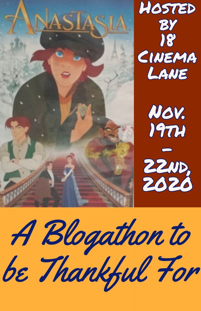
After a temporary break from blogging to work on a creative side project, I have returned to write a blog follower dedication review! 18 Cinema Lane received 265 followers right before my blogathon, A Blogathon to be Thankful For, started. Because I was reading participants’ articles, as well as writing my own editorial, I planned on publishing this review after the event. Shortly after the blogathon ended, 18 Cinema Lane received 270 followers. As the Christmas season is now upon us, I chose to talk about one of Hallmark’s newest seasonal titles. A film I had wanted to see was Hallmark Movies & Mysteries’ The Christmas Bow. What intrigued me was the story’s use of music and the dramatic nature of the plot. Even though Hallmark Movies & Mysteries is known for creating less light-hearted Christmas films than Hallmark Channel, the stories themselves do contain good messages and themes.

Things I liked about the film:
The acting: While I’m not familiar with the acting talents of Lucia Micarelli, I feel she did a great job with the material she was given! Lucia’s best scene was when, during a flashback, her character, Kate, is playing the violin for her grandmother. Throughout this scene, Lucia was able to convey so much emotion with her face alone; trying to hold back tears while staying passionate about the music her character loved. Prior to watching The Christmas Bow, I had seen some of Michael Rady’s performances from his Hallmark projects. A consistent part of Michael’s acting abilities is how he makes his portrayals appear so effortless. Whether his character was interacting with his cousin or having deep conversations with his mother, Michael gave a performance that felt natural. The supporting cast in this film was strong, with some stand-out performers among the cast. One of them was James Saito, who portrayed Kate’s relative, Grandpa Joe! Whenever James’ character came on screen, he brought joy with him. That’s because he had a great on-screen personality and his smile lit up the room!
The interior design: I really liked seeing the interior design inside Kate’s family’s home! It was not only creative, but also photogenic. In Kate’s room, the décor was primarily white with splashes of color. With the addition of Christmas lights, the room appeared brighter. This prevented the space from looking drab or unimpressive. The living room featured light and dark stone along one wall and the fireplace. Light wood cabinets from the nearby kitchen complement the stone work. Within this house, there were interesting design choices when it came to specific elements in certain rooms or areas. The upstairs hallway contains a tall white bookshelf. A dark wood ladder and desk pairs nicely with the shelving unit.
The music: When I first read the synopsis for this movie, I knew that music would play a significant role in the story. However, all of the music in The Christmas Bow was pleasant to listen to! Because Kate is a violinist, classical music has a primary place in this film’s soundtrack. As she performs, the songs themselves are really good. From ‘Carol of the Bells’ to ‘Have Yourself a Merry Little Christmas’, these were familiar tunes that were strengthened by the sound of the violin. I also liked the story angle the film’s creative team took in regards to the influence music has during the Christmas season. When Kate and Patrick’s cousin meet for the first time at a café, Kate teaches him that closing his eyes will help him see the music. Patrick’s cousin tries this technique as Christmas music plays throughout the café. This lesson also shows how music can play a role in people’s lives.

What I didn’t like about the film:
A less dramatic injury: Based on The Christmas Bow’s synopsis, I expected the film’s protagonist to be involved in a car accident that causes her to be so traumatized, she decides to avoid the violin as much as possible. In the movie, Kate ends up hurting her hand due to getting it caught in a door. Hand injuries and broken bones are serious. However, compared to what I expected, it seemed like this part of Kate’s story wasn’t as dramatic as it could have been.
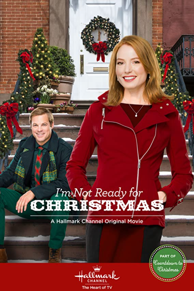
Obligatory Christmas activities: In my review of I’m Not Ready for Christmas, I mentioned how the Christmas activities featured in the film were obligatory for the sake of reminding the audience that they were watching a Christmas movie. The Christmas Bow has a similar flaw, as Patrick’s cousin continually presents a list of Christmas activities he wants to complete before December 25th. While these activities were woven into the overall story better than I’m Not Ready for Christmas, their presentation in The Christmas Bow felt like they had to be there. The activities themselves were those that have been featured in countless Christmas movies before, such as buying a Christmas tree and making gingerbread houses.
A party planning subplot: One of the subplots in The Christmas Bow revolved around Kate’s family planning a Christmas party at their music store. The subplot itself wasn’t bad and preparation for a party can work as a story concept. But an influx of this type of story during last year’s Christmas line-ups made me hope both networks would move away from showing party planning in their movies. Sadly, Hallmark isn’t aware of that detail as they continue to recycle this plot point.

My overall impression:
The Christmas Bow is the first 2020 released Christmas movie from Hallmark I’ve seen. Therefore, I can only compare it to the 2015 film, I’m Not Ready for Christmas. What I will say is The Christmas Bow is far better than I’m Not Ready for Christmas! Sure, there were flaws within the film. But the overall story was engaging with memorable strengths. Music was easily woven into the plot, feeling like it naturally fit in the movie. Character interactions and acting performances helped make the film worth watching. The story itself definitely belonged on Hallmark Movies & Mysteries, as the material was more emotional than projects found on Hallmark Channel. While it’s too early to say if The Christmas Bow will go on to become one of Hallmark’s “classics”, I can state here that I liked the film. Thank you to my followers who have supported 18 Cinema Lane! It truly is an accomplishment I appreciate!
Overall score: 7.8 out of 10
Have you seen any of Hallmark’s 2020 Christmas films? If so, which one has been your favorite? Let me know in the comment section!
Have fun at the movies!
Sally Silverscreen


.jpg)
.jpg)