Take 3: Dr. Terror’s House of Horrors (1965) Review

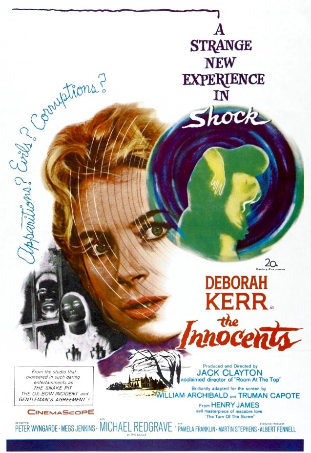
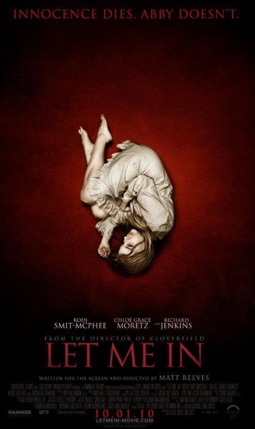
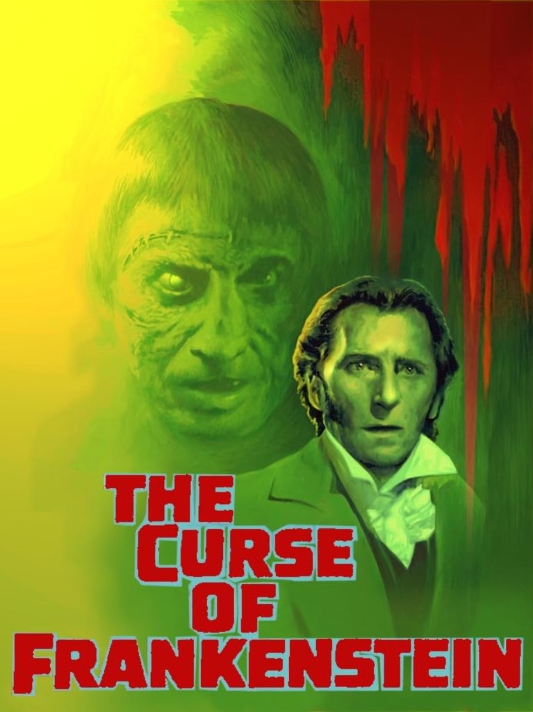
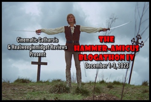
I’d like to thank Gill (from Realweegiemidget Reviews) and Barry (from Cinematic Catharsis). If it wasn’t for the hosts of The Hammer-Amicus Blogathon V, I wouldn’t have been introduced to the cinematic world of Hammer-Amicus. Since my introduction in 2021 (when I participated in my first Hammer-Amicus Blogathon), I’ve covered three Hammer-Amicus movies on 18 Cinema Lane; Vampire Circus, The Curse of Frankenstein, and Let Me In. While Vampire Circus was ok and Let Me In was just fine, I found The Curse of Frankenstein underwhelming. Now, with a recommendation from Barry (from Cinematic Catharsis), I’ve selected 1965’s Dr. Terror’s House of Horrors as the next Hammer-Amicus presentation to review! I knew almost nothing about this movie prior to choosing it for the blogathon. But I was willing to watch the film with an open mind. Since I finally checked out Dr. Terror’s House of Horrors, it’s time to start my review and share my honest opinion!

Dr. Terror’s House of Horrors (1965) poster created by Amicus Productions, Hollywood Classics International, Regal Films International, and Paramount Pictures

Things I liked about the film:

The interior design: Dr. Terror’s House of Horrors is presented like an anthology; five passengers learn their fate from Dr. Terror himself. Throughout the film, the audience takes a peek into each character’s life as well as their living/working space. These spaces featured interesting design choices that gave them their own distinctness. In the segments titled “Werewolf” and “Disembodied Hand”, a fireplace was the focal point in one room. The fireplace in “Werewolf” was covered in a glossy black paint, while the fireplace in “Disembodied Hand” shone in a glossy blue paint. Biff Bailey’s apartment in the segment titled “Voodoo” featured a zebra patterned couch, which actually complimented the black-and-white checkered floor and black-and-white striped walls. The design choices I described stood out due to the film’s creative team utilizing materials, patterns, and colors that were more unique. I can honestly say I’ve never seen a blue fireplace until I saw Dr. Terror’s House of Horrors!

Incorporation of music: In the segment titled “Werewolf”, Jim Dawson learns about a legendary werewolf buried in the basement of the home he’s remodeling. Any time this werewolf is brought up or poses a threat to the characters living and working in the home, drumbeats, the pattering of a xylophone, and other suspenseful musical sounds can be heard. This segment utilized music to emphasis the fear factor the werewolf contributed to the story. Because Biff Bailey is a musician, music plays a large role in the “Voodoo” segment. One of the songs featured in this specific segment is ‘Give Me Love’. Performed by Sammy Coin (portrayed by Kenny Lynch), the instrumentals provided a cheery jazz tune that can put any listener in a good mood. Kenny’s smooth vocals not only complimented the song itself, but also made me wonder what his vocals would sound like in a song with a more serious tone. ‘Give Me Love’ is one of those songs that is so memorable, I’ll listen to it long after the end of the movie!

The creativity of each story: As I mentioned earlier in this review, Dr. Terror’s House of Horrors is presented like an anthology. With the segments chronicling each of the five passengers, the creativity woven into the script highlighted the uniqueness every passenger brought to the train car! The segment, “Disembodied Hand”, revolves around Franklyn Marsh. An art critic who took his job a little too seriously, Franklyn carries guilt for how he mistreated a popular artist, with his guilt represented by the disembodied hand of that artist. Meanwhile, in the segment titled “Vampire”, Dr. Bob Carroll is confronted with the possibility his wife may be a vampire. This concept gave Bob an internal conflict between loving his wife and protecting his patients. In my review of 2010’s Let Me In, I said vampire stories can be as creative as film-makers want it to be. A similar statement can be said about the horror genre, with Dr. Terror’s House of Horrors presenting strong evidence.

The Hammer-Amicus Blogathon V banner created by Gill from Realweegiemidget Reviews and Barry from Cinematic Catharsis

What I didn’t like about the film:

No clear explanation for tarot cards: Throughout Dr. Terror’s House of Horrors, Dr. Terror (portrayed by Peter Cushing), predicts each passenger’s fate by selecting tarot cards. While the tarot cards themselves are shown on screen, no clear explanation for how exactly the cards correlate with the fates was given. Before the start of the “Werewolf” segment, Dr. Terror selects two cards called “Enchantress” and “Priestess”. But after watching that segment, I was confused by what werewolves had to do with those aforementioned cards? It seemed as if the creative team behind the movie assumed their audience would already know the meaning of the cards shown in the film.

Limited sense of urgency: Each segment in Dr. Terror’s House of Horrors incorporates a horror element that poses a threat to the passengers in Dr. Terror’s train car. These segments also contain a limited sense of urgency. Most of the time, the “slice of life” parts of the story were emphasized. When a suspenseful or horrifying moment was about to happen, the segment would end and move on to the next one. This flaw was the result of squeezing five separate stories into an hour and thirty-eight-minute film. I honestly think this script would have worked better as an anthology television series.

A frustrating ending: For this part of my review, I will be spoiling Dr. Terror’s House of Horrors. If you have not seen this film and are planning on watching it, skip ahead to the part of my review titled “My overall impression”.

Like I mentioned earlier in my review, Dr. Terror uses tarot cards to predict the fates of the five passengers. After these fates are revealed, he removes the death card from the deck. This implies all the passengers will eventually die. When the passengers get off the train, they learn through a newspaper article five passengers died in a train crash. That detail clarifies the passengers from Dr. Terror’s train car did, indeed, die, with Dr. Terror himself becoming a skeleton. Personally, I found this ending frustrating because it made the previous stories amount to nothing. While I recognize the movie’s creative team was trying to create the ultimate plot twist, with the death tarot card used as foreshadowing, this creative decision almost made me feel like I wasted my time watching Dr. Terror’s House of Horrors.

Scared audience image created by Katemangostar at freepik.com. <a href=’https://www.freepik.com/free-photo/terrified-friends-watching-horror-movie-in-cinema_1027311.htm’>Designed by Freepik</a>. <a href=”https://www.freepik.com/free-photos-vectors/people”>People image created by Katemangostar – Freepik.com</a>. Image found at freepik.com.

My overall impression:

Whenever I review a movie on 18 Cinema Lane, I present my opinion as honestly as possible. In my most honest opinion, Dr. Terror’s House of Horrors was such a mixed bag. On the one hand, I appreciate the creativity woven into each of the five segments. This creativity brought distinctness to the stories, interesting interior design choices, and good incorporation of music. But, on the other hand, the ending was too frustrating for my liking. I wish the script provided clear explanations for how the tarot cards correlated with each character’s fate. I also wish there was a stronger sense of urgency throughout the film. At best, Dr. Terror’s House of Horrors was just ok. But, at worst, it left me confused and frustrated. Though I’ve only seen (and reviewed) a few Hammer-Amicus films, I’m starting to wonder if I’ll find a title that is my cup of tea?

Overall score: 6 out of 10

Have you seen Dr. Terror’s House of Horrors? Which Hammer-Amicus film would you like to check out? Please tell me in the comment section!

Have fun at the movies!

Sally Silverscreen

Take 3: The Innocents (1961) Review

Film recommendations from my readers are welcomed here at 18 Cinema Lane. These suggestions are then placed on a Pinterest board, which I use as a reference for upcoming reviews. Some movies have been on the board for so long, they’re at the very bottom. One of these titles is 1961’s The Innocents. Recommended by Maddy (from Maddy Loves Her Classic Films), this is a Deborah Kerr starring production that is quite different from the other projects of hers I’ve reviewed on my blog. That’s because The Innocents is classified as a horror film. Because of this distinct, I’ve been trying to find the right opportunity to talk about the movie. Hoofers and Honeys’ 4th Annual Spooky Classic Movie Blogathon became that opportunity! Deborah’s films covered on 18 Cinema Lane have fluctuated in quality. While I liked titles like The Chalk Garden and The King and I, I wasn’t a fan of Marriage on the Rocks. What will my opinion be of The Innocents? Keep reading my review to find out!

The Innocents (1961) poster created by Achilles, Flair Communications, Twentieth Century Fox, and Twentieth Century Fox Film Company

Things I liked about the film:

The acting: A large portion of The Innocents prominently features two young characters: Miles and Flora, as Deborah’s character, Miss Giddens, believes they are in danger. In stories like this, where younger characters play a significant role, it’s important to cast actors and actresses that can, acting wise, carry some of the film. Flora reminded me somewhat of Eloise (from the 2003 adaptations, Eloise at the Plaza and Eloise at Christmastime), marching to the beat of her own drum with a bit of a mischievous spirit. Meanwhile, Miles possessed the precociousness of Cedric from Little Lord Fauntleroy and the sweetness of Tiny Tim from A Christmas Carol. These concepts were displayed well through Pamela Franklin’s and Martin Stephens’ performance! Vocal inflections, facial expressions, and even body language worked in their favor, making Miles and Flora captivating characters. Because of Martin’s and Pamela’s acting talents, their convincing portrayals kept me invested in their characters’ story!

As I mentioned before, Deborah Kerr portrays Miss Giddens, who becomes Flora and Miles’ new governess. Looking back on her films, including The Innocents, I’ve noticed how expressive Deborah’s performances have been. Specifically speaking about the 1961 film, Deborah uses her eyes to display thoughts and feelings instead of just relying on dialogue. In one scene, Miss Giddens learns the truth about Miss Jessel and Peter Quint, the governess and valet who worked at the estate before Miss Giddens’ arrival. While she discovers this information from a housekeeper named Mrs. Grose, Miss Giddens’ eyes show concern, sadness, and even fear. She also raises her eyebrows from time to time, emphasizing how shocking the information about Peter Quint and Miss Jessel is. This example of Deborah’s expressiveness elaborates Miss Giddens adapting to the strange things she’s been seeing and hearing during her time at the estate. Similar to Martin’s and Pamela’s performance, Deborah’s portrayal of Miss Giddens was convincing!

The set design: The Innocents mostly takes place at the Bly estate, which belongs to Flora and Miles’ uncle. Though this story was character-driven, the set design was an underrated yet impressive component of the movie. The fireplace in the main sitting room appeared marble with a carved design. Each room features tall windows, implying the large scope of the rooms themselves. Though shown during brief moments, a detailed tapestry hung on a wall near the main stairway. Elaborate tapestry even covered a long seat in one of the rooms. Details like the ones I described emphasized how financially well-off Miles and Flora’s family is. They also helped make Bly estate visually appealing!

Mise-en-scène: In my recent review of 2010’s Let Me In, I talked about how the movie’s mise-en- scène (the way a film’s scene is presented to the audience) was one of the strengths of the movie. This was also a strength in The Innocents, as some scenes’ presentation added intrigue to the story! One evening, Miles confesses to Miss Giddens how his uncle doesn’t have time for him and his sister. At first, the conversation is shown in a medium shot. The very next shot is a close-up of Miles’ face, with light shining on his cheek to reveal a tear rolling down. Through this visual presentation, the audience is told how his uncle’s lack of acknowledgement deeply troubles Miles. It also provides possible motivation for Miles’ actions later in the film.

The 4th Annual Spooky Classic Movie Blogathon banner created by Kristen from Hoofers and Honeys

What I didn’t like about the film:

Limited horror elements: I mentioned in my review’s introduction how The Innocents is classified as a horror film. Because of this classification, I expected the script to emphasize the horror elements within the story. But these elements, like potential ghost sightings and unexplained noises, had such a limited presence in the film, they were featured in “don’t blink or you’ll miss it” moments. In fact, the script placed more emphasis on the “slice-of-life” parts of the story. As a movie blogger who doesn’t review horror movies often, I found this creative decision disappointing. Some of my interest in The Innocents waned because I don’t really find “slice-of-life” stories compelling.

Scenes that feel like padding: One evening at Bly estate, Miss Giddens stays up in the middle of the night in order to discover the cause of the strange happenings throughout the home. The majority of the scene takes place in the upstairs hallway. But the overall scene lasts over five minutes. Moments when Miss Giddens attempts to open doors and walks through the hall seem repetitive due the how long the scene is. With The Innocents having a run-time of an hour and thirty-nine minutes, some of those five minutes could have been trimmed to make the movie about an hour and thirty-four minutes. This is just one example of scenes feeling like padding.

Conclusion with little to no evidence: For this part of my review, I will spoil The Innocents. If you haven’t seen this movie and are planning on watching it, skip ahead to the part of my review titled “My overall impression”.

After witnessing what she believes is the ghost of Miss Jessel, Miss Giddens comes to the conclusion Flora and Miles are possessed by the spirits of Miss Jessel and Peter Quint. She even comes up with a plan to make the children admit this is true. But up until that point, the film doesn’t show how Miss Giddens reaches her conclusion. Little to no evidence is presented, denying the audience an opportunity to see Miss Giddens putting the pieces together. I, personally, couldn’t take her conclusion too seriously because of the lack of evidence. Miss Giddens’ weaker conclusion also added confusion to the overall story, leaving me wondering what I had just watched.

Image of ghost reading created by Freepik at freepik.com. <a href=”https://www.freepik.com/free-photos-vectors/book”>Book photo created by freepik – http://www.freepik.com</a>. Image found at freepik.com.

My overall impression:

I’m going to be brutally honest, The Innocents is one of the most confusing movies I’ve ever covered on 18 Cinema Lane. When the film ended, I audibly said, “What the heck did I just watch”? Without spoiling The Innocents, all I’ll say is I recognize how the movie’s creative team tried to give their project an ambiguous ending. But when the 1961 picture is also classified as a mystery film, that type of ending doesn’t work due to the genre being known for reaching definitive resolutions. Another flaw that contributes to The Innocents’ confusion is a conclusion with little to no evidence. That lack of evidence prevented me from taking the conclusion too seriously. Despite this confusion, the movie was intriguing enough to keep me invested in the story. The strength of the acting performances and the mise-en-scène are two factors that worked in the film’s favor. Out of Deborah’s films reviewed on 18 Cinema Lane, The Innocents was just ok. While there are things about the movie I liked, the overall execution could have (and should have) been stronger.

Overall score: 6.5 out of 10

Have you seen 1961’s The Innocents? What “classic” horror movies do you like watching? Let me know in the comment section!

Have fun at the movies!

Sally Silverscreen

Take 3: Let Me In (2010) Review

I apologize to my readers for my lack of blog posts these past two weeks. I’ve been working on an editorial I’m publishing on Halloween. Researching, writing, and curating that editorial has taken up a lot of time. But I wasn’t going to miss out on participating in Taking Up Room’s Secret Places and Trippy Houses Blogathon, especially since my selected film is a perfect choice for Halloween! When I learned one of the eligible subjects was “strange neighbors”, I was reminded how I was recommended the 2010 movie, Let Me In. Suggested by John L. Harmon, I had heard it was one of the better vampire films in the world of cinema. Since I had heard of the movie, but never saw it, I couldn’t agree or disagree with that statement. But now that I’ve finally seen Let Me In, I can now give my honest opinion about the film!

Let Me In (2010) poster created by Overture Films, Exclusive Media Group, Hammer Films, EFTI, and Relativity Media

Things I liked about the film:

The mise-en-scène: As I explained in my review of 1955’s The End of the Affair, mise-en- scène is how a film’s scene is presented to the audience. Throughout Let Me In, the way mise-en- scène was utilized presented scenes in visually creative ways. At the very beginning of the movie, a snowy forest was shown during the night. The only source of light comes from two police cars and an ambulance. A long shot slowly becomes a close-up shot, giving the audience a reason to focus on the bright vehicles. Anytime Owen and Abby look through the peephole of their apartment door, the shot is shown in a fish-eye lens. This film-making technique puts the audience in Abby and Owen’s perspective, allowing them to see what the children are seeing. It also emphasizes how, despite their differences, Owen and Abby have shared experiences like seeing who is at their door.

How music was incorporated: Music can be an effective component of film-making. It can elevate a scene’s emotions or set a scene’s tone. In Let Me In’s opening scene I just referenced in this review, a rhythmic drumbeat is one of the first sounds the audience can hear. That specific sound creates a sense of urgency, signifying danger is on the horizon. When Abby moves into Owen’s apartment building, gentle angelic-sounding singing can be heard. This is symbolic of how Owen sees Abby; an angel who will provide a light in his darkness. The two examples from Let Me In I discussed add additional context to the scenes themselves. How the film’s creative team incorporated music into the 2010 picture shows the understanding they had for how music can work in their project’s favor.

Disguising Abby’s vampire identity: Before watching Let Me In, I knew it was a vampire movie. But I was pleasantly surprised by how Abby’s vampire identity was disguised. Most of Abby and Owen’s interactions take place at night, at first seeming like just a coincidence. When Owen notices Abby isn’t wearing shoes, she states how she doesn’t feel cold. Abby even tells Owen she’s stronger than he thinks. These verbal and visual clues creatively signified how Abby was a vampire. But because of the clues’ subtlety, it leaves the audience guessing why, on the surface, Abby seems so strange. New twists on vampire cliches, like vampires avoiding sunlight, made Let Me In more unique from other vampire films.

The Secret Places and Trippy Houses Blogathon banner created by Rebecca from Taking Up Room

What I didn’t like about the film:

The audio: When I reviewed Fist of Fury, I talked about the film’s audio being one of the major flaws. I had to turn up my television’s volume in order to hear what the characters were saying. Let Me In shares this same issue. Once again, I had to raise my television’s volume just to hear the dialogue, as the characters’ speech was quiet. As I suggested in my review of the Hallmark Hall of Fame movie, Face to Face, Let Me In’s creative team should have used ADR (automated dialog replacement).

The bullying subplot: One of the subplots in Let Me In involves Owen dealing with bullies. This subplot gave Owen a conflict to resolve, with the conflict eventually reaching a resolution. But because the script prioritized Abby and Owen’s friendship, the bullying subplot wasn’t consistently focused on. In fact, Owen stands up to his bullies about an hour into this hour and fifty-six minute movie. The inconsistency of the bullying subplot also drew that story out longer than necessary.

Underutilized religious undertones: In a scene taking place at a hospital, President Ronald Reagan is delivering a speech on television. During the speech, he talks about evil being present in the world and how people are joined together by Scripture. Owen’s mother says prayers during mealtime and features religious relics in her apartment. These are some examples of the religious undertones in Let Me In. With the movie set in early 1983, I thought the “Satanic Panic” was going to play a large role in this story, especially with Abby being a vampire. However, the religious undertones present in the script were underutilized, not providing any commentary or interesting perspective. In fact, it felt like this part of the film was there just for the sake of being there.

Happy vampire image created by Freepik at freepik.com. <a href=’https://www.freepik.com/free-vector/several-vampires-ready-for-halloween_1317599.htm’>Designed by Freepik</a>. <a href=”https://www.freepik.com/free-photos-vectors/party”>Party vector created by Freepik</a>. Image found at freepik.com.

My overall impression:

Vampires are no stranger to 18 Cinema Lane. Out of the vampire movies I’ve seen (and reviewed), these projects have shown that this type of story can be as creative as film-makers want it to be. 2010’s Let Me In is an interesting and creative vampire film! Abby’s vampire identity was disguised in very clever ways, even putting new twists on vampire cliches. How mise-en-scène and music were incorporated into the movie showcases the creative team’s more unique approach to a familiar type of story. While Let Me In has its merits, it also has its flaws. Religious undertones that could have provided commentary or an interesting perspective to the script were underutilized instead. Poor audio and an overshadowed subplot also didn’t help. But the 2010 project does stand out from other vampire titles. If you don’t mind a slow-burn story that primarily focuses on the power of friendship, then I’d say give Let Me In a chance.

Overall score: 7 out of 10

Have you seen Let Me In? What kinds of movies do you like to watch around Halloween? Let me know in the comment section!

Have fun at the movies!

Sally Silverscreen

Comparing with the Critics – Worst of 1985 – The Bride

This review is from my series, Comparing with the Critics. If you’d like to learn more about the series, click on the link below.

Introducing my new series, Comparing with the Critics!

The summer of 1985 was a disappointing time for Gene Siskel and Roger Ebert. They were so let down by that particular time of the year, At The Movies dedicated an entire episode to discussing the worst movies of the summer. The Bride, which was released on August 16th, was the first film featured in this episode. It left such a bad impression on Roger and Gene, it also appeared on the ‘Worst of 1985’ episode of the show. In each of these episodes, Roger describes The Bride as “an ambitious film that lost it’s way” and a movie that “shot for the stars and failed miserably”. Because I hadn’t even heard of The Bride before starting my Comparing with the Critics series, I couldn’t agree or disagree with Roger’s sentiments. From the way the movie was described, it seemed to answer the question of what would happen if Victor Frankenstein’s female creation fell in love with him? This is a question that is infrequently asked in Frankenstein related media. As someone who has read Mary Shelley’s source material, I was curious to see how the film’s creative team would answer this question. But now that I have seen The Bride, I’m disappointed by how this question was approached. Unlike Gene and Roger, though, I wouldn’t go so far to say the movie is bad.

The Bride poster created by Colgems Productions Ltd., Delphi III Productions, Lee International Studios, and Columbia Pictures

After showing a clip from The Bride in At The Movies’ Worst Movies of the Summer episode, Roger claims the film “didn’t know whether it wanted to be a serious movie about the philosophical issues raised by the whole Frankenstein legend or whether it just wanted to be a glamourous, sleek remake”. I personally believe the movie’s creative team knew exactly what they were doing, accomplishing two goals in one picture. Throughout The Bride, there are two parallel stories; the first about Frankenstein and his female creation (Eva) and the second about Frankenstein’s male creation (Viktor) and Rinaldo. These stories show Viktor and Eva learning about the world around them as well as interacting with those they depend on. Every time Rinaldo introduces Viktor, he always refers to Viktor as “his friend”. Meanwhile, Frankenstein calls Eva “his ward”. The stories in The Bride were, in my opinion, intended to take a specific approach to the Nature vs. Nurture debate, presenting how two creations created by the same man could journey to the same outcome.

In Mary Shelley’s original source material, there aren’t really any heroes in that story. That’s because it focuses on the main message of some good intentions possibly leading to bad results. In The Bride, Viktor receives a “hero’s journey”, where he not only gets to fall in love, he also gets to save the day. His name, according to Rinaldo, even means “He will win”. As I mentioned in this review’s introduction, I have read Mary Shelley’s novel. From what I remember, Frankenstein destroys his female creation and his male creation is presented in the story as more of a cautionary tale. With that said, I think this creative liberty added an interesting dynamic to The Bride!

Hand-written letter image created by Veraholera at freepik.com. <a href=”https://www.freepik.com/free-photos-vectors/background”>Background vector created by Veraholera – Freepik.com</a>. <a href=’https://www.freepik.com/free-vector/love-letter-pattern_1292902.htm’>Designed by Freepik</a>. Image found at freepik.com.

While talking about The Bride’s two parallel stories, Gene says the story of Viktor and Rinaldo “was much more interesting than Frankenstein and the monster”. I find myself agreeing with Gene, especially since this story included a “hero’s journey” and a conflict that needed to be resolved. But another reason why I liked Rinaldo and Viktor’s story is David Rappaport’s portrayal of Rinaldo. When Rinaldo first meets Viktor, he’s surprisingly not intimidated by Viktor’s size. Instead, Rinaldo’s confidence helps Viktor find a sense of belonging as well as build a friendship between himself and Viktor. Rinaldo’s charisma shows the audience his good intentions, always striving to give Viktor a better life than Frankenstein did. As he’s giving Viktor a new shirt, Rinaldo is horrified by the scars on Viktor’s back. The sight immediately brings concern to Rinaldo’s face, his saddened tone of voice concluding how Viktor must have been mistreated. The scene I just described shows how David’s performance gave Rinaldo a genuineness that allowed him to be a likeable character. Though this film is titled The Bride, Rinaldo became this movie’s MVP!

Back to 1985 Blogathon banner created by Quiggy from The Midnite Drive-In and Hamlette from Hamlette’s Soliloquy

Both Roger and Gene agreed that Viktor and Eva should have spent more screen-time together. Roger proclaims “if we’re gonna have those parallel stories for two hours, let’s have a pay-off at the end”, with Gene adding “a pay-off for half an hour, not for five minutes”. Like I talked about earlier in this review, I believe the creative team’s intention for The Bride was to present a specific approach to the Nature vs. Nurture debate, as well as giving Viktor a “hero’s journey”. However, my biggest criticism with these parallel stories was the editing. The way these stories were sewn together made the movie feel disjointed. This is because some parts of the story were longer than others. One scene shows Eva studying a series of pictures by herself for only a few seconds. The very next scene shows Viktor and Rinaldo on their journey to the circus, with the scene itself lasting several minutes. Frankenstein and Eva receiving shorter screen-time sometimes prevented the audience from seeing interesting interactions between these two characters. This creative decision also gave Eva and Frankenstein’s story less intrigue.

Group of clowns image created by Freepik at freepik.com. Image by Freepik

When I was introduced to The Bride, I was given the impression the film was trying to answer the question of what if Victor Frankenstein’s female creation fell in love with him. This made me curious to see how the movie’s creative team would answer this question. But like I said in my review’s introduction, I’m disappointed by how this question was approached. That’s because the film’s creative team didn’t answer or explore the question at all. They bring up an equally interesting and infrequently asked question of what if Frankenstein fell in love with his female creation? However, so much time was spent focusing on Eva learning about the world around her, the aforementioned question was given little time for exploration or discussion. When it came to Frankenstein’s love for Eva, it simply came across as possessive and controlling. As I’ve been saying throughout this review, Viktor was given a “hero’s journey”. This means the story always intended to have Eva fall in love with Viktor, not Frankenstein. Even though I liked the creative decision of Viktor’s “hero’s journey”, I’m still disappointed by the potential questions that were left unanswered.

Comparing with the Critics banner created by me, Sally Silverscreen. TV show title cards created by WTTW National Productions, WTTW, Public Broadcasting Service (PBS), Lifetime Television, Tribune Entertainment, Buena Vista Television, and Disney-ABC Domestic Television

Toward the beginning of At The Movies’ Worst Movies of the Summer episode, Gene claims the summer of 1985 “happened to be one of the dullest, most juvenile, most homogenized summer movie seasons in recent memory”. Out of the movies that premiered during that time, I’ve only seen six pictures in their entirety, including The Bride. Personally, I didn’t find any of these films to be bad or disappointing. Specifically speaking about The Bride, I thought it was a fine, serviceable, interesting enough title. Though I was disappointed the movie’s creative team didn’t answer the question of what if Victor Frankenstein’s female creation fell in love with him, there were aspects of the film I liked. While the acting was one of the strengths of The Bride, David Rappaport’s portrayal of Rinaldo shined the brightest! Rinaldo was such a likable character, he became my favorite! Another strength of this film was Viktor receiving a “hero’s journey”. Even though it was a creative liberty, it added an interesting dynamic to The Bride’s story. It was also interesting to see the creative team’s approach to the Nature vs. Nurture debate. I apologize for sounding like a broken record, but this is yet another Comparing with the Critics review where I disagreed with Roger and Gene. As I continue with my series, I have to wonder how often this will keep happening?

This review was brought to you by

Sally Silverscreen

Take 3: The Phantom of the Opera (1925) Review (Silent Pioneers Double Feature Part 2)

In my review of 1920’s The Garage, I admitted silent films are rarely covered on 18 Cinema Lane. Acknowledging the one hundredth anniversary of a movie is even rarer. This is a reason why I selected 1925’s The Phantom of the Opera for the Silent Pioneers Blogathon! But reviewing this film also presents a full circle moment for me. Before 2025, I had seen pieces of The Phantom of the Opera from 1925. That’s because those pieces are featured at the beginning of Phantom of the Megaplex (which happens to be celebrating its 25th anniversary this year). As a fan of that movie, I felt I owed it to myself to finally check out the film that paved the way for countless cinematic projects. Though this is my first time seeing 1925’s The Phantom of the Opera in its entirety, I am familiar with its story. This is due to seeing parts of 2004’s adaptation of The Phantom of the Opera. So, without further delay, let’s start this review!

The Phantom of the Opera (1925) poster created by Universal Pictures

Things I liked about the film:

Color coded film: Silent films have a reputation for appearing in black and white. But in The Phantom of the Opera, only the Phantom’s lair is presented in this hue. This is because the Paris Opera House is color coded based on where a scene takes place. Outdoor scenes appear in blue. Scenes taking place backstage, and even a ballet performance, are presented in pink. The only scenes fully in color are those during the Bal Masque de l’Opera. Color coding the movie’s scenery gives each part of the story its own distinct significance. It definitely gives The Phantom of the Opera a unique identity!

The acting: When you think of 1925’s The Phantom of the Opera, you think of Lon Chaney. Though he spent the movie with his face covered by make-up or a mask, Lon utilized the use of his eyes and body language to give the Phantom emotion. During the Bal Masque de l’Opera, the Phantom discovers someone betrayed his trust. His eyes not only appear very wide, they even look pained. The Phantom falls back in his seat, emphasizing how shocked he is by the betrayal. Even though Lon stole the show, there are other performances I liked in The Phantom of the Opera! Mary Philbin portrays Christine Daae. Through a variety of acting techniques, Mary shows the audience what her character is thinking and feeling. A perfect example is when Christine meets the Phantom for the first time. Shocked by his appearance, she leans back against the wall, trying to move as far from him as possible. Christine’s eyes are wide and her jaw drops in horror, illustrating how unsettled she is by the Phantom.

The on-screen chemistry: As I just said in this review, Mary Philbin portrays Christine Daae. Throughout The Phantom of the Opera, Christine shares romantic feelings with Raoul, portrayed by Norman Kerry. When these characters shared moments together, their interactions were romantically tender. The love between Christine and Raoul feels like it radiates off the screen. Mary and Norman’s on-screen chemistry was very sweet, making their characters’ scenes together feel genuine. Their performances, as well as the screenwriting, made Raoul and Christine’s relationship one of the best parts of The Phantom of the Opera! I wish Mary and Norman shared more scenes together.

The Silent Pioneers Blogathon banner created by Maddy from Classic Film And TV Corner

What I didn’t like about the film:

Underutilized characters: There were a few underutilized characters in The Phantom of the Opera. Two of them are the new owners of the Opera House. At the beginning of the movie, the ownership of the Opera House changed hands. Not only are the new owners informed of the Phantom’s existence, they are presented with evidence he actually exists. Yet, these owners don’t do anything to remove the Phantom from the Opera House or protect their business from the Phantom. A major reason for this is how the characters were underutilized, making limited appearances throughout the story.

Little sense of urgency: Like I said in my review, the new owners of the Opera House don’t do anything to remove the Phantom from the Opera House or protect their business from the Phantom. Any time the Phantom makes threats to ruin the show or even when Christine disappeared, there was little sense of urgency to prevent the Phantom’s chaotic plans. The day after Christine went missing, there was a newspaper article written about her disappearance. But no search party was organized to look for her. Even Raoul’s suspicions don’t appear raised when he receives a mysterious note from Christine. When Christine returns at the Bal Masque de l’Opera, no one notices except for Raoul. With all this said, the Phantom doesn’t seem as big of a concern to the Opera House’s community as he should be.

Unanswered questions: For this part of my review, I will spoil The Phantom of the Opera. If you haven’t seen this film and are planning on watching it, skip ahead to the part of my review titled ‘My overall impression’.

The 1925 version of The Phantom of the Opera attempts to give the Phantom a backstory. But this attempt leaves the audience with more questions than answers. On a notecard addressing the Phantom’s history, it states he is a “master of Black Art”. This statement is never given an explanation, especially since the Phantom isn’t shown adopting magic or supernatural powers. The notecard also states the Phantom was “exiled to Devil’s Island for criminal insane” and that he “escaped”. No explanation is provided why he was taken to the island in the first place. Did the Phantom actually commit a crime or was he falsely accused, with taking over the Opera House and causing chaos his form of revenge? These are two examples of unanswered questions in The Phantom of the Opera.

String of musical notes image created by Freepik at freepik.com. <a href=’https://www.freepik.com/free-vector/pentagram-vector_710290.htm’>Designed by Freepik</a> <a href=”https://www.freepik.com/free-photos-vectors/background”>Background vector created by Freepik</a>. Image found at freepik.com. 

My overall impression:

1925’s The Phantom of the Opera is considered a classic, not just from the Silent Film Era, but within film history. So, imagine my shock when I discovered the movie was never included on any of American Film Institute’s 100 movies lists. When this film was first released, it brought something new to cinema’s table. The Phantom of the Opera paved the way when it came to the power of make-up. The 1925 picture also showed the world the expansive nature of storytelling through a cinematic lens. This is why, in my opinion, the story of the Phantom and his opera house is better suited for film than the stage. Lon Chaney is one of the most celebrated actors of all time. His role as the titular character proves why that statement holds true. Lon’s ability to transform into the Phantom makes his performance captivating. Beyond the make-up, he effectively uses his eyes and body language to bring emotion to his character. Though the film has its flaws, The Phantom of the Opera still holds up, even a hundred years later. Color coding for each area of the Opera House gave the production a unique identity, as well as distinct significance to these spaces. In a world where silent films are not as common as they once were, I’m thankful for the restoration efforts made for The Phantom of the Opera.

Overall score: 7.5-7.6 out of 10

Have you seen 1925’s The Phantom of the Opera? Which story do you wish had been adapted into a silent film? Let me know in the comment section below!

Have fun at the opera!

Sally Silverscreen

The Top 10 Worst Movies I Saw in 2023

I’m going to be honest with my readers; in 2023, I saw more movies I disliked than liked. Luckily, I saw enough films to create a top ten best movies of the year list! When it comes to the movies I disliked, the majority of these titles were disappointing or average. This is different to my list of the worst movies of 2022. What’s also different about this year’s list is how my top three worst films are not all Hallmark projects. Like I have said in past lists, my top ten worst movies I saw in 2023 list is not intended to be mean-spirited, negative, or disrespectful. It’s just a list of my own, honest opinion. Since I reviewed some of the movies on my list, I will provide the links to those reviews in this article.

Dishonorable Mentions

Family History Mysteries: Buried Past, Sea Change, Murder 101: College Can Be Murder, Murder 101: The Locked Room Mystery, She Inherited Danger, My Diary of Lies, Double Nickels, A Zest for Death: A Hannah Swensen Mystery, Blackbeard, the Pirate, Christmas at Castle Hart, Shadow Island Mysteries: Wedding for One, and A Hidden Life (I turned this movie off after 42 minutes)

Image by starline on Freepik

10. The Curse of Frankenstein

After I watched and reviewed Frankenweenie, I was hoping the creative team of The Curse of Frankenstein would follow Mary Shelley’s source material closer than the Disney animated film did. Instead of doing that, they relied more on creative liberties. As I said in my review of The Curse of Frankenstein, I found this distracting, especially since I read the book prior to watching the film. Some of these creative liberties were adopted just for the sake of it. One of them was presenting Victor Frankenstein’s creature as a bumbling, destructive machine. This creative decision was a disservice not only to Mary Shelley’s work, but also to Christopher Lee, the actor who portrayed Frankenstein’s creature.

Take 3: The Curse of Frankenstein Review

9. The Last Child

I selected The Last Child for the Futurethon blogathon because of the film’s creative presentation; a futuristic story surrounded in a “contemporary” aesthetic. Unfortunately, the creativity of the 1971 made-for-TV movie didn’t reach beyond the surface. Despite the concern of population control within the story, there was little sense of urgency. That caused the movie to have too many low-stakes. It also didn’t help how the future in The Last Child wasn’t explained. This is another television film from the ‘70s that failed to impress.

Take 3: The Last Child Review

8. A Walk in the Spring Rain

Out of all the movies I saw and reviewed this year, A Walk in the Spring Rain is the most flavorless film. Even though this is a movie where the audience waits for the inevitable to happen, the meandering nature of the script forces viewers to focus on drawn-out subplots, such as the protagonists’ daughter, Ellen, thinking about law school. What adds to the film’s meandering nature are stretched out scenes, making A Walk in the Spring Rain feel longer than necessary. Like I said in my review of the 1970 production, every beloved film star has at least one project on their IMDB filmography that is lesser known. For Ingrid Bergman, A Walk in the Spring Rain is one of her more forgettable films.

Take 3: A Walk in the Spring Rain Review

7. Carrot Cake Murder: A Hannah Swensen Mystery

In 2023, Hallmark Movies & Mysteries released two new chapters in the Murder She Baked/Hannah Swensen series: Carrot Cake Murder: A Hannah Swensen Mystery and A Zest for Death: A Hannah Swensen Mystery. While I found both entries disappointing, Carrot Cake Murder: A Hannah Swensen Mystery was the most disappointing movie out of the two. Other than solving a mystery, this story didn’t progress the series forward. Something happens in Mike and Hannah’s relationship that is resolved in A Zest for Death: A Hannah Swensen Mystery. This made Carrot Cake Murder: A Hannah Swensen Mystery an even more pointless chapter in the series. If you’ve never watched the Murder She Baked/Hannah Swensen series, skip this film, as you wouldn’t be missing much.

Take 3: Carrot Cake Murder: A Hannah Swensen Mystery Review

6. Silent Night, Fatal Night

Silent Night, Fatal Night is a Lifetime movie that is basically a gender-swapped, Christmas version of Misery, with a bit of a twist. Unlike the 1990 film, almost every character in Silent Night, Fatal Night makes one dumb decision after another. While the antagonist in the Lifetime film was unsettling, he was more annoying. Plus, I found it difficult to believe the protagonist, a mystery author, wouldn’t have more intuition to save herself. This isn’t the first time Lifetime has told a story similar to Misery. However, I wish the network would create stories that are less reminiscent of other, better movies from the 1990s.

Carrot Cake Murder: A Hannah Swensen Mystery poster created by Lighthouse Pictures, Looking Glass Productions, and Hallmark Movies & Mysteries

5. Jesse James Meets Frankenstein’s Daughter

Chosen for the Fifth So Bad It’s Good Blogathon, Jesse James Meets Frankenstein’s Daughter was built on a gimmick. Instead of embracing the silliness of that gimmick, the movie’s creative team took their project a little too seriously. Their project was misleading as well, no friendship or romance forming between Jesse and Frankenstein’s granddaughter. Though Jesse James Meets Frankenstein’s Daughter is classified under the western and horror genre, the western genre is emphasized more, preventing a balance between the two genres. The 1966 film is not my “so bad it’s good” movie. Since I did giggle a few times while watching it, I took a step in the right direction to find my “so bad it’s good” film!

Take 3: Jesse James Meets Frankenstein’s Daughter Review

4. Jesse Stone: Night Passage

For me, 2023 was not the year for mysteries, as the top four worst movies on my list are mystery films. The main issue with Jesse Stone: Night Passage is how none of the detectives do any detective work. What they do instead is pull assumptions out of their pockets, with those assumptions being conveniently correct. Subplots were prioritized over the mystery itself. This creative decision caused the story to lack any sense of urgency. It was nice to see familiar faces like Saul Rubinek (who portrayed Artie on Warehouse 13) and Liisa Repo-Martell (who portrayed Maida Flynn on Emily of New Moon). Sadly, there wasn’t much the cast could do to save Jesse Stone: Night Passage.

3. Mount Hideaway Mysteries: Heartache and Homecoming

This movie is so bad, it was, at times, unintentionally funny. Parts of the script reminded me of The Cookie Mobster, with the screenwriters not displaying an understanding for how some things worked. One such example is how Game Boy Color video game consoles were incorporated into the story. The film was riddled with other flaws, such as the color of a character’s earrings changing from scene to scene. Another, more consistent, flaw was telling instead of showing, like other characters mentioning how good looking the male protagonist is every time he appears in a scene. Also, just because the protagonist is a veterinarian does not mean she has to hold an animal every time a scene takes place at the veterinary clinic.

2. The Abigail Mysteries

I have never reviewed or talked about a movie from Great American Family on 18 Cinema Lane. So, it’s a shame that when I do talk about one of their movies, it’s because the project is bad. It is possible to create a good mystery story with elements of faith. But because The Abigail Mysteries heavily prioritized the elements of faith, the mystery was overshadowed, causing the overall story to lack a sense of urgency. From no on-screen chemistry to inconsistent audio quality, The Abigail Mysteries was filled with flaws. There were even times when actors would deliver their lines too quickly, making it difficult to understand what they were saying. I know this is the network’s first attempt at making a mystery movie. But if Great American Family is serious about creating more mystery projects, their efforts need to be better than The Abigail Mysteries.

1. Mystery Island

This is the second year in a row where a newly released Hallmark Movies & Mysteries movie is the worst film I saw. With Hallmark no longer prioritizing the mystery genre, I can’t say I’m that surprised. The poor writing is the biggest problem of Mystery Island. The mystery’s reveal is so ridiculously written, it makes the entire story feel pointless. Emilia Priestly, the film’s protagonist, has a legitimate reason to get involved in the movie’s mystery, as she is a psychiatrist for Scotland Yard. Instead of using her skills to solve the case, Emilia a) flips through books, b) eavesdrops on other characters’ conversations, and c) follows people into the jungle and runs out of that same jungle in wedge sandals. I’d like to think Hallmark will find the motivation to create better mystery productions. But as of late 2023/early 2024, I’m not getting my hopes up.

Jesse James Meets Frankenstein’s Daughter poster created by Circle Productions, Embassy Pictures, and Embassy Home Entertainment

Have fun in 2024.

Sally Silverscreen

Take 3: The Curse of Frankenstein Review

When I was first introduced to the world of Hammer-Amicus films, it was through the Third Hammer-Amicus Blogathon, hosted by Gill and Barry, from Realweegiemidget Reviews and Cinematic Catharsis. For that event, I reviewed the 1972 movie, Vampire Circus, which I thought was just ok. With the return of the aforementioned blogathon, I’ve decided to choose a Hammer-Amicus production that was recommended to me. Back when I wrote about Vampire Circus, Barry, from Cinematic Catharsis, suggested I check out several films, with 1957’s The Curse of Frankenstein being one of them. In my review of Frankenweenie, I mentioned how I haven’t seen many adaptations of Mary Shelley’s Frankenstein. To make up for lost time, I selected The Curse of Frankenstein for the blogging event!

The Curse of Frankenstein poster created by Hammer Films and Warner Bros.

Things I liked about the film:

The use of WarnerColor: When discussing “classic” cinema, there has been a debate over whether a film should remain with black-and-white imagery or if it should receive the Technicolor treatment. In my opinion, I’m glad The Curse of Frankenstein was released in WarnerColor, which I believe was the studio’s version of Technicolor. This creative decision allowed certain elements within scenes to appear vibrant! In Victor’s laboratory, various jars and bottles were scattered throughout the room. Liquid filled these bottles and jars, boasting bright colors like red, blue, even purple. These hues provided a nice contrast to the gray walls of the laboratory. The incorporation of color worked in the favor of the film’s wardrobe department! While working on his experiment, Victor wore a beige three-piece suit. He also wore a maroon neck scarf, which gave his outfit a pop of color. Another character who wore a mostly beige outfit is Elizabeth, whose gown was covered in a silky beige material. Her dress featured a light blue bow and sash, providing the gown with a nice color combination!

Historical accuracy: Mary Shelley’s Frankenstein was published in 1818. Reflecting on The Curse of Frankenstein, it seems like the movie’s creative team kept this fact in mind as the project looked and felt historically accurate! Remember when I mentioned Victor wore a three-piece suit with a maroon neck tie? His friend, Paul, also wore a three-piece suit. Victor even wore a pocket watch, an accessory that he occasionally used. The attire of both Paul and Victor highlighted how men dressed in the 1800s. Home décor is also reflective of when a story takes place. In the upstairs hallway and in the sitting room of Victor’s house, the walls were covered in intricate wallpaper. The wallpaper, which featured elegant patterns, showcases the artistic details that homeowners in the 1800s favored.

The acting: From what I remember of Mary Shelley’s story, Elizabeth’s presence was very limited. Her appearances in the book were so small, readers only became familiar with her. In The Curse of Frankenstein, Elizabeth was given more appearances in the story. This allowed Hazel Court, the actress who portrayed Elizabeth, to present her character as a friendly woman with a likable personality! One scene I liked was when Elizabeth is having a debate with Victor and Professor Bernstein. Professor Bernstein warns Victor about being consumed by science, also reminding Victor of how he should use science for good. Elizabeth adds to the debate by stating it would be better for Victor to go outside and get some fresh air. The way she suggests this to Victor is of kind encourage. A pleasant smile is shown on her face and she is comfortably sitting in an armchair.

In order to bring his experiment to life, Victor recruits the help of his friend, Paul. Because of how often Paul interacts with Victor, Peter Cushing and Robert Urquhart share several scenes together. What Robert’s and Peter’s performance have in common is how effective they utilized emotion! As Victor is conducting his first experiment, bringing a puppy to life, Victor’s face is filled with curiosity. Realizing his experiment was a success, his face slowly transforms into happiness. Victor is so happy, even his eyebrows move. Anytime Paul is upset over Victor’s obsession with his experiment, Robert consistently presents his face with a stern look. His voice also sounds stern, with a hint of anger detected. Based on their performance in The Curse of Frankenstein, I was impressed by Peter and Robert’s acting talents!

The Hammer-Amicus Blogathon IV banner created by Gill from Realweegiemidget Reviews and Barry from Cinematic Catharsis

What I didn’t like about the film:

A prolonged appearance of Frankenstein’s creature: Within Mary Shelley’s novel, a key character is Frankenstein’s creature himself. Through interactions between the creature and Victor Frankenstein, readers are reminded of how some good intentions can lead to bad results, a message that overarches Mary’s story. In The Curse of Frankenstein, however, so much time is spent showing Victor creating the creature to the point where the creature doesn’t become alive until almost fifty minutes into this hour and twenty-three-minute movie. Even when the creature, portrayed by Christopher Lee, appears in the film, he is only on screen for a handful of scenes. He also doesn’t have many interactions with Victor.

Changed context: After watching Oliver! from 1968, I read Charles Dickens’ novel. Comparing the book to the film, I discovered how the creative liberties made to the adaptation changed the context of certain parts of the story. Since I have read Mary Shelley’s novel before seeing The Curse of Frankenstein, I took notice of how the 1957 movie changed the context of certain narrative parts. A great example is Victor’s motivation for creating the creature. Mary Shelley’s book explains how the inspiration for Victor’s experiment came to him at college. Victor was curious about whether he could, from a scientific perspective, create a human being out of nothing. The adaptation shows Victor being encouraged by his tutor to bring people back from the dead, after Victor and his tutor bring a puppy back to life. Looking back on The Curse of Frankenstein, it seems like some of these creative liberties were made just for the sake of it.

Some inconsistent parts of the story: There were some parts of The Curse of Frankenstein that were inconsistent. One example is Victor’s quest to create the creature. When his tutor encourages him to bring people back to life, Victor declares he will set out to create “the perfect man”, using the “hands of an artist” and the “brain of a genius”. Several scenes later, when Victor shows his friend, Paul, his progress, Paul is disgusted by what he sees. Victor states how the looks don’t matter, but how he brought the creature to life at all. But when Paul criticizes Victor for the creature’s lack of intelligence, Victor blames Paul for destroying the creature’s brain. If Victor’s goal was to bring the creature to life at all, why would he be so upset over the creature’s brain? Victor’s motivation for creating the creature should have been consistent like it was in the book.

Scared audience image created by Katemangostar at freepik.com. <a href=’https://www.freepik.com/free-photo/terrified-friends-watching-horror-movie-in-cinema_1027311.htm’>Designed by Freepik</a>. <a href=”https://www.freepik.com/free-photos-vectors/people”>People image created by Katemangostar – Freepik.com</a>. Image found at freepik.com.

My overall impression:

When a book or pre-existing story is being adapted into a form of visual media, there are bound to be creative liberties included in the final product. Sometimes, these creative liberties can improve upon the source material, making the piece of visual media more entertaining. But there are times when creative liberties are incorporated just for the sake of it. When I chose to review The Curse of Frankenstein, I was hoping the creative team behind the 1957 film would display a stronger understanding for Mary Shelley’s story, especially after seeing Frankenweenie. Instead, the film’s creative team relied so much on creative liberties, I found it distracting. What also didn’t help was prolonging the appearance of Frankenstein’s creature. Based on the movie’s appearance, it looks like the creative team cared about how their project was presented. I not only liked the acting performances, I also appreciate the project’s historical accuracy and the use of WarnerColor. But, unfortunately, The Curse of Frankenstein is another movie that emphasizes style over substance.

Overall score: 5.1 out of 10

Have you seen The Curse of Frankenstein? Would you like to see me review more films from Peter Cushing’s or Christopher Lee’s filmography? Please tell me in the comment section!

Have fun at the movies!

Sally Silverscreen

Take 3: The Raven (1963) Review

April Fool’s Day; a time for jokes, pranks, and laughter. On such a day, a comedic film would be most appropriate. Therefore, it’s time to introduce my selection for The ‘Favorite Stars in B movies’ Blogathon: 1963’s The Raven! Recommended by the late Patricia from Caftan Woman, I discovered this particular title was considered a “B movie” while searching for the perfect movie to write about. It just so happens to star an actor that is no stranger to 18 Cinema Lane; Vincent Price! The Raven is the tenth film of Vincent’s I have seen and reviewed. Most of his projects I have enjoyed to various degrees. But how will the 1963 title turn out? Don’t fly away from this review, as the review is about to begin!

The Raven (1963) poster created by Alta Vista Productions and American International Pictures

Things I liked about the film:

Interactions between characters: When creating a movie, it’s important to cast actors and actresses who not only perform well individually, but also within a group. If the quality among the cast is strong, the interactions between their characters will appear realistic to the audience. This is the impression I received as I watched The Raven. Scenes shared by Vincent Price and Peter Lorre serve as one great example. In one scene, Vincent’s character, Dr. Erasmus Craven, has attempted to reverse the spell placed on Dr. Adolphus Bedlo, Peter Lorre’s character. Unfortunately, Craven’s attempt doesn’t go according to plan. Bedlo is distraught at having wings for arms. His face bears a frown, eyes filled with a sad look. With disdain and concern is his voice, Bedlo is afraid the spell’s effects will be permanent. Meanwhile, Craven bears a look of concern on his face. But with a worried look in his eyes, Craven appears to care about the well-being of his friend. Through interactions like the one I described, Craven and Bedlo’s friendship felt believable. That was made possible with a combination of screen-writing and the performances of Vincent and Peter!

The humor: I knew The Raven was classified as a “horror-comedy” before I watched it. However, I was surprised by how the comedy was incorporated into the story! The humor in The Raven was mostly found within the dialogue. But the movie’s climax is where the humor really shines! In this scene, Craven and Dr. Scarabus, portrayed by Boris Karloff, participate in a magical duel. When it was Craven’s turn to use his magic, his responses to Scarabus became sillier as the duel continued. I won’t spoil this part of the story, for readers who haven’t seen this movie yet. All I will say is the humor was so well executed, I burst out laughing on numerous occasions.

Following the characters’ journey: The Raven is about Craven and his friend, Bedlo, traveling to Scarabus’ castle to reclaim Bedlo’s magic and save the spirit of Craven’s late wife, Lenore. As the story unfolds, the audience witnesses the steps Bedlo and Craven take in order to make the trip a reality. Seeing this step-by-step process allows viewers to feel like they are traveling alongside the characters. That creative decision adds interactivity to the story!

The ‘Favorite Stars in B movies’ Blogathon banner created by Brian from The Films from Beyond the Time Barrier

What I didn’t like about the film:

Inconsistent parts of the story: Within the The Raven, there were times when parts of the story were inconsistent. In one example, Craven and Bedlo need hair from a dead man. So, they take some hair from Craven’s deceased father. In order to open the casket of Craven’s father, Craven uses a knife to pry open the casket’s lid. A few scenes later, when Bedlo and Craven want to open Lenore’s casket, they are easily able to lift the lid. While these inconsistencies were not a common flaw, I believe this issue could have been avoided.

A drawn-out first half: As I already mentioned in this review, I liked how the characters’ journey allowed the audience to feel like they were traveling alongside the characters. But because of the movie’s hour and twenty-six-minute run-time, this journey was drawn out. Within the story’s first half, the sense of urgency was limited. There was also a small conflict that prolonged the journey. With those flaws addressed, it makes me wonder if this story would have worked better as a short film?

A random plot twist: For this part of my review, I will spoil a plot twist in The Raven. If you are interested in watching this movie, but have not seen it yet, please skip ahead to the section titled ‘My overall impression’.

While spending the night at Scarabus’ castle, Bedlo helps Scarabus trap Craven, his daughter, Estelle, and Bedlo’s son, Rexford. After Scarabus and Bedlo succeed, Bedlo confesses he tricked Craven into coming to Scarabus’ castle, in order to gain more magic from Scarabus. While this plot twist was unexpected, it felt random. There was no indication Bedlo would be that under-handed. Plus, this plot twist came right after another plot twist had been revealed. In my opinion, the plot twist involving Bedlo felt like it was included in the story just for the sake of it.

Image of crow at sunset created by Rayudu NVS at freeimages.com. Photo by <a href=”/photographer/rayudu238-57835″>rayudu NVS</a> from <a href=”https://freeimages.com/”>FreeImages</a&gt;. Image found at freeimages.com.

My overall impression:

As of early April, 2023, I have seen two Corman productions based on the works of Edgar Allan Poe; The Pit and the Pendulum and The Raven. A sense of wonder exudes from these two movies. What I mean by this is, I am amazed by how these creative teams were able to take simple stories and turn them into feature films! While I liked The Raven, I still prefer The Pit and the Pendulum. This is because of the movie’s flaws, such as the drawn-out first half and the random plot twist. However, there were strengths in The Raven, like the interactions between characters and the humor. I’m aware of Vincent Price’s other movies based on Edgar’s work. I’ll have to check those out another day!

Overall score: 7.3 out of 10

Have you seen or read The Raven? Are there any adaptations of Edgar Allan Poe’s work you’d like me to review? Let me know in the comment section below!

Have fun on April Fool’s Day!

Sally Silverscreen

Take 3: The White Buffalo Review

Though it’s only February, it seems like 2023 has become the year where movies that sound “bonkers” end up getting reviewed on 18 Cinema Lane. First, it was the Lifetime movie, Sea Change. Most recently, it was Jesse James Meets Frankenstein’s Daughter. Now, for Classic Movie Muse’s Kim Novak Blogathon, it’s The White Buffalo. If it wasn’t for this event, I would have never heard of this film, as I happened to stumble upon it on Kim’s IMDB filmography. Based on the title, synopsis, and poster, The White Buffalo seemed like it would be “bonkers”. But as Sea Change and Jesse James Meets Frankenstein’s Daughter have taught me, just because a movie sounds “bonkers”, doesn’t mean it will be “bonkers”. So, I was curious to see if The White Buffalo met my expectations. I’ve also mentioned in the past how westerns aren’t often reviewed on 18 Cinema Lane. So writing about The White Buffalo for the Kim Novak Blogathon has given me an excuse to check out more western films!

The White Buffalo poster created by Dino De Laurentiis Company and United Artists

Things I liked about the film:

Kim Novak and Charles Bronson’s on-screen chemistry: In The White Buffalo, Kim portrays Poker Jenny, a widow from the town of Cheyenne. When Bill, portrayed by Charles Bronson, arrives in town, he pays Jenny a visit. Though these characters spent only a brief period of time together, I felt Kim and Charles had strong on-screen chemistry! There was camaraderie between Jenny and Bill, a shared history only they knew. Confident personalities complimented one another, highlighting how well they get along. Because of their strong acting performances, both Kim and Charles successfully sold this relationship! I wish their characters shared more screen time together.

Using the buffalo sparingly: The White Buffalo has gained legend status in the world within this movie. This is because of the terror it inflicts on people who have crossed its path. The buffalo itself is only shown in a handful of scenes, while the majority of the film shows the characters either talking about the buffalo or searching for its existence. That creative decision was a good way of building tension and suspense for the audience. Limited presentation of the buffalo highlights how this creature is a threat who can show up unexpectedly. It is also a film-making technique from the horror genre, where the unseen can be scarier than what is seen. This reminds me of films such as Jaws.

Building atmosphere: In any film, the atmosphere can compliment the world the characters and story exist in. It can also elevate the movie’s intended tone. In the opening scene of The White Buffalo, a snowy landscape is presented at night-time. Slow camera movements travel over the landscape, building up to the audience’s first look of the White Buffalo. Suspenseful music is heard on top of the footage, providing a reason for the viewer to be scared of the titular creature. When the buffalo finally appears on screen, it’s an explosive moment where adrenaline and terror collide. The opening scene of this movie lays down the foundation for what this story is about!

The Kim Novak Blogathon: A 90th Birthday Celebration banner created by Ari from The Classic Movie Muse

What I didn’t like about the film:

Limited sense of urgency: Throughout the film, Bill and Crazy Horse, portrayed by Will Sampson, are seeking the White Buffalo in order to destroy it. This quest serves as the main conflict in The White Buffalo. While there was a sense of urgency in the story, it wasn’t consistently featured in the movie. Along with the film’s main conflict, sub-conflicts share the run-time, such as Bill’s encounter with a criminal from his past. Because of this creative decision, those sub-conflicts took away from the urgency toward finding the White Buffalo.

The under-utilization of Kim Novak: In past blogathons, I have reviewed a movie because of a certain actor’s involvement, only to see that actor’s talents under-utilized. This was the case when watching The White Buffalo, as Kim Novak is one of the reasons why I sought out this film. As I mentioned earlier in this review, Jenny and Bill spent only a brief period of time together. During this hour and thirty seven minute movie, Kim appeared in about three to four scenes. She did a good job with the acting material she was given. However, I was disappointed by her limited on-screen appearances.

The run-time: When talking about Kim’s few appearances in The White Buffalo, I said the movie was an hour and thirty seven minutes. With the story itself being straight-forward, the run-time doesn’t need to be very long. This could have been achieved had the sub-conflicts been eliminated from the script. The run-time could have also been shortened if some scenes were cut down. One example is when Bill meets Charlie for the first time, a scene that lasts about fifteen minutes.

Snowy mountain image created by Freepik at freepik.com. <a href=’https://www.freepik.com/free-vector/landscape-background-of-snow-track-and-mountains_968656.htm’>Designed by Freepik</a>. <a href=”https://www.freepik.com/free-photos-vectors/background”>Background vector created by Freepik</a>. Image found at freepik.com.

My overall impression:

In the introduction of this review, I said just because a movie sounds “bonkers”, doesn’t mean it will be “bonkers”. That is what happened when I saw The White Buffalo. At best, the movie is ok. The atmosphere was well-built and the acting was strong. The film even does a better job at combining the western and horror genres than Jesse James Meets Frankenstein’s Daughter! But the film isn’t without its flaws. The story contains a limited sense of urgency and the movie is a bit drawn out. I was also disappointed by the under-utilization of Kim’s talents. However, watching The White Buffalo did give me an opportunity to seek out more projects from Will Sampson’s filmography, as I am familiar with his performance in One Flew Over the Cuckoo’s Nest. Like I said in this review’s introduction, I was also given an excuse to watch more western movies. Therefore, I’m grateful I was able to expand my cinematic horizons!

Overall score: 6-6.1 out of 10

Have you seen The White Buffalo? Are there any westerns you’ve checked out that also feature the horror genre? Please tell me in the comment section!

Have fun at the movies!

Sally Silverscreen

Take 3: Jesse James Meets Frankenstein’s Daughter Review

My quest to find my “so bad it’s good” movie has, at this point, turned into a saga. During my time participating in the So Bad It’s Good Blogathon from Taking Up Room, I have selected a film I thought would earn the coveted title, only to have that film fall short of my expectations. But I haven’t given up, as I still believe my “so bad it’s good” film is out there somewhere. When I reviewed Sea Change, I said the movie sounded so “bonkers”, I had to check it out for myself. I had a similar experience when I discovered the 1966 film, Jesse James Meets Frankenstein’s Daughter. Based on that title alone, the movie sounded “bonkers”, a well-known criminal from the “wild, wild west” crossing paths with someone from the story of Frankenstein. I hadn’t seen a film where the western and horror genres combined, so I was curious to see how this story would turn out. I was also curious to see if Jesse James Meets Frankenstein’s Daughter would finally be my “so bad it’s good” movie.

Jesse James Meets Frankenstein’s Daughter poster created by Circle Productions, Embassy Pictures, and Embassy Home Entertainment

Things I liked about the film:

Maria’s house: Within this movie’s dialogue, Maria explains how her house formerly belonged to a missionary. Though the space is more reflective of Maria’s taste in design, I was impressed with the set! Despite only three rooms being shown on screen, my favorite room was the sitting room! The walls and massive fireplace were covered in a light-colored sandstone. A large medallion with carved images sits over the fireplace, boasting a darker metal hue. Red armchairs and curtains nicely complimented the sandstone. These details added elements of elegance and European flair to the desert!

The inclusion of science: In stories from the western genre, science isn’t often found in the script. In fact, the only times I’ve seen science included in western stories are during school lessons or whenever a medical situation takes place. Maria is a scientist from Austria, who just so happens to be related to the same Frankenstein from Mary Shelley’s novel. She is driven to make her experiment work, using an artificial brain that was passed down through her family. Despite the film’s science being poorly written, I appreciate this story adopting a more unique identity. I also appreciate the creativity this movie’s creative team attempted.

The Fifth So Bad It’s Good Blogathon banner created by Rebecca from Taking Up Room

What I didn’t like about the film:

Poorly written science: As I previously stated in this review, the science in Jesse James Meets Frankenstein’s Daughter is poorly written. It honestly made the characters sound like they didn’t know what they were talking about. While performing one of her experiments, Maria explains to her brother why they moved to the United States. She says there are more “electrical storms” in the United States than there are in Austria. What Maria failed to remember is how thunderstorms can take place anywhere, as clouds can congregate to create the effects of a typical storm, such as lightening. This made Maria’s trip seem kind of pointless.

A misleading title: I mentioned in this review’s introduction how the title of Jesse James Meets Frankenstein’s Daughter sparked my curiosity, as it made the movie sound “bonkers”. Personally, I thought the film would feature Jesse James in his younger years interacting with the daughter of Frankenstein’s monster. However, the title turned out to be a lie. Maria is Victor Frankenstein’s granddaughter. When Jesse meets Maria, forty minutes into the movie, nothing happens after their initial meeting. They don’t fall in love or form some sort of alliance. If given an honest title, this film would be called “Jesse James Meets Juanita”.

Delayed reactions: Though not a common flaw, there were a few times where actors presented delayed reactions. When Juanita’s family first meets Jesse and his friend, Hank, both men are running from the law. Hank has a very noticeable injury, which is getting worse by the minute. But it takes Juanita about five to ten seconds to acknowledge Hank’s injury. I’m not faulting the actors, as they tried their best with the material given. I will fault the screenwriting, as there could have been a stronger sense of urgency written into the script.

Lack of horror: In this review’s introduction, I said I was curious to see a movie combine the western and horror genres. But when I watched the film, the western genre was emphasized. To me, it felt like the movie’s creative team wanted to take their western story seriously, instead of finding a balance between the horror and western genres. When the horror elements were utilized, it seemed like they were used to tell a rehashed version of Mary Shelley’s story. Even though I appreciate the creativity attempted, I wish the delivery was stronger.

Small, western town image created by Freepik at freepik.com. <a href=”https://www.freepik.com/free-photos-vectors/background”>Background vector created by freepik – http://www.freepik.com</a>. Image found at freepik.com.

My overall impression:

For five years, I have been searching for my “so bad it’s good” movie. Throughout this search, I have found films that were either ok or disappointing. With Jesse James Meets Frankenstein’s Daughter, there were a few times I found myself giggling. But I wouldn’t say this movie is “so bad it’s good”. To be honest, this film was built on a gimmick. Though that could work with the right creative talent, Jesse James Meets Frankenstein’s Daughter didn’t have a strong delivery. It felt like the movie’s creative team wanted to take their project seriously. This made the film feel more like a generic western. The inclusion of the horror genre added some creativity to the movie. Unfortunately, the horror elements were not utilized well. With this review for the So Bad It’s Good Blogathon, it feels like I took a step in the right direction! Hopefully, those steps will lead me to my “so bad it’s good” movie!

Overall score: 4.9-5 out of 10

Have you seen or heard of Jesse James Meets Frankenstein’s Daughter? Would you like to see more westerns combine other genres? Please let me know in the comment section!

Have fun at the movies!

Sally Silverscreen